Tokens
Tokens are visual representations of elements on the Board in Alkemion Studio. They serve as the graphical instances that you interact with during the creation and organization of your Modules. Each Token corresponds to an Asset on the Board: a Node, a Widget or an Anchor.
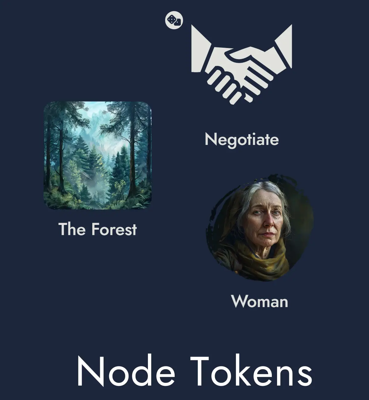
Node Tokens
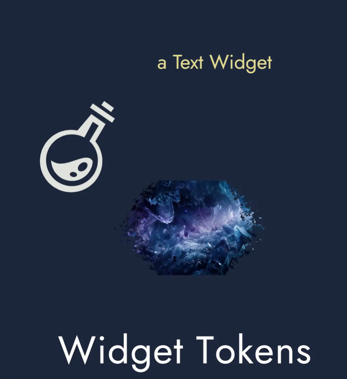
Widget Tokens
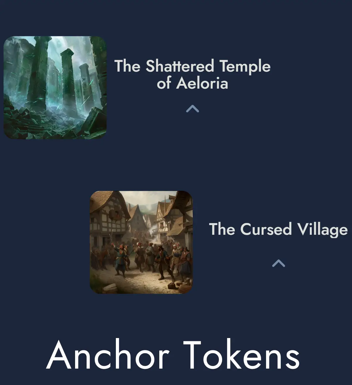
Anchor Tokens
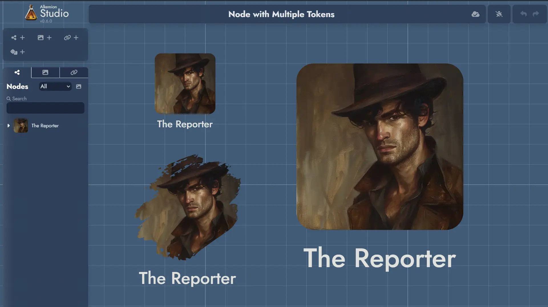
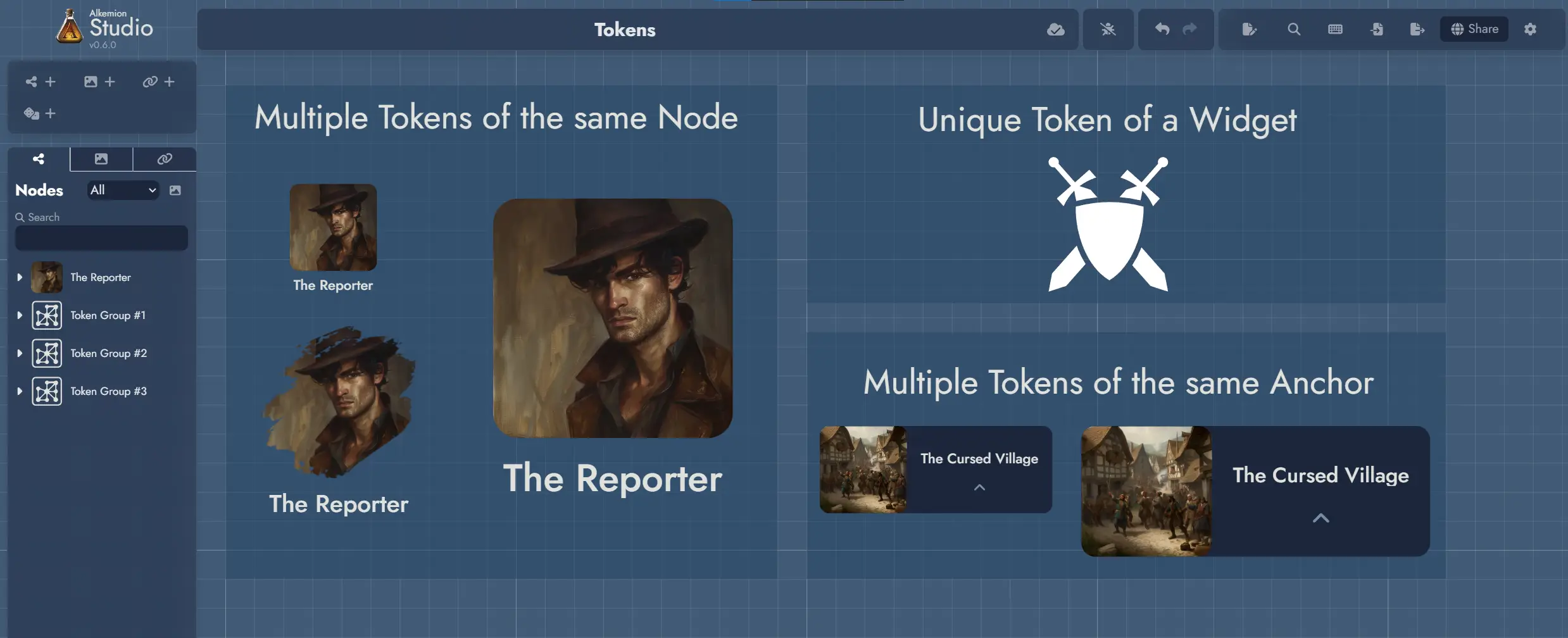
Multiple vs Unique Tokens
Nodes can have several Tokens on the Board to represent them. In addition, each Token belonging to the same Node share the same image, but can have its own visual customization settings.
An Anchor can be represented by several Tokens on the Board, and just like Node Tokens, each can have its own visual customization settings.
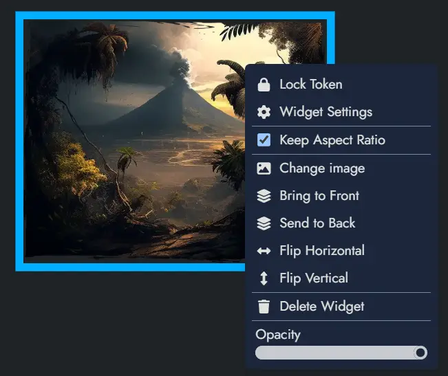
A Widget is different in nature from a Node in that it is merely a decorative or illustrative element within a Board. This nature makes the Widget a Token in itself, and it exists only through its unique representation on the Board.
Adding a Widget to a Module imposes its presence on the Board via its unique Token. And deleting a Widget's Token from a Board means deleting the Widget from the Module.
Floating Token Toolbars
Every Token on the Board has a floating toolbar that appears when the Token is selected. It gives you quick access to the most common actions and settings without opening the full Settings Panel.
Floating toolbars can be toggled on or off globally from the Board Settings panel or the Board context menu. When disabled, Tokens continue to behave normally; the toolbar simply does not appear on selection.
In reader mode (shared modules), Node Tokens display a minimal toolbar with View and Info buttons, giving viewers quick access to open the Node's content or details without full editing controls.
Token Selection
To select a Token, click (or tap) on it.
To select multiple Tokens, hold down the Ctrl key, or click on the board and create a selection area by dragging the mouse. The same can be achieved on touch devices by tapping and dragging.
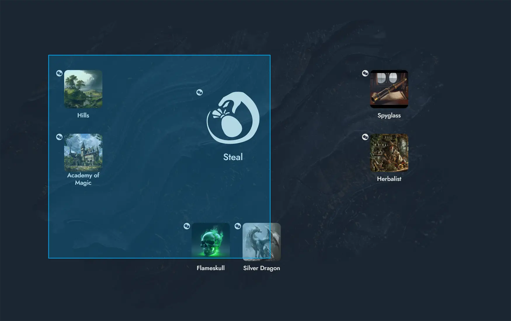
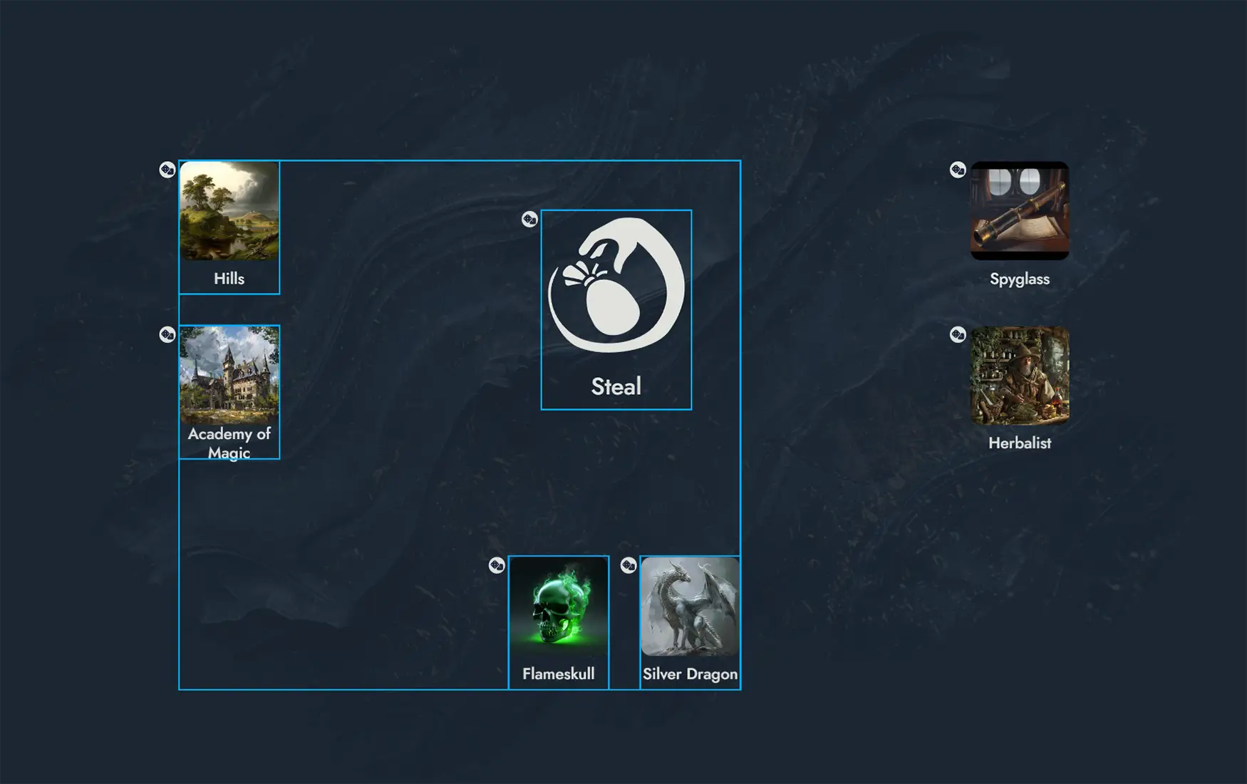
Once Tokens are selected, several actions can be performed: they can be deleted by pressing the Del key or dragged across the Board.
Additional actions are available in the Contextual Menus.
Contextual Menus
Right-clicking on a Token will display a contextual menu with various actions (or a long press on touch devices). Some of these actions can also be applied to a selection of Tokens (see Token Selection).
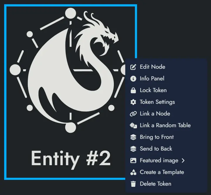
The details of the available actions are described below:
Lock Token and Unlock Token will respectively lock and unlock the Token. A locked Token cannot be moved or selected. A contextual menu with a limited set of actions can still be triggered on a locked Token.
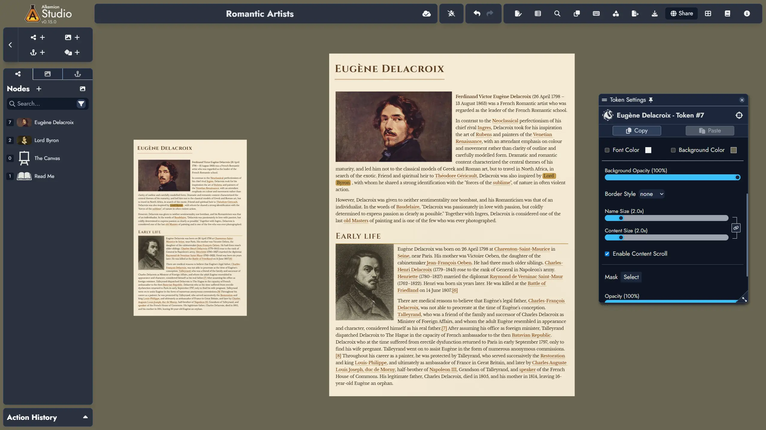
Token Settings will open the Settings Panel for the Token. The panel offers visual customization options and link configurations that vary by Asset type; Node Tokens and Widget Tokens each provide different settings.
Duplicate Token will create a new Token with the exact same settings and position it right next to the original.
Bring to Front and Send to Back will change the display layer of the Token so that it appears on top of or below any overlapping Tokens. Also, both these actions can be done with PageUp and PageDown key shortcuts on a selection of Tokens.
Create a Template will open the Create Template dialog and let you create a new Template containing the Token (along with its parent Node), and any other selected Assets.
The following options are only available for Node Tokens:
Edit Node will open the Token's parent Node in the Editor.
Info Panel will open the parent Node's Information Panel in a floating window (or a modal window on small screens). This panel contains the essential information about the Node.
Link a Node and Unlink a Node will allow you to link the Token's parent Node to another Node or to remove one of the current links. The first action will open a Node selection modal, whereas the second will directly list the current links in a sub-menu.
Link a Random Table, Change Random Table and Unlink the Random Table: The first option will allow you to link the Node to a Random Table. A modal window will let you select one of the available Random Tables. The second option will let you change the linked Random Table with the same modal window. The third option will unlink the currently linked Random Table.
Featured Image will open the Image Browser and let you pick a new Featured Image for the Token's parent Node.
Delete Token will delete the Token, but it won't delete the parent Node.
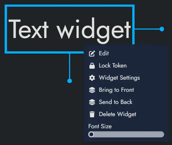
The following options are only available for Widget Tokens:
Delete Widget will delete the Widget and its unique Token.
The following options are only available for Anchor Tokens:
Travel to Module will transport the Board to the Module set in the Anchor.
Delete Token will delete the Token, but it won't delete the parent Anchor.
Duplicating Tokens
To duplicate one or more Tokens, first select the Tokens you wish to duplicate (see Token Selection for more details about this).
Once selected, you can duplicate the Tokens in two ways:
- Right-click to open the contextual menu and choose the 'Duplicate Tokens' option.
- Use the keyboard shortcut Ctrl + D.
The duplicated Tokens will appear adjacent to the original ones and will retain all the same settings and properties as the originals.
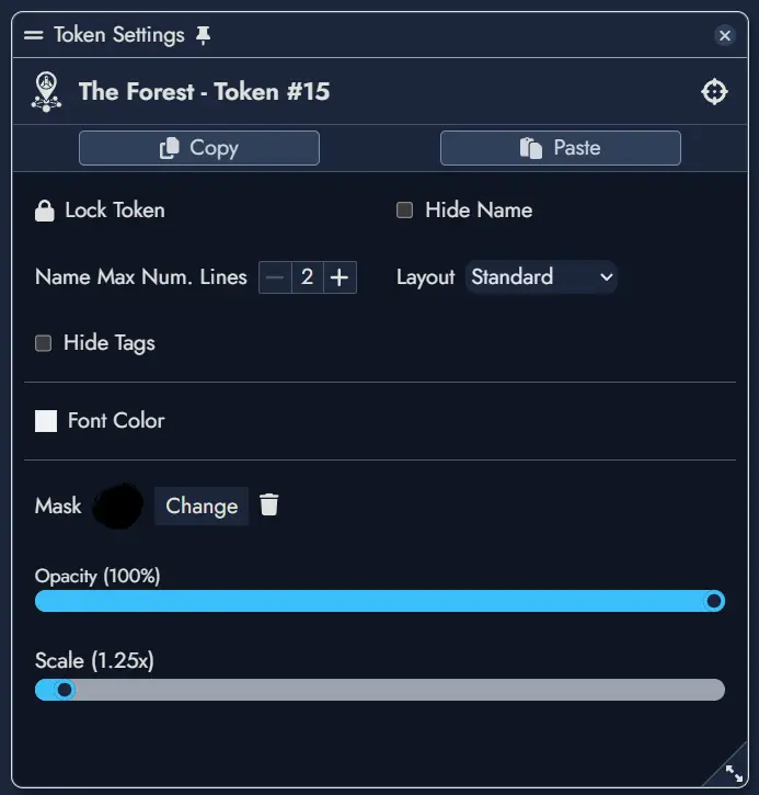
Customizing Tokens
The Token Settings Window, accessible via a Token's contextual menu, provides various customization options specific to the selected Token.
If a Node contains multiple Tokens, the settings will apply only to the currently selected one. Available customization options in this window depend on the Asset type.
Below are the options available to a Node Token:
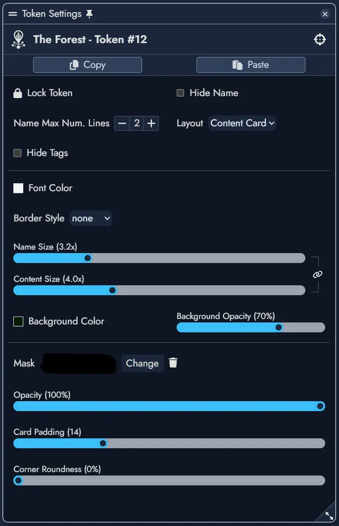
Left window is for a standard layout, right is for a content card layout.
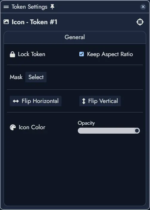
Below are the options available to a Widget Token:
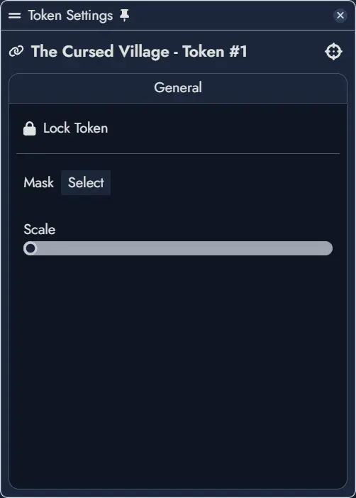
Below are the options available to an Anchor Token:
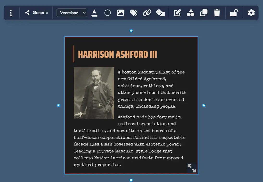
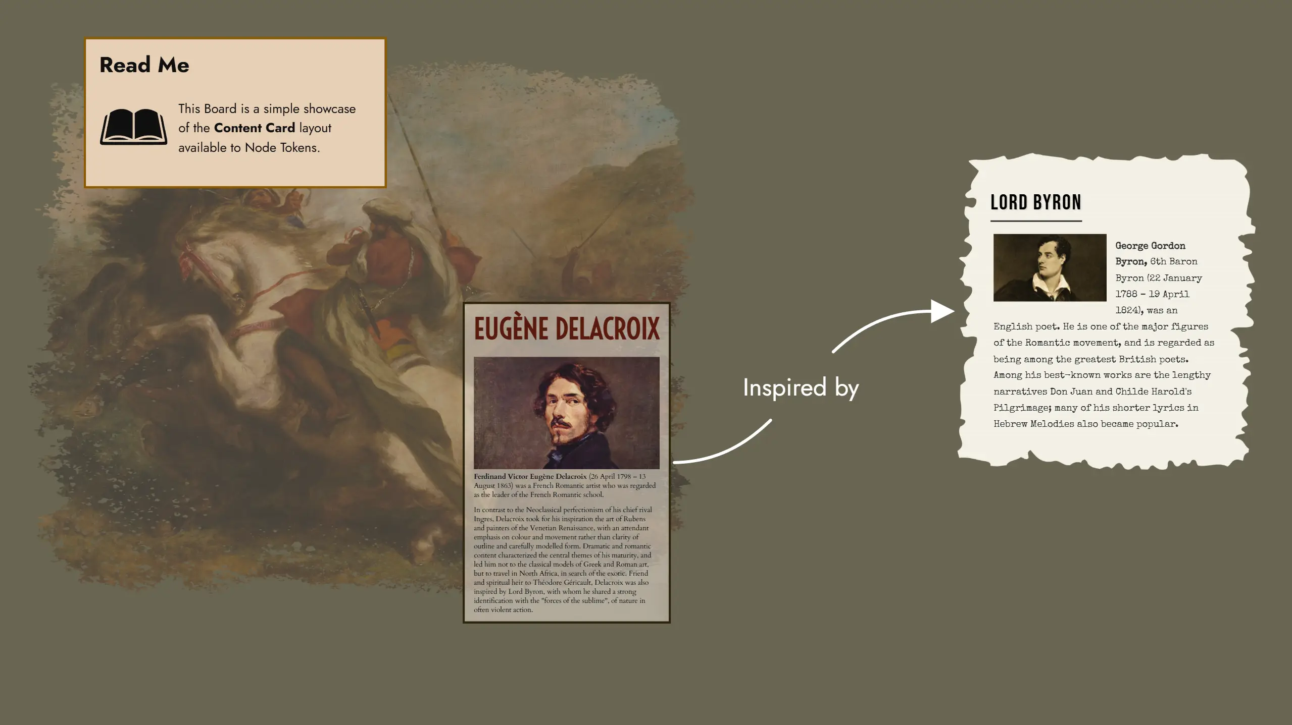
Content Card Layout
The Content Card layout is a specialized Token layout that displays not only the Node's name but also its rich text content directly on the Board. Unlike the Standard layout which only shows the name and featured image, Content Card tokens render the actual content of the Node, making it visible without needing to open the Editor.
This layout is particularly useful for displaying narrative text, descriptions, or any content you want readily visible while navigating your Module on the Board.
Theme Selection
Content Card tokens display their content using a Theme, similar to how content appears in the Editor. You can select any available theme for each Content Card token independently of the theme used in the Page Editor. This allows you to visually differentiate different types of content or simply match the aesthetic of your Board.
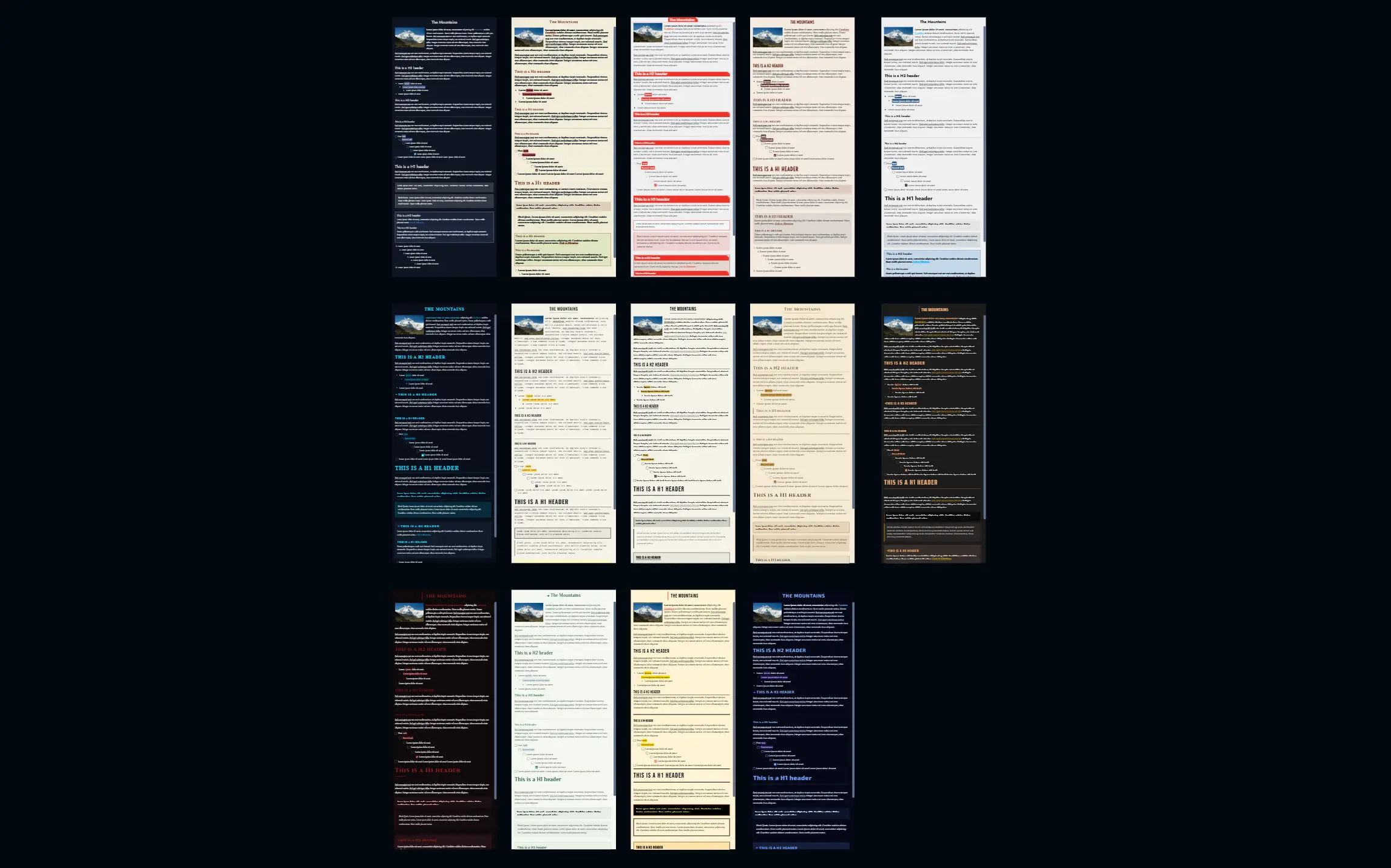
Responsive Scaling
The content displayed in a Content Card token scales according to two dedicated slider settings: Name Size and Content Size. These settings allow you to independently control the size of the Node's name and its content text, or you can adjust them in sync to maintain consistent proportions. This flexibility ensures optimal readability while allowing you to create visual hierarchy within your cards on the Board.
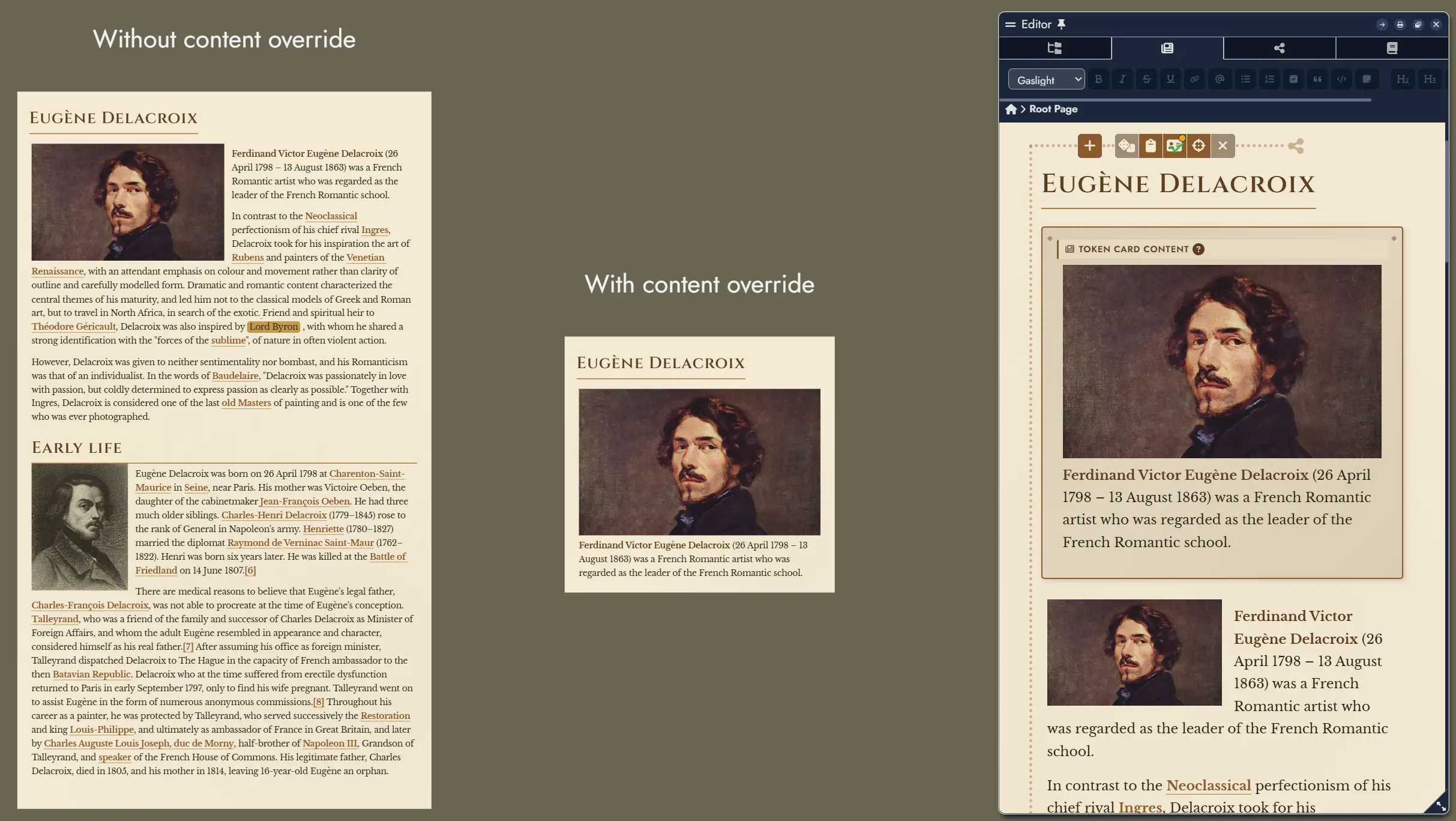
Content Override
By default, a Content Card token displays the full content of its parent Node. However, you have two levels of content override available:
- In the Editor, you can specify alternative content for any Node that will be displayed in all Content Card tokens of that Node, overriding the original content. You can hide and display this alternative content in the Editor using the button in the Node's toolbar.
- In the Token Settings, you can use the "Don't override token content" checkbox to force an individual token to display the original Node content, ignoring any Editor-level override.
Customization Options
The Token Settings Window for Content Card layout provides extensive customization options:
Header Settings:
- Hide Name: Toggle the visibility of the Node's name at the top of the card.
- Emphasized Header: When enabled, the name uses h1 styling instead of h2 for greater prominence.
- Name Alignment: Position the Node's name horizontally (left, center, or right).
- Name Size: Adjust the size of the name text using a slider.
Content Display:
- Content Size: Adjust the size of the content text using a slider.
- Enable Content Scroll: When checked, a vertical scrollbar appears when content overflows the card boundaries, allowing you to see all content within a fixed token size.
Theme Override:
- Font Color: Override the theme's default font color with a custom color of your choice.
- Background Color: Override the theme's default background color with a custom color.
- Background Opacity: Control the transparency of the background, from 0% (fully transparent) to 100% (fully opaque).
Card Appearance:
- Border Style: Choose from various border styles (none, solid, dashed, dotted) to frame your card.
- Card Padding: Adjust the inner spacing between the card's border and its content.
- Corner Roundness: Control the border-radius to create rounded corners on the card.
Tags Display:
- Hide Tags: Toggle the visibility of any Tags assigned to the Node.
- Tag Scale: Adjust the size of tag overlays displayed on the token.