The Editor
The Editor facilitates the organization and detailed editing of your Module's content. It consists of three main components: the Editable Page, the Content Tree, and the Details Panel. Use this interface to arrange Nodes, edit their rich-text content, and prepare your Module for in-game access, printing, or sharing.
The Editor can be opened in full screen or as a resizable window within the Board, letting you write while navigating your visual structure.
Editable Page
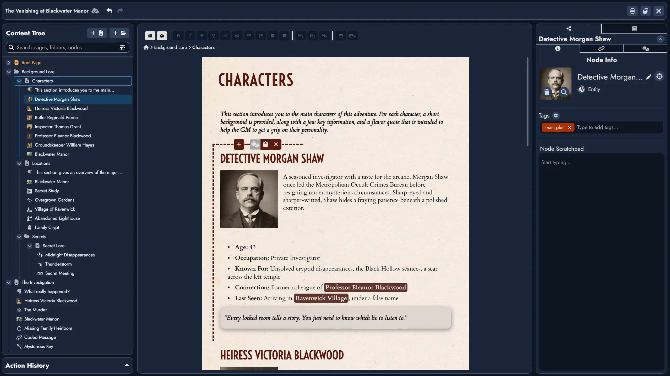
The Editable Page displays the contents of the currently selected Page from the Content Tree. You can switch between multiple Pages within your Module. Each Page is an independent document-like space where you can arrange content blocks.
A Page can include an ordered mix of Node Blocks (content tied to a Node) and Text Blocks (standalone content not linked to any Node). Within this area, you can edit Node content using rich-text tools, add or format standalone text, insert images, and build your Page's layout block by block.
At the end of each Page, a placeholder Text Block is automatically shown to let you begin typing without needing to manually add a block. This placeholder is only converted into a real Text Block when you start entering content. If the last block on the Page is already a Text Block, no placeholder is added.
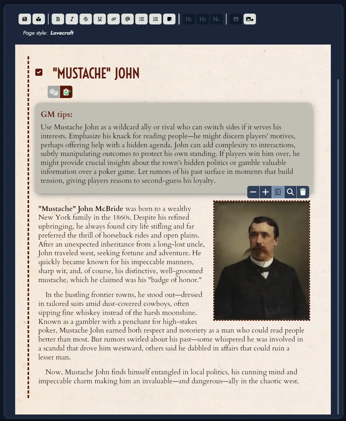
A dotted line indicates the selected Content Block. When a Node is selected, additional functions appear, such as rolling the linked random table , toggling notes , or inserting new blocks .
When the Editor is in windowed mode, a “Center on Board” button is available; clicking it will center the Board on the selected Node’s token. If the Node has multiple tokens, repeated clicks will cycle through them.
Each Content Block can be shown or hidden in the page using the context menu available on each block in the Content Tree.

The toolbar includes the following functions:
The button lets you switch between multiple visual themes, with support for custom themes planned in a future update.
toggles reader mode, hiding overlay buttons.
Standard formatting tools include bold , italic , strikethrough , underline , bullet and numbered lists , and headers .
inserts a secure link (https only).
inserts a Mention to another Node. See the Mentions section.
applies a sticky-note style to a paragraph.
inserts an image from your Library.
inserts the Node's featured image.
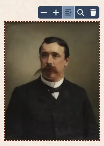
Selecting an image by clicking on it displays a toolbar dedicated to that image.
The and buttons can be used to change the size of the image, while the alignment buttons lets you position the image on the left, right or center of the content.
Finally, the magnifying glass button lets you zoom in on the image, while the trash button lets you delete the image from the content.
Mentions
Mentions create inline references to other Nodes, providing a soft-link for narrative or organizational purposes.
Inline Mention: While typing in the Editor, press the "@" key to trigger the Mention feature. This action opens a floating search window, allowing for immediate searching of Nodes by name. Navigate the search results using the arrow keys and select the desired Node to insert a Mention. After selection, you can continue typing without interruption.
Toolbar Mention Button: To use this feature, first position your text cursor where you wish to insert a Mention or select existing text to be linked. Clicking the button on the toolbar will open a selection window. Here, you can choose the appropriate Node to link to the selected text. If the caret is positioned within a word, the entire word will be automatically selected and linked as a Mention.
Clicking on a Mention in the Editor will select the referenced Node in the Node Details Panel. If you press the Ctrl key while clicking, the Editor will also scroll to bring the referenced Node into view, assuming it is included in the current active Page. This provides seamless navigation when referencing related material.
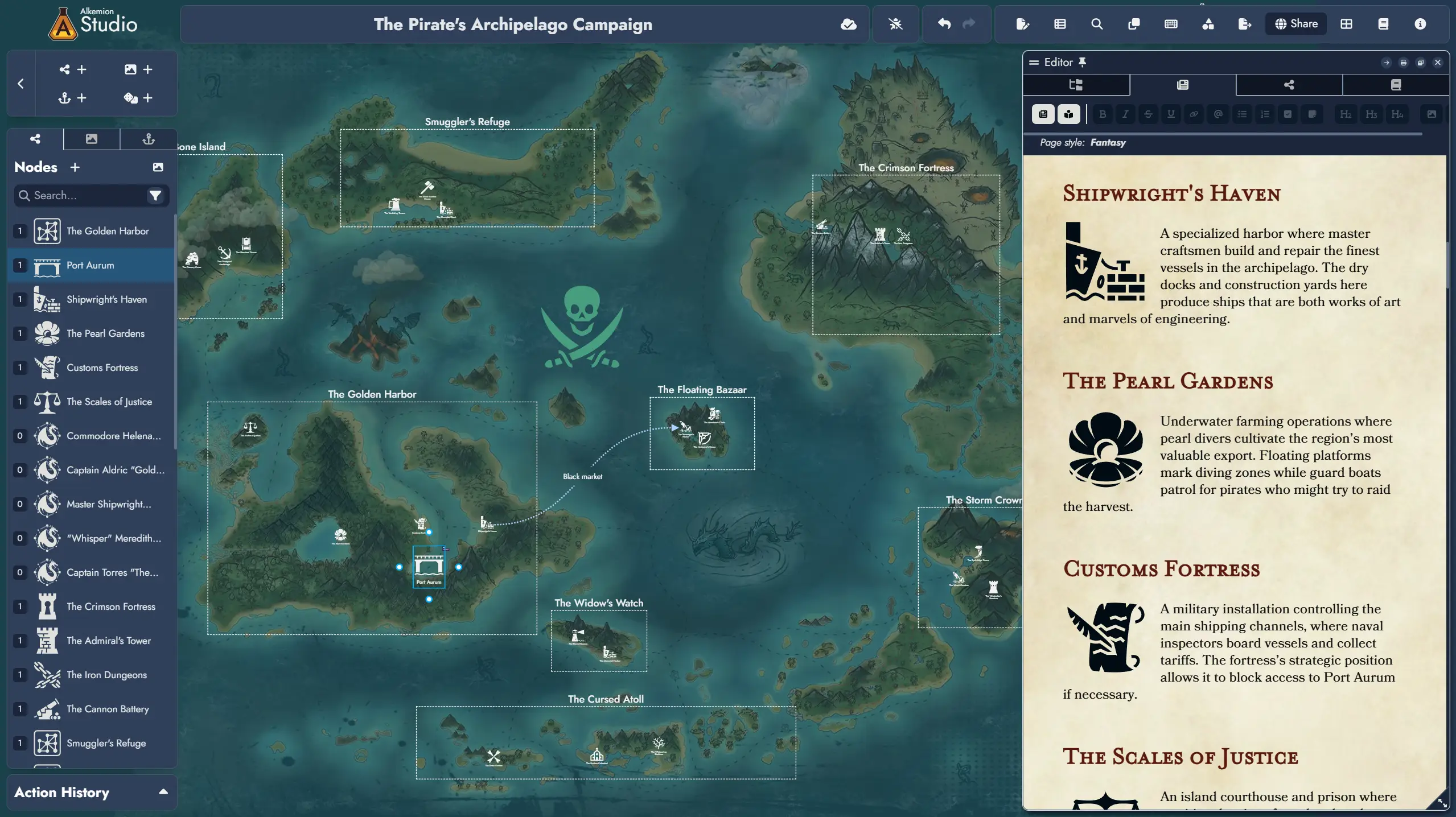
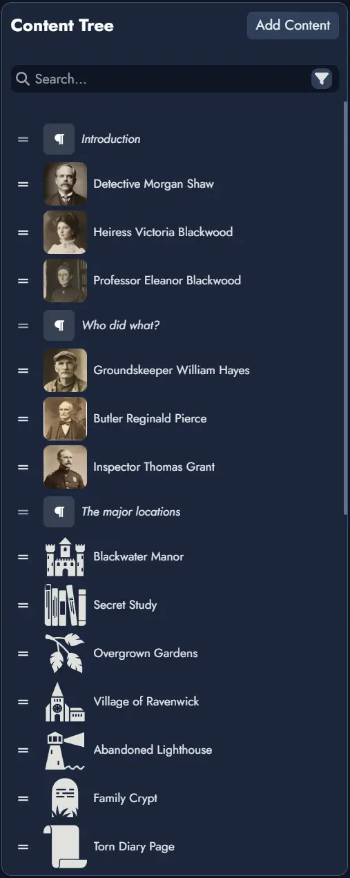
Content Tree
The Content Tree lets you manage multiple Pages inside your Module. Pages act like documents or folders, similar to file browsers in tools like Obsidian or Notion.
Pages can contain a combination of Node Blocks and Text Blocks, organized into a nested folder structure if desired. You can rearrange Pages or Blocks using drag-and-drop, and use right-click (or long press on mobile) for contextual actions like renaming, deleting, or inserting new content.
Selecting a Node Content Block will display its details in the Node Details Panel.
You can move content blocks between Pages or folders, and freely reorganize your Module's structure. You can also move or copy selected page content to another page directly from the Content Tree context menu. A Node can be included in multiple Pages (but only once per Page).
The “Search” input field will let you search throughout the Module content. A settings button on the far right of the search field provides additional search and filtering options.
The and buttons at the top right of the Content Tree let you add a new folder or Page. The new item will be created inside the currently selected folder or Page in the structure, or at the end of the tree if nothing is selected.
Right-clicking on a Content Block in the tree will display a contextual menu with various actions (or a long press on touch devices). Some of these actions can also be applied to a selection of Content Blocks. To select multiple Content Blocks, hold down the Ctrl key while clicking.
Node Details Panel
Provides meta-information and available actions for the currently selected Node. These are divided into three tabs:
Information Tab : features general information about the Node such as its title, type and its Featured Image. It will also display two input fields dedicated to notes:
- The Tags section contains a Tag Box you can use to manage the Tags associated with this Node. You can find more information about managing a Node's Tags in the dedicated page.
- The “Node Scratchpad” lets you store any kind of notes you want to associate with this Node.
Linked Nodes Tab : features the list of Nodes connected to the one selected in the Node Details Panel. From this tab you can remove any of the connections, or you can add new ones. Any of the listed Node can also be selected.
Random Tab : this is where you can link the selected Node to a Random Table. When the selected Node is linked to a Random Table, it will be featured here, and you will be able to remove the link or change it for another Random Table. In this tab you also have the possibility to roll the linked Random Table.
Print/PDF Preview
The Print/PDF Preview feature allows you to review how your Module will appear when printed or exported as a PDF. It opens a modal with two panels: the left panel displays the Editor with your Nodes, and the right panel shows the page layout with page breaks.
The right preview panel can be zoomed in or out to adjust the display for your convenience.
- Preview Panel: When activated, this panel shows a visual representation of your Module’s content divided into pages. The display updates automatically as you modify the content.
- Page Breaks: You can manually insert page breaks using the dedicated button Page Break in the toolbar or adjust page breaks by dragging them in the left Editor panel.
- Content Control: Only Nodes visible in the Editable Page will be included in the preview. You can toggle Node visibility using the Content Tree in the Editor.
- Export Options: Once satisfied with the layout, use the print button to open your browser’s print settings and either print the module or save it as a PDF.