Tags
Tags are customizable labels you can assign to Nodes to categorize and organize content within your Modules. They allow for quick filtering, searching, and visual organization across Nodes on the Board.
Each Tag includes a name and can optionally feature a color, icon, or description. Tags help you highlight specific themes, topics, or status indicators for your Nodes, making it easier to manage and view relevant content at a glance.
You can also build reusable sets of Tags using Tag Collections, stored in your Library and importable into any Module.
Managing a Node's Tags
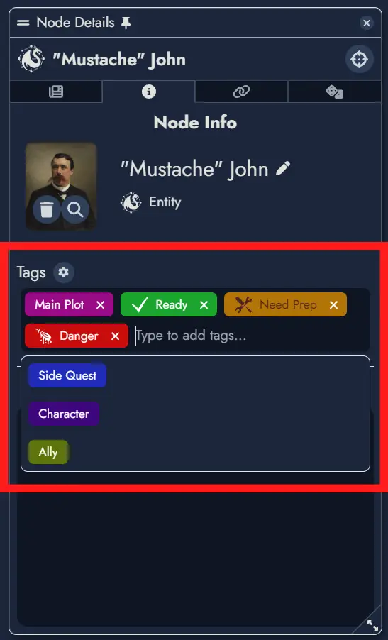
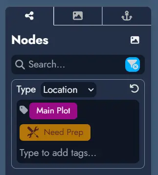
You can manage the Tags of any Node in your Module through its Tag Box, located in the Node's Information Panel.
The Tag Box displays the Tags currently assigned to the Node. Clicking on a Tag opens the Tag Editor, where you can modify its properties.
To add an existing Tag to a Node, use the dropdown menu in the Tag Box. Typing in the text field filters available Tags for quick selection. Once selected, the Tag will be assigned to the Node.
You can also create new Tags directly in the text field. Type a new name, press Enter, and the Tag will be created and automatically assigned to the Node.
To remove a Tag from a Node, simply click its close button: .
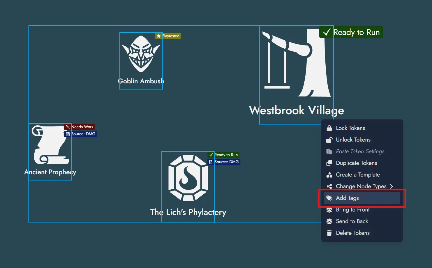
Adding Tags in Batch
You can add Tags to multiple Nodes at once using context menus. Select one or more Node Tokens on the Board, nodes in the Asset Tree, or content blocks in the Editor's Content Tree, then use the context menu to choose the Tags to apply to the parent Nodes of your selection.
Editing a Tag
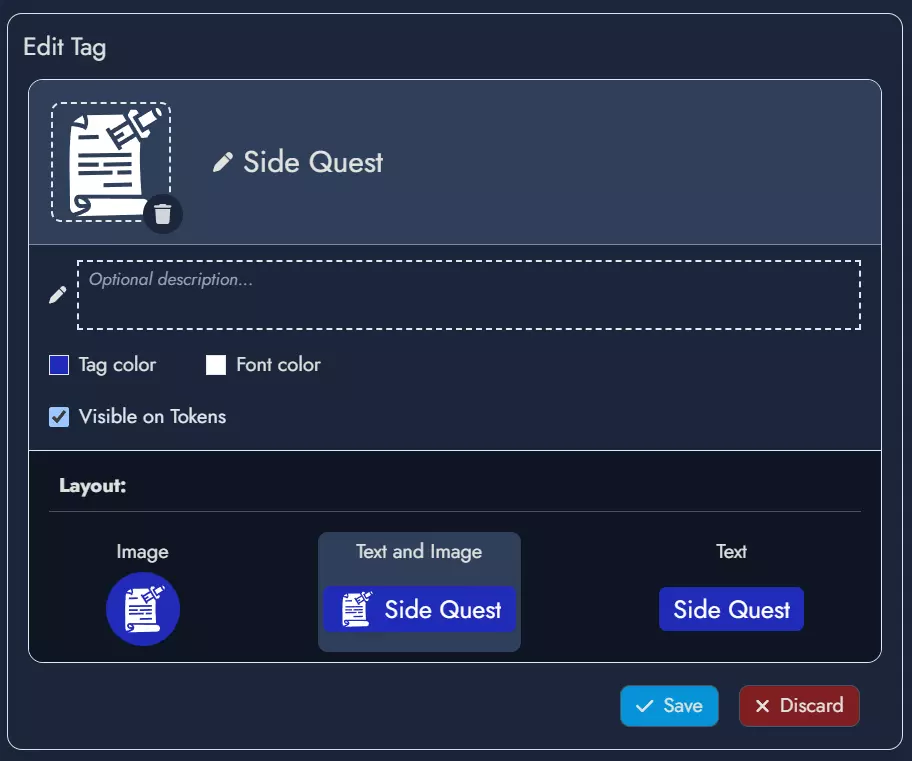
Clicking on a Tag in the Tag Box opens the Tag Editor, where you can set or modify various properties:
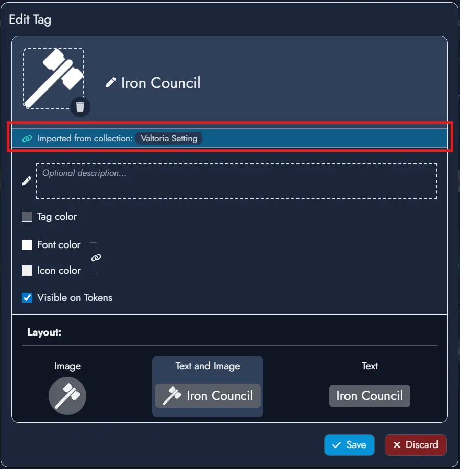
- Featured Image: Click the image box to set an image or icon as the Tag's Featured Image. This visual can optionally appear on the Tag Chip, the visual representation of the Tag across the application.
- Description: Use this optional field to describe the purpose or theme of the Tag.
- Tag and Font Colors: These values customize the style of the Tag Chip. An additional Icon Color setting lets you independently control the color of the Tag's icon. A lock option is also available to modify the icon and font colors simultaneously.
- Visible on Tokens: Check this box to display the Tag Chip on the Node's Tokens. This setting can be customized for each Token in its Token Settings panel.
- Layout: Choose the Tag Chip style by combining the Tag's name and visual. Note that layout options using a visual can only be selected if a Featured Image has been set.
To save your changes, click Save. Click Discard to cancel any modifications.
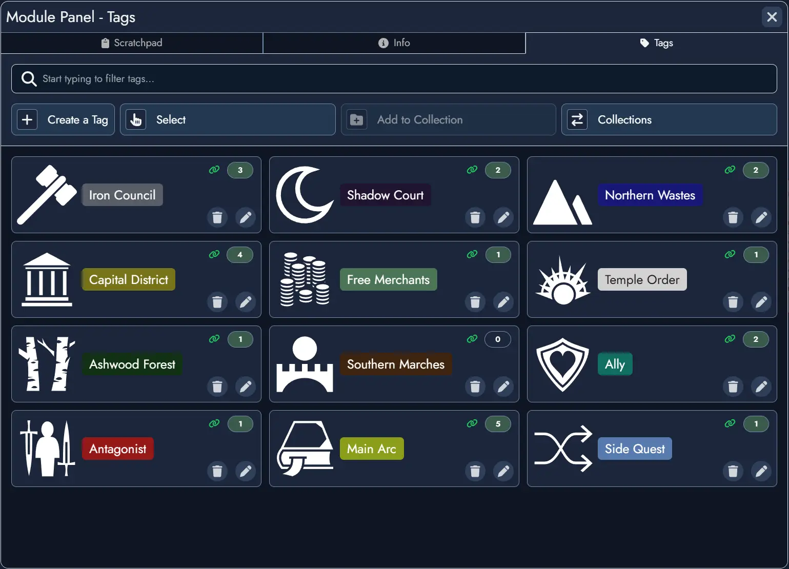
The Tag Manager
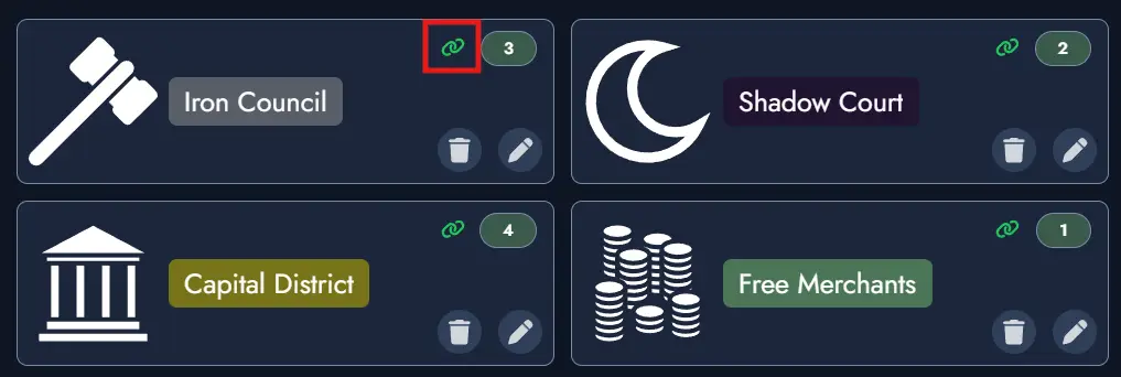
The Tag Manager, located in the Module Panel, lists all Tags available in your Module. Each Tag card displays the number of Nodes that currently use it, giving you a quick sense of how widely each label is applied.
Right-clicking any Tag card opens a context menu with quick access to the most common actions. You can also select multiple Tags at once and apply actions in batch across your entire selection using the same context menu.
Tags Filtering
A filter button on the far right of any search field provides filtering options. You can filter Nodes by type or select specific Tags if they are available in the Module. The filter button turns blue to indicate when a filter is active.
Tag Collections
Tag Collections let you build reusable sets of Tags in your Library and import them into any Module. This is especially useful when you want to apply a consistent set of labels across multiple projects without recreating them from scratch each time.
Creating and Managing Collections
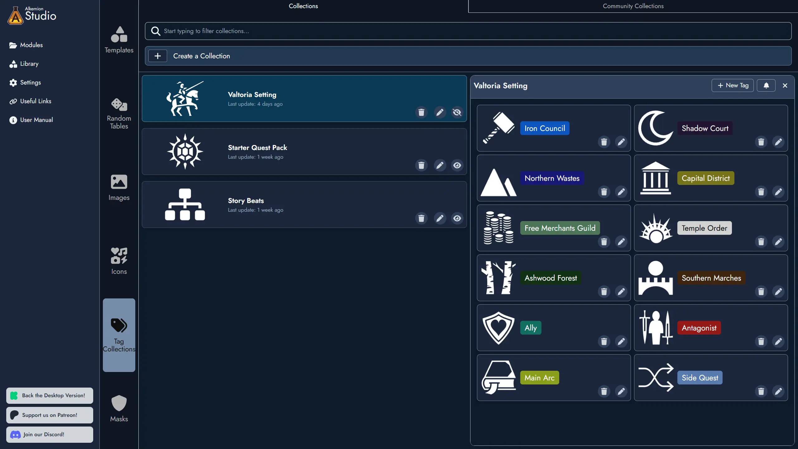
Tag Collections are managed from the Tag Collection Manager, located in the Library. It is accessible from both the Lobby and from inside any open Module.
To create a new Collection, open the Tag Collection Manager, give the Collection a name, and optionally assign a Featured Image to help identify it at a glance. You can then add Tags to the Collection and edit or remove them at any time. Collections can also be renamed, have their image changed, or be deleted directly from the manager.
When working inside a Module, navigation shortcuts are available to move quickly between the Tag Collection Manager in the Library and the Tag Manager in the Module Panel.
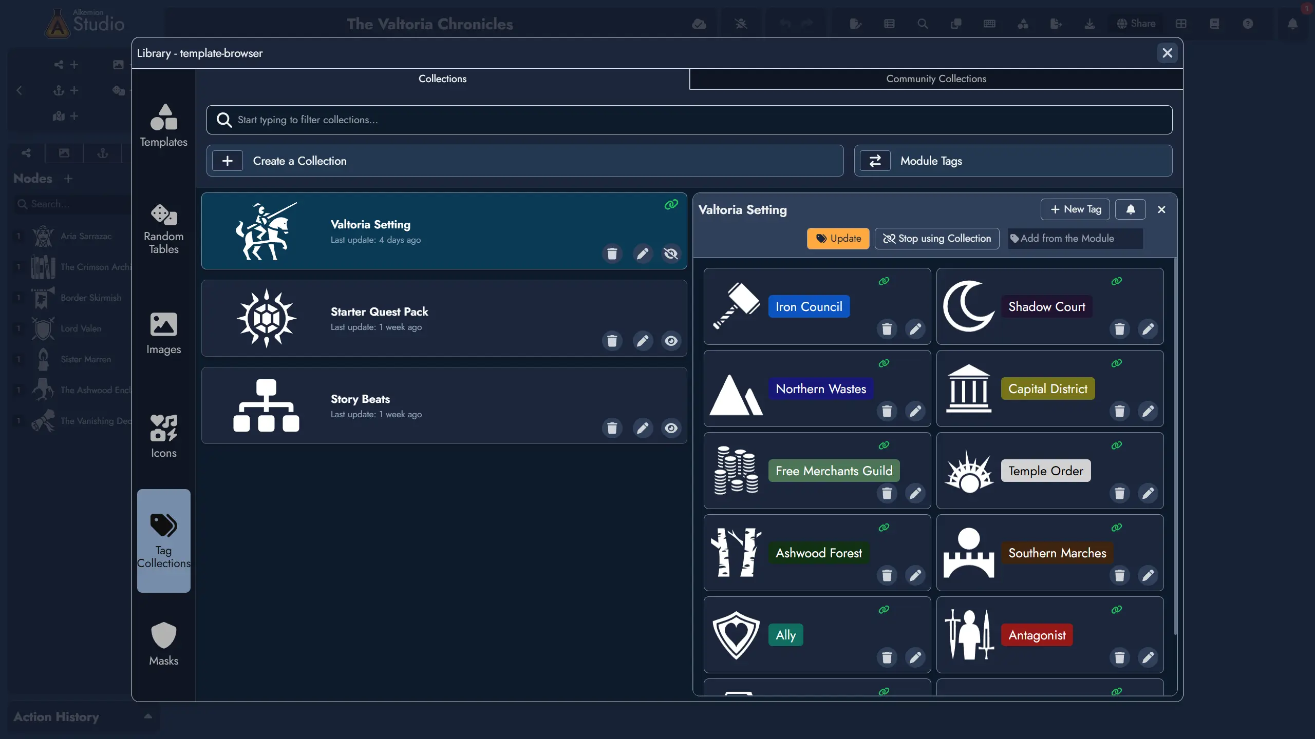
Importing a Collection
You can import a Tag Collection into any open Module directly from the Tag Collection Manager. When importing, you can select which Tags from the Collection to bring in.
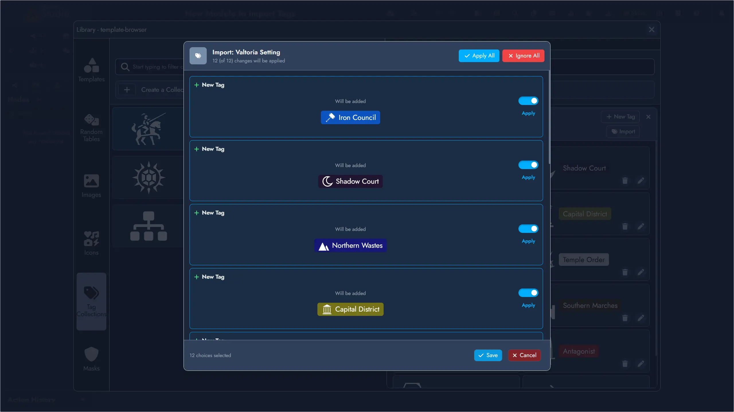
Imported Tags behave exactly like local Tags: you can edit or delete them freely without affecting the source Collection. A link icon on both the Collection card and each imported Tag card makes these connections easy to spot at a glance. The Tag Editor also indicates which Collection a subscribed Tag originates from.
Synchronization is one-directional: changes flow from the Collection to the Module, never the other way around. To update the source Collection, edit it directly in the Tag Collection Manager.
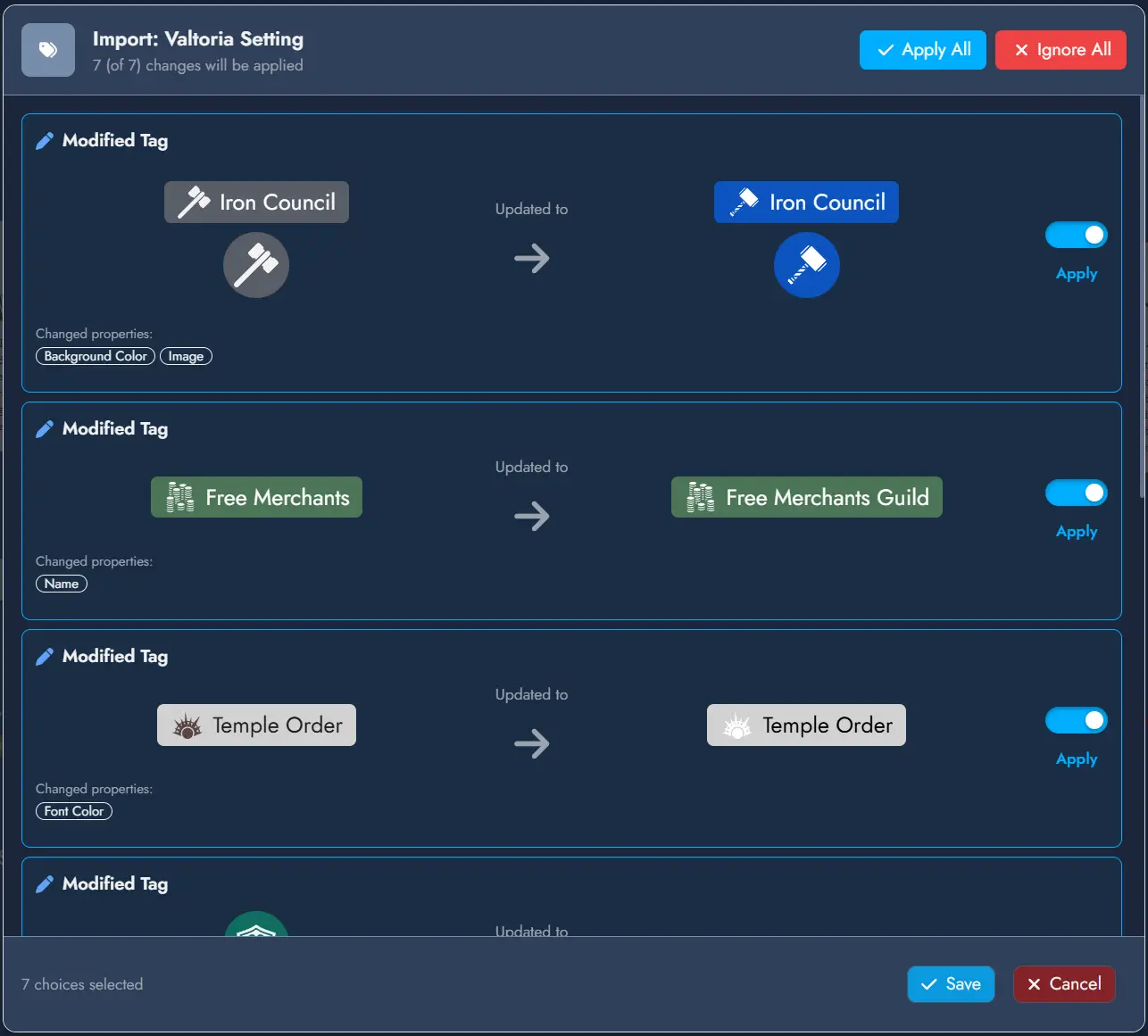
Keeping Tags Up to Date
When you update a Tag Collection, any Module that has imported Tags from it will show a soft notification on next load if there are pending changes to review. You can dismiss the notification and come back to it later, or open the update panel immediately to review each change individually and choose to apply or ignore it.
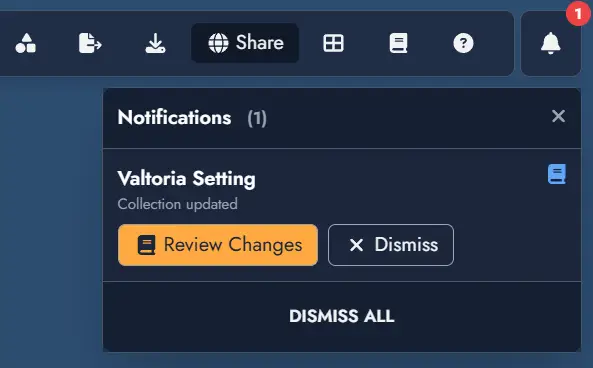
The update panel can always be accessed from the Update button on the Collection card in the Tag Collection Manager, even after dismissing a notification.