Alkemion Studio
User Manual
Version: 0.18
Generated: July 22, 2026 at 8:51 PM
Welcome to Alkemion Studio!
Alkemion Studio is a free visual tool built for the tabletop roleplaying game community. It gives you one place to design adventures, build worlds, manage campaigns, and keep your prep material connected and ready to use at the table.
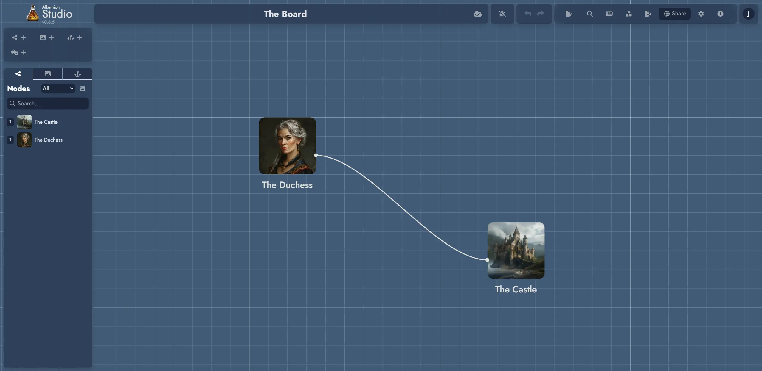
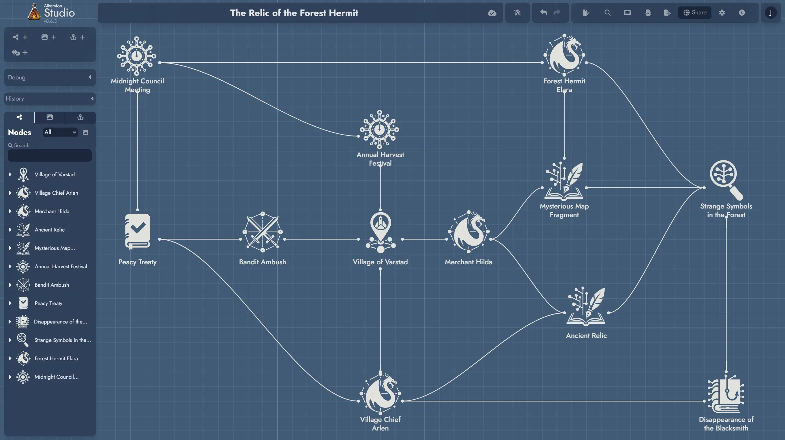
Everything is organized into Modules: self-contained projects that combine a visual Board for mapping your ideas and a rich-text Editor for writing them out. On the Board, your content lives as Nodes: locations, characters, clues, events, or anything else you need. Connect them with Links and the structure of your adventure or world takes shape in front of you.
The tool imposes no fixed structure. A Module can be a one-shot adventure, a campaign bible, a worldbuilding hub, a solo session journal, or a loose collection of prep material. When your project grows across several Modules, a Module Collection brings them together with shared search, a shared Library, and quick navigation between them.
For inspiration, check out "10 ways Alkemion Studio could be useful for you", a short post exploring common and creative ways people use the app.
This documentation covers all the features of Alkemion Studio. Start with the core concepts if you are new, or jump directly to the feature that interests you.
If you have questions or just want to share what you are building, come find us on Discord:
Start with the Concepts 🧭 page to learn the core building blocks, then head to the Features 📚 section for detailed how-to guides.
User Manual Downloads
Prefer reading offline or working from local files? Download the full Alkemion Studio user manual as PDF or Markdown archive.
- English (US)
Concepts
This page explains the core building blocks of Alkemion Studio. Understanding these concepts will help you organize your projects and use the app more effectively.
Modules
A Module is your workspace. It can be a complete adventure, a character backstory, or the setting for a campaign. Everything you create lives inside a Module.
Modules are made of Nodes, individual pieces of content, and the connections between them. You can visualize, organize, and edit these Nodes on the Board.
Nodes
A Node is a unit of content. It can be a Location, NPC, event, item, clue, challenge, or anything else you want to include in your Module.
Nodes can be connected to each other to show relationships or progression. This makes it easy to design non-linear stories that respond to player choices.
Templates
Templates are reusable sets of content. They can be full Modules or smaller structures, like a town with several locations and NPCs.
You can use Templates to start a new project or import them into an existing Module. You can also create your own Templates from what you’ve already built.
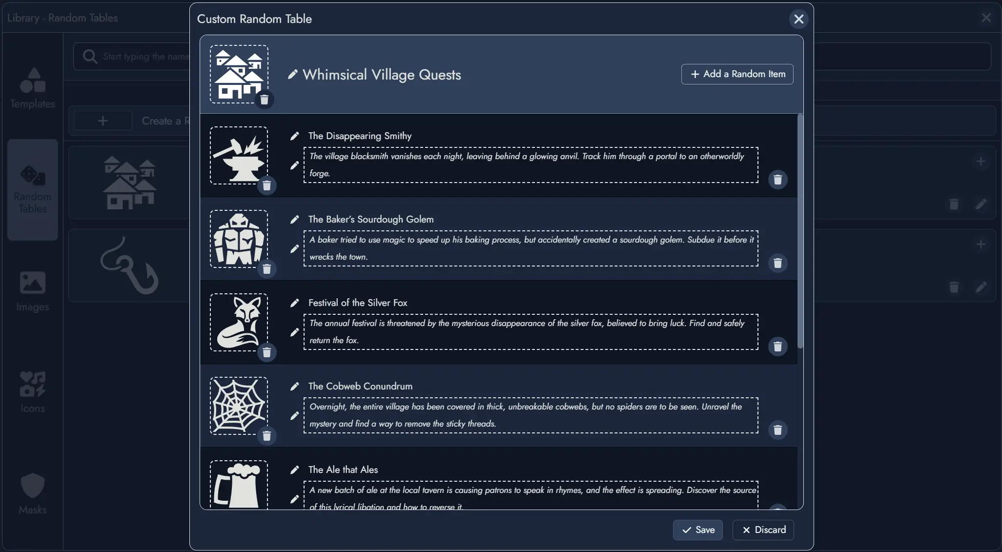
Random Tables
Random Tables contain lists of themed results—names, places, ideas, and more. You can roll on them to quickly generate new content.
You can link a Node to a Random Table. It then becomes a Random Node whose content changes based on the result of a roll.
You can create your own tables, or browse existing ones to spark inspiration.
Widgets
Widgets are decorative elements for the Board. You can use them to add images, icons, or text labels.
Widgets help you add context or organize space visually, but they don’t hold content or connect like Nodes do.
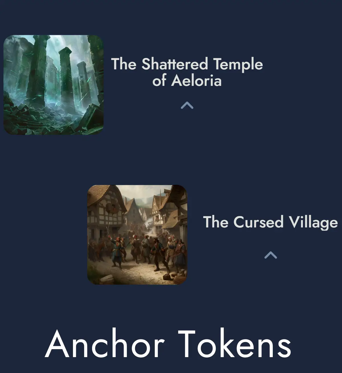
Anchors
Anchors let you link to other Modules or external URLs. Use them to connect large campaigns or reference outside material.
Like Nodes, Anchors can appear on the Board as Tokens. Clicking an Anchor Token opens the destination.
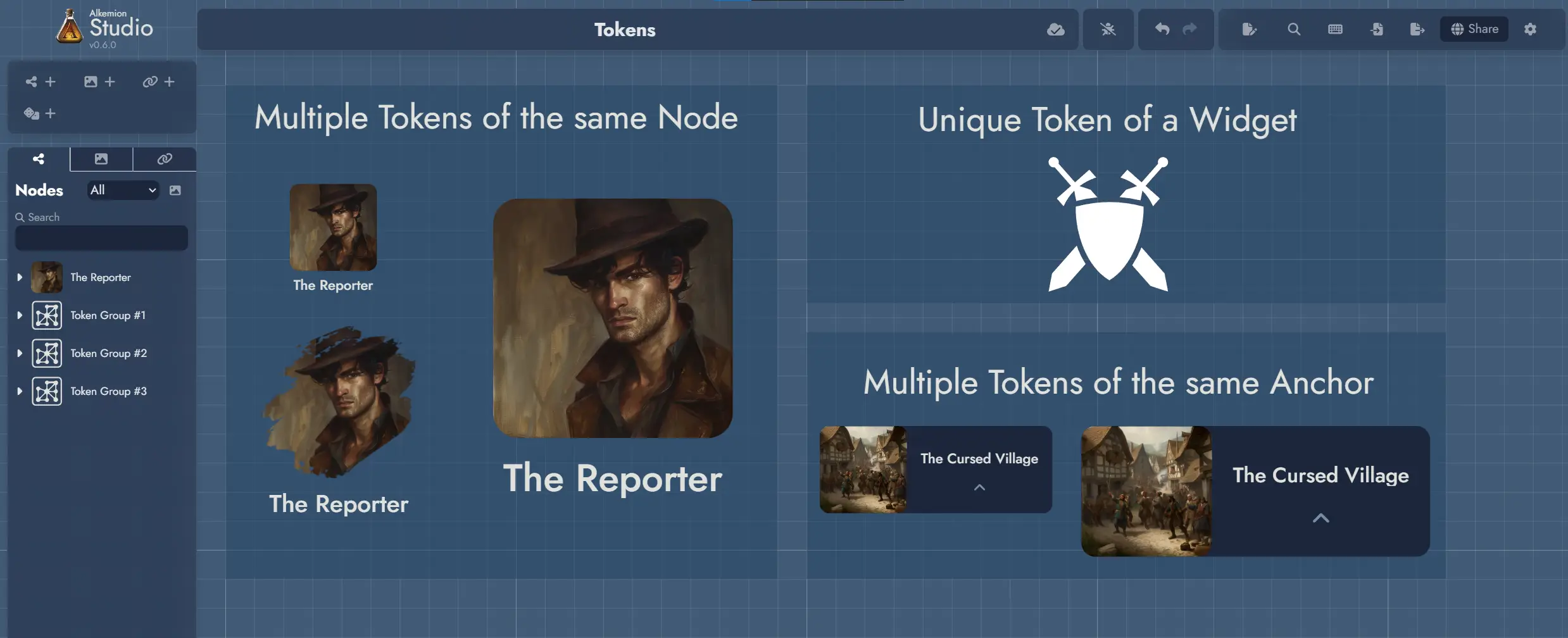
Tokens
A Token is the visual icon you see on the Board. It represents a Node, Widget, or Anchor.
You can place the same Node in different spots on the Board using multiple Tokens. Each Token can look different depending on how you customize it.
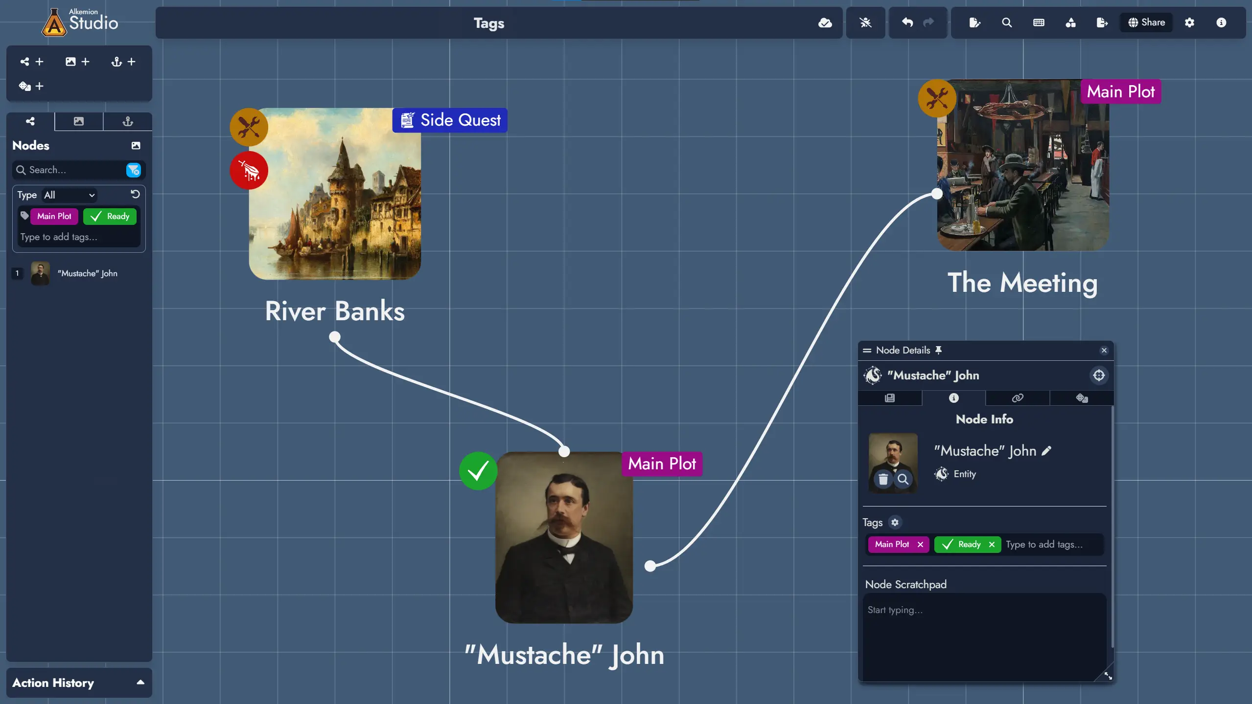
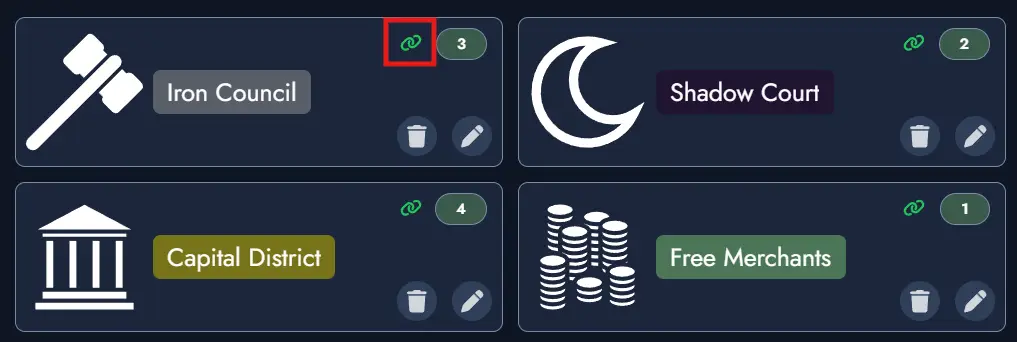
Tags
Tags are labels you assign to Nodes. They help you filter, search, and visually group content.
Each Tag can include a name, color, icon, and description. You can display Tags directly on Tokens to spot patterns or categories at a glance.
Let's get started!
To begin using Alkemion Studio, sign in with your Google or Discord account, or register with a valid email.
After login, you'll land in the Lobby — your workspace for creating and organizing Modules.
Short interactive tours will appear as you explore the application. We recommend following them to quickly understand the main interface elements.
Where to Begin
If you're used to tools like Obsidian, Miro, or wikis, here's a quick way to get started in Alkemion:
- Create a new Module in the Lobby and give it a name.
- On the Board, create a few Nodes: a location, a couple of NPCs, and a plot item.
- Link them to each other directly or with Clue Nodes to sketch a network of possibilities.
- Open the Editor to start writing. Nodes appear in a printable, editable view.
You can organize your ideas spatially like in Miro, outline them like in a wiki, and write them like in a word processor. Everything stays connected.
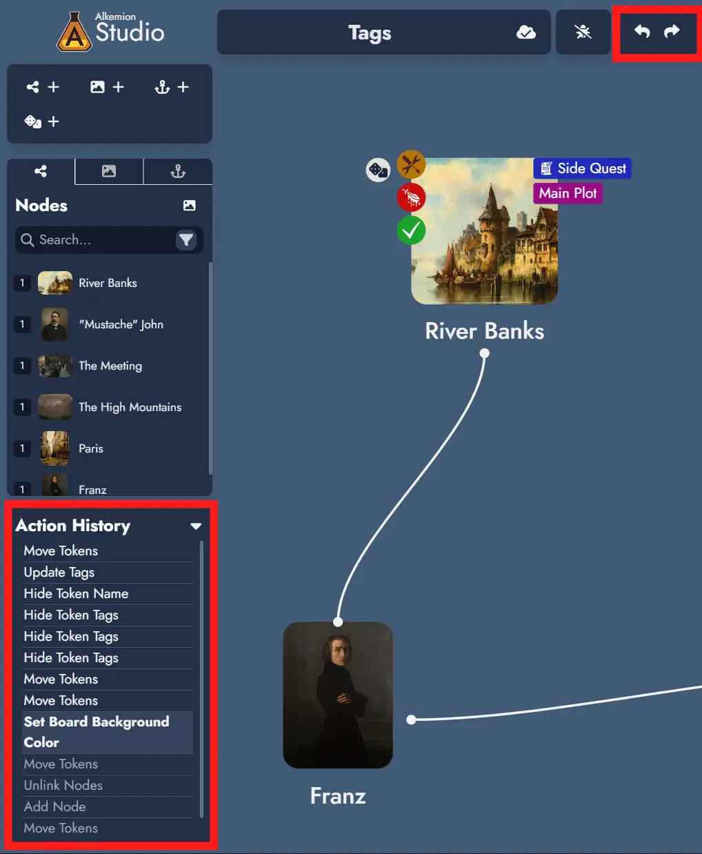
Undo/Redo
Most actions in Alkemion Studio can be undone and redone using the interface buttons / , or these shortcuts:
- Ctrl + Z to undo
- Ctrl + Y or Ctrl + Shift + Z to redo
Undo/redo is context-sensitive: the Board and the Editor each have their own history. You can only undo actions within their original context.
The current stack of actions is visible in the Action History panel, below the Node Tree.
Note: reloading the app clears the undo/redo stack.
Controls and Keyboard Shortcuts
Use the Controls button in the top toolbar to view all available shortcuts. The list is searchable.
You can also select whether you're using a mouse or trackpad to adjust pan and zoom behavior on the Board.
The Lobby
The Lobby is your starting point in Alkemion Studio. From here, you can access your Modules, browse your Library, adjust Settings, view Useful Links, or open the User Manual.
Modules Tab
Use this tab to view, organize, duplicate, or delete your Modules.
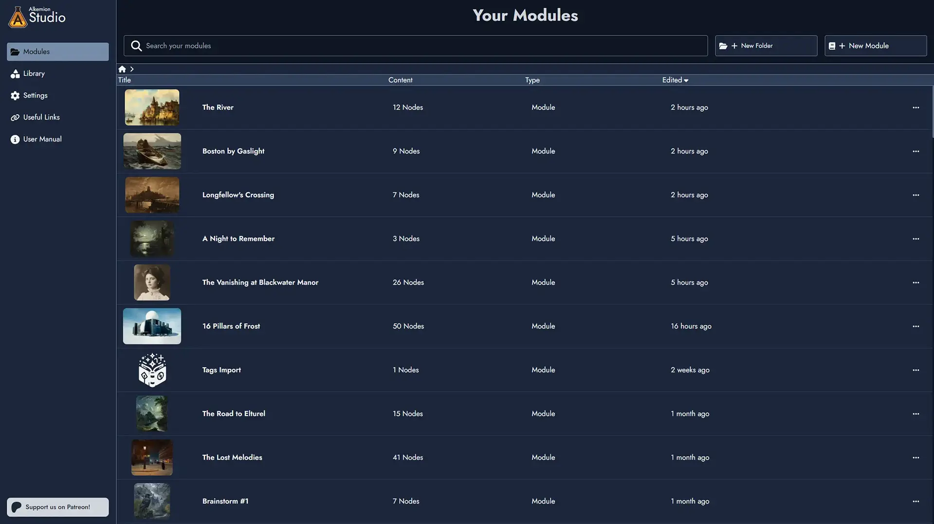
Clicking a Module opens it on the Board. You can rename, duplicate , or delete a Module using the action menu.
You can create folders and subfolders to organize your Modules. Move Modules between folders freely. The "Edited" timestamp on a folder reflects any changes made to Modules inside it, not just changes to the folder itself.
The search in the Modules tab is recursive: it searches across all folders and subfolders. Results include a Path column showing where each Module is located.
You can drag any Module card to reorganize it: drop it onto a folder to move it inside, or drop it onto the parent folder to move it out. Dropping a Module onto a Module Collection card adds it as a child of that collection. Dropping a child Module outside its collection removes it from the collection.
To create a new Module, click + New Module and choose to start from an empty Board or a Template.
Module Collections
Module Collections let you group related Modules together under a parent Module. A campaign with several adventures, a world hub with region and faction Modules, a solo project with session journals. The structure is whatever fits how you think.
To create a Module Collection, use the Promote to Collection action in any Module's context menu. Everything in the Module stays exactly as it is, and you can always turn it back into a regular Module if you change your mind. You can also check the Collection option in the New Module window to start fresh.
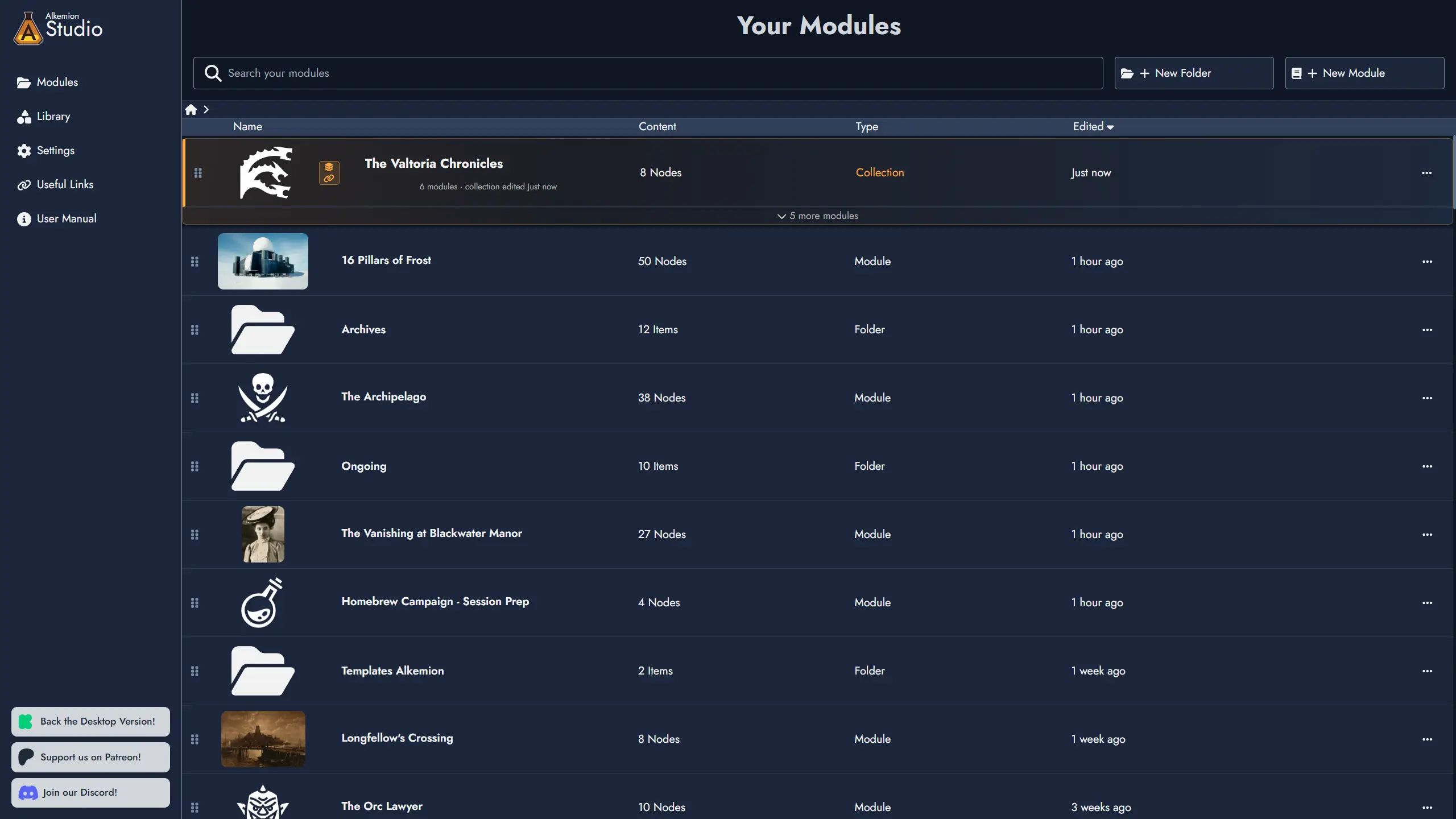
In the Lobby, a collection card expands and collapses to show its Modules nested beneath it. Click the card to open its Board; use the expand/collapse control to show or hide its contents.
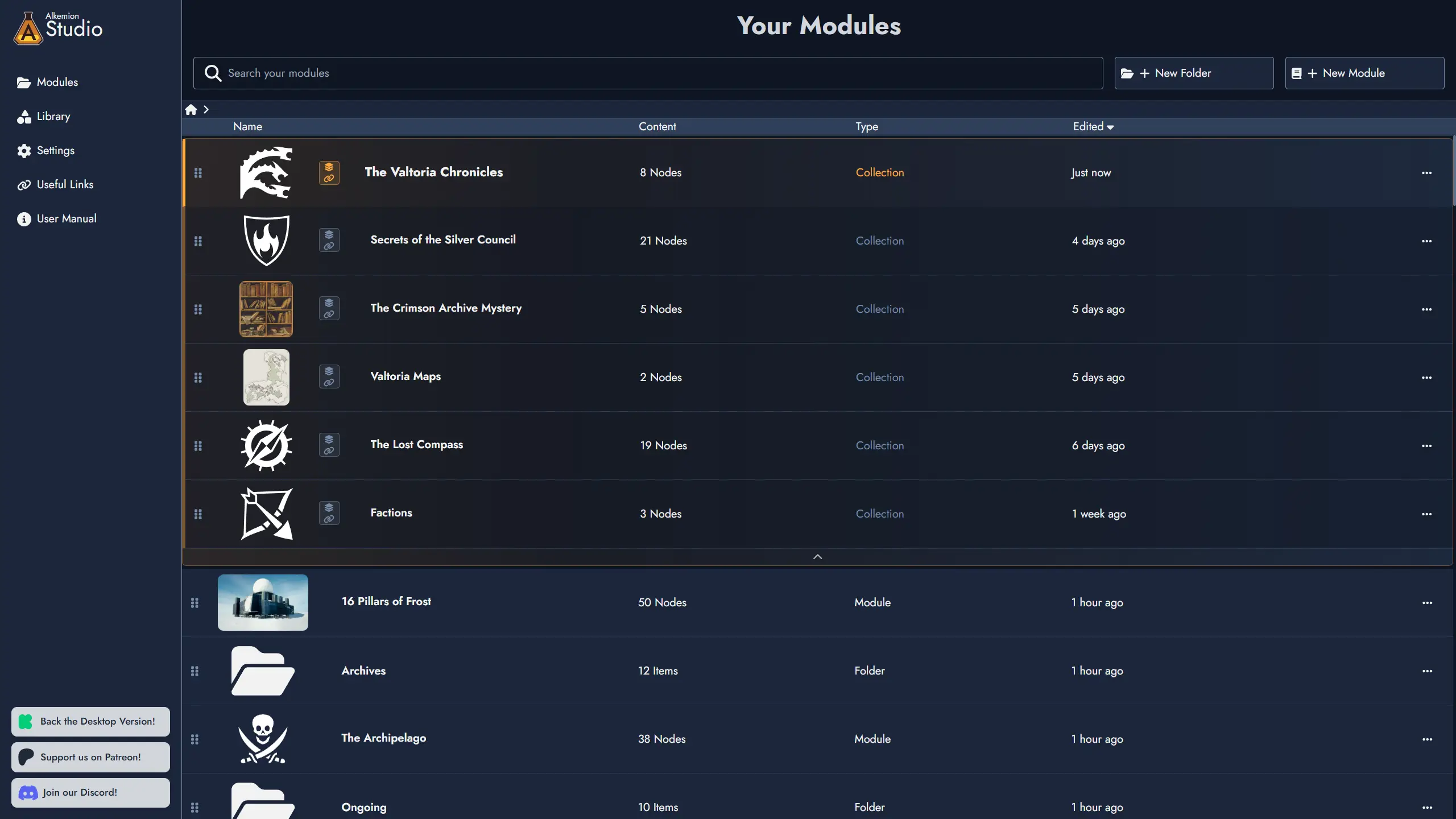
Add Modules to a collection through its context menu, or by dragging a Module card directly onto the collection. Remove a Module from a collection at any time. Its content is never affected. A Module can only belong to one collection at a time.
The collection's own Board is a blank canvas. Use it however you like: a campaign overview, a visual map of your Modules, or simply leave it empty.
Modules within a collection also gain access to a shared curated Library and cross-module search. See the Library and Board sections for more detail.
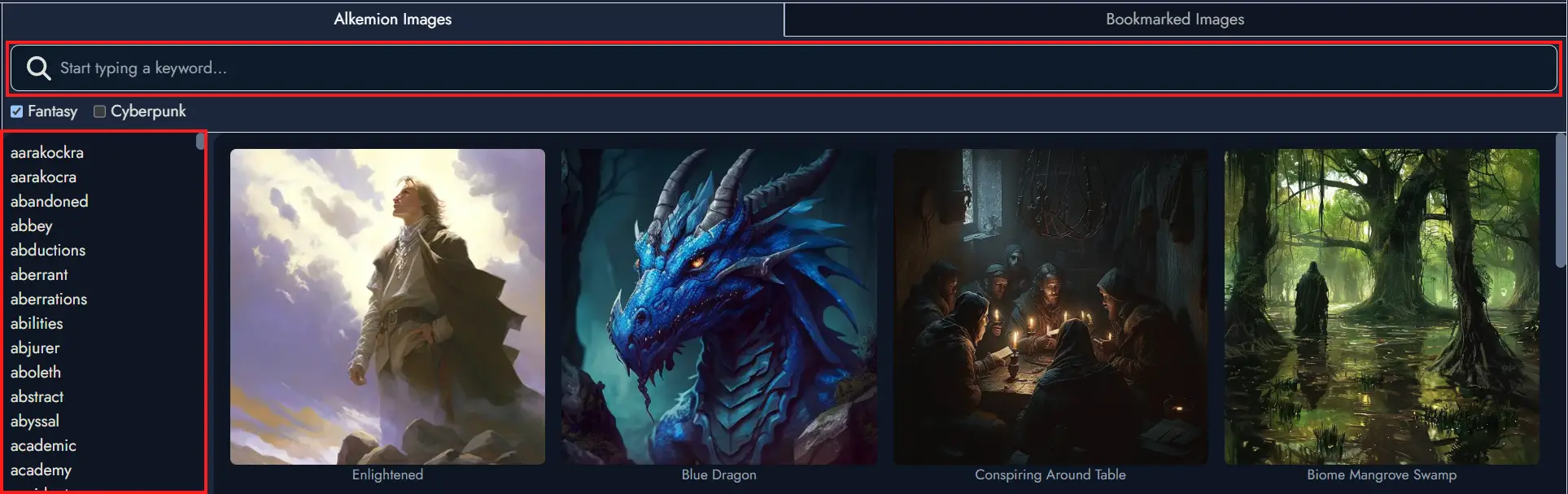
Library Tab
The Library is where you manage all reusable assets: Templates, Random Tables, Images, Icons, and Masks.
All assets are organized in categories and can be bookmarked for quick access.
You can browse both your personal creations and those shared by Alkemion or the community.
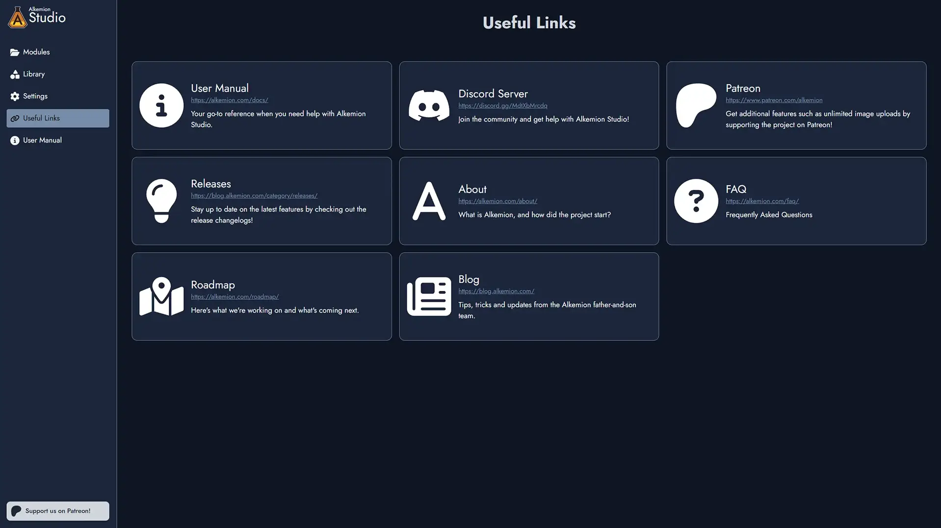
Useful Links Tab
Access external resources related to Alkemion Studio:
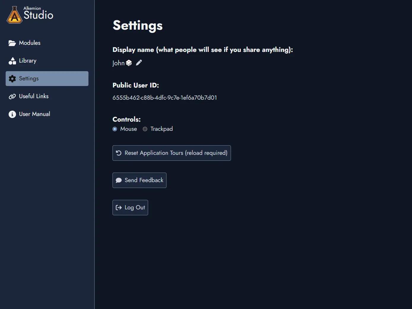
Settings Tab
Use this tab to set your display name and choose between mouse or trackpad controls.
You can also reset the application tours or log out.
You’ll also see your Public User ID in this tab. This ID can be shared safely and helps the Alkemion team identify your account for support or feedback. It’s not sensitive and poses no security risk.
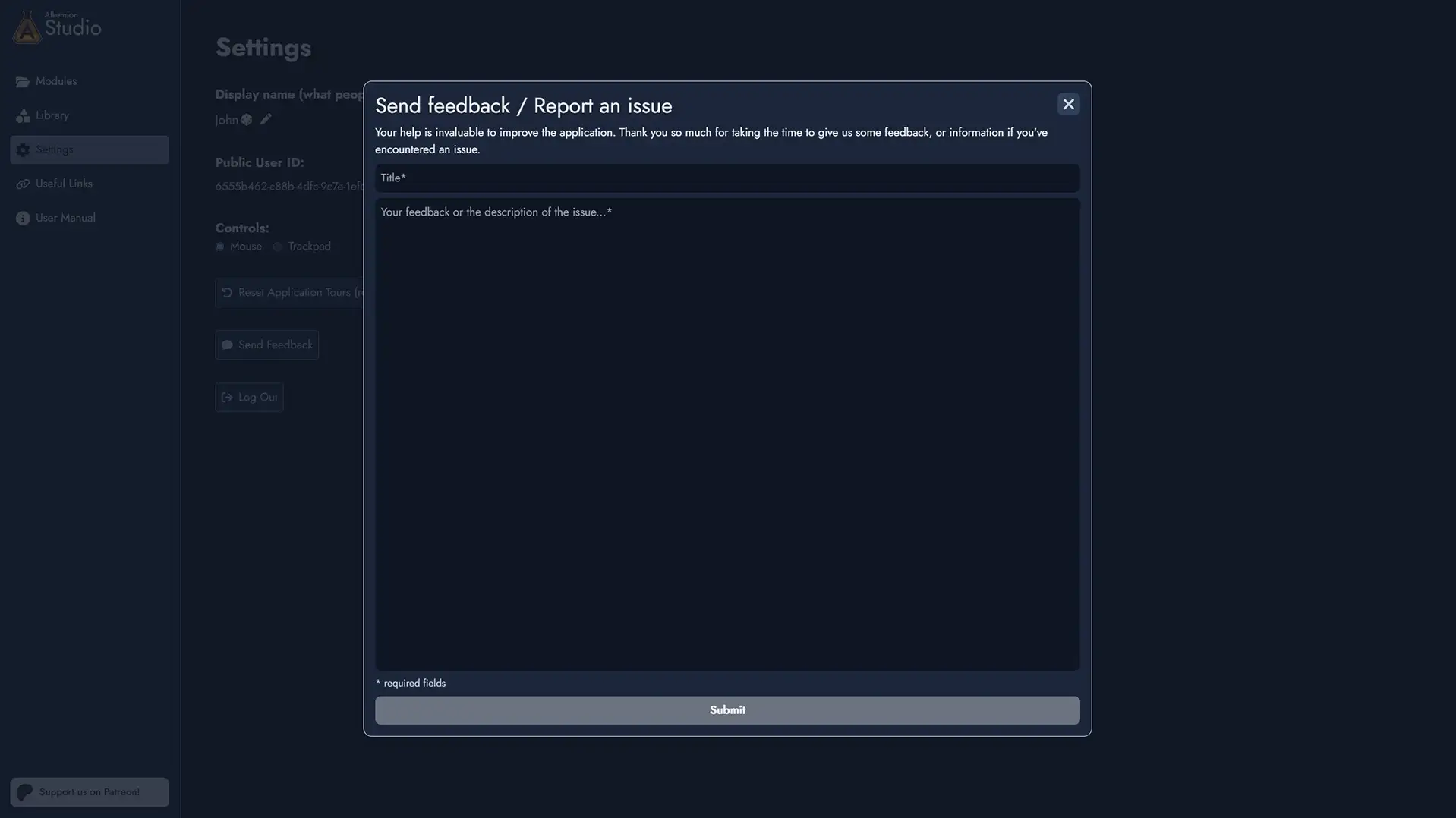
Send Feedback / Report an Issue
Use the feedback form to suggest improvements, report bugs, or share ideas.
All messages are read. If you report a bug, including steps to reproduce it would be really helpful.
Modules
A Module is your project in Alkemion Studio: a self-contained piece of content that brings together a visual Board, a rich-text Editor, and all the tools you need to design and organize your ideas in one place.
What a Module represents is entirely up to you. There is no required structure. A Module could be a one-shot adventure, a sprawling campaign setting, a session journal, a faction deep-dive, a collection of random tables, or something else entirely. The tool shapes itself around how you think, not the other way around.
What a Module Can Be
Because Modules carry no fixed meaning, they adapt naturally to any creative workflow. A Module works well on its own, and it can also be part of a larger structure when your project grows. Here are a few common ways people use them.
A single adventure. Map out locations, NPCs, clues, and plot hooks as Nodes on the Board. Connect them with Links to sketch the possible paths players can take. Write the full content in the Editor when you are ready. One Module, one adventure, ready to run.
Part of a campaign. As your campaign grows across multiple adventures, each Module can represent one chapter or arc. Group them all under a Module Collection to keep them connected: search across every Module at once, share a common Library of assets, and navigate between them without returning to the Lobby.
A worldbuilding hub. Dedicate a Module to a region, a faction, or a historical period. Keep it focused. Then bring all your world Modules together in a collection, with a parent Module serving as the lore hub that ties everything together.
Solo roleplaying. Use one Module per session journal, tracking discoveries and events as Nodes. Group them in a collection alongside a character Module and a world lore Module. Random Tables can spark unexpected directions when inspiration runs dry.
Loose prep material. Not every Module needs to be a full adventure. A Module can hold a single dungeon, a set of tavern NPCs, or a batch of rumours you want to keep handy. Add it to a collection whenever it finds its place in a larger project, or save it as a Template to reuse it across future ones.
What's Inside a Module
Every Module contains the same set of tools, ready to use as much or as little as you need.
- The Board -- an infinite visual canvas where you place and connect your content using Tokens and Links.
- The Editor -- a rich-text writing space that organizes your Nodes into printable, exportable Pages.
- Nodes -- the content-bearing elements of your Module: locations, NPCs, clues, events, and more.
- Tags -- customizable labels for organizing and filtering your Nodes.
- Widgets and Anchors -- visual elements and navigation shortcuts for structuring your Board.
- Random Tables -- rollable tables you can link to Nodes for on-the-fly generation.
A Module also has its own scratchpad for module-wide notes, a featured image, and a description. You can export it, share it as a read-only link, or save it as a Template for future reuse.
Creating and Managing Modules
Modules are created and managed from the Lobby. Click + New Module to start from a blank Board or from a Template. You can rename, duplicate, or delete any Module from its action menu in the Lobby.
Folders let you group Modules however you like. Create as many subfolders as you need and move Modules between them freely, either through the context menu or by dragging a Module card directly onto a folder.
Module Collections
When your work spans several Modules, a Module Collection lets you bring them together. Any Module can become a collection: promote it through its context menu in the Lobby, and it becomes a parent container for as many child Modules as you need.
What the collection means is, again, up to you. A campaign hub with one Module per adventure. A world with separate Modules for factions, regions, and history. A solo project grouping session journals, a character sheet, and world lore. The system defines none of it.
Promoting a Module changes nothing about its existing content. You can turn it back into a regular Module at any time if you change your mind.
Collections in the Lobby
In the Lobby, a Module Collection card expands and collapses inline to show its child Modules nested beneath it. Click the expand/collapse control to show or hide the children. Click the card itself to open the collection's Board.
Add Modules to a collection through its context menu, or by dragging any Module card directly onto the collection. Remove a Module from a collection at any time. Its content is never affected.
The collection's own Board is a blank canvas, available for any purpose you choose. Some users build a visual overview of their campaign there, using Anchor Tokens to represent child Modules and connecting them with Links to show narrative or thematic relationships. Others leave it empty and use it purely as an organizational container.
Shared Library
When you are working inside any Module that belongs to a collection, the Library panel shows a toggle switch labeled with the collection's name. Switching to it displays only the assets curated for that collection: Templates, Tag Collections, Images, Icons, Masks, and Random Tables.
This is a convenience feature for large projects. Instead of searching your full Library, you curate the assets relevant to this campaign or world once, and they are always easy to find from any Module in the collection.
To curate an asset, open the Library from inside any Module in the collection and use the Curate for collection toggle on any asset. Curated assets are never imported automatically; they are simply easier to find when you need them.
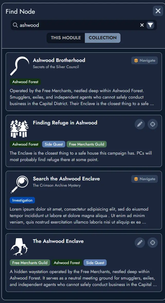
Cross-Module Search
Inside any Module that belongs to a collection, the search window includes a scope toggle. Switch to All modules in collection to search across every Module in the collection at once.
Results show the Node name, type, Tags, a content preview, and the source Module name. From any result, you can navigate directly to that Node in its source Module, or add it as a copy to your current Module.
This is particularly useful during campaign play, when you remember that an NPC or location was defined somewhere in the collection but cannot recall exactly which Module.
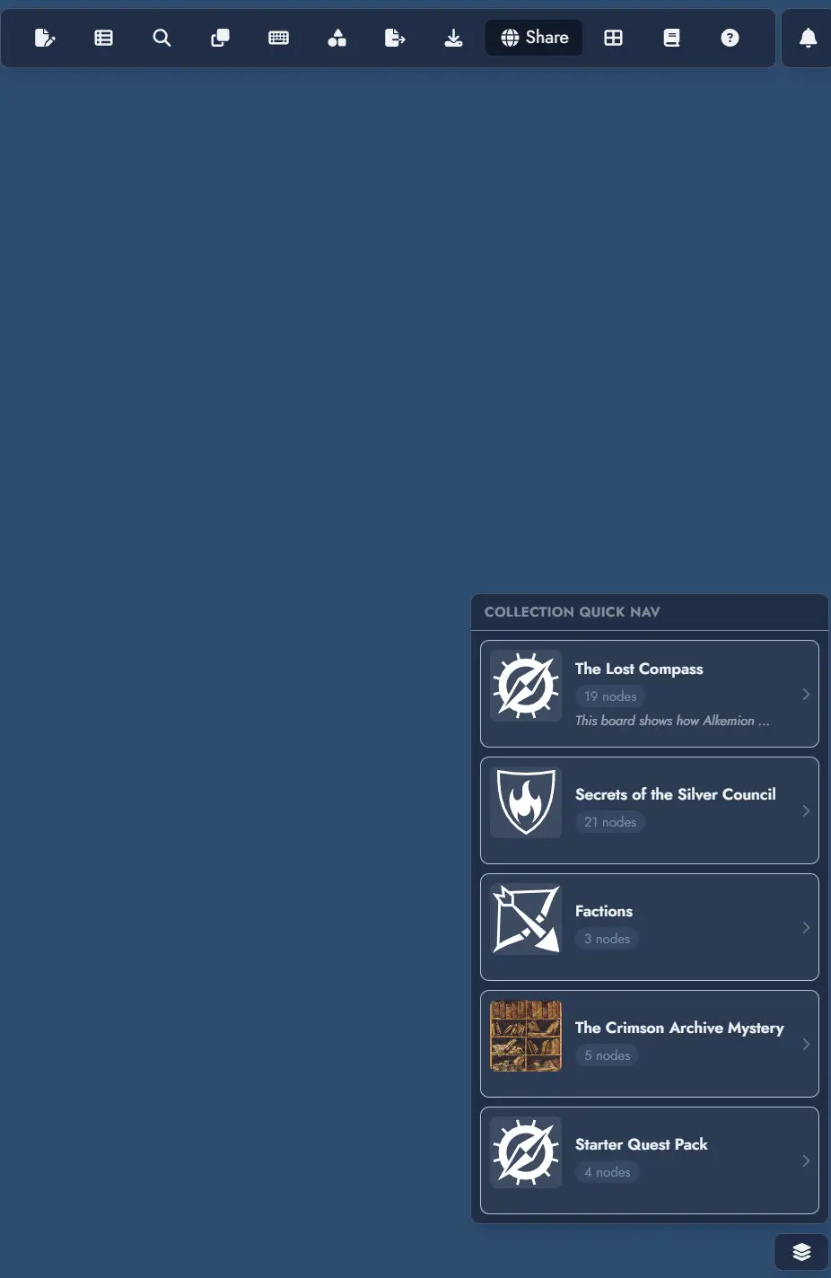
Quick Navigation
When inside a Module that belongs to a collection, a quick navigation button appears at the bottom right of the Board. It opens a menu listing all Modules in the collection. Selecting one takes you there immediately, without going back through the Lobby.
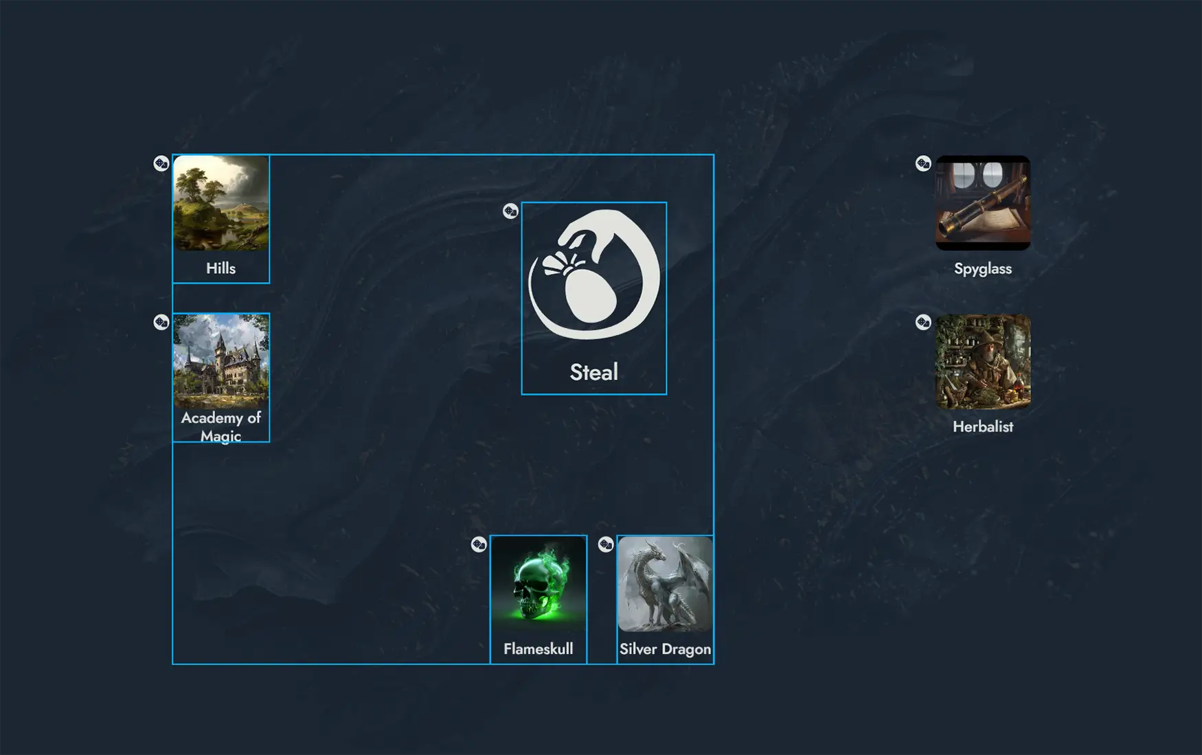
The Board
The Board serves as your main workspace in Alkemion Studio, where you visually map out and manage the components of your Module.
The Board lets you position different types of Assets (Nodes, Widgets and Anchors) using customizable Tokens to visually compose your Module.
Board's context menu
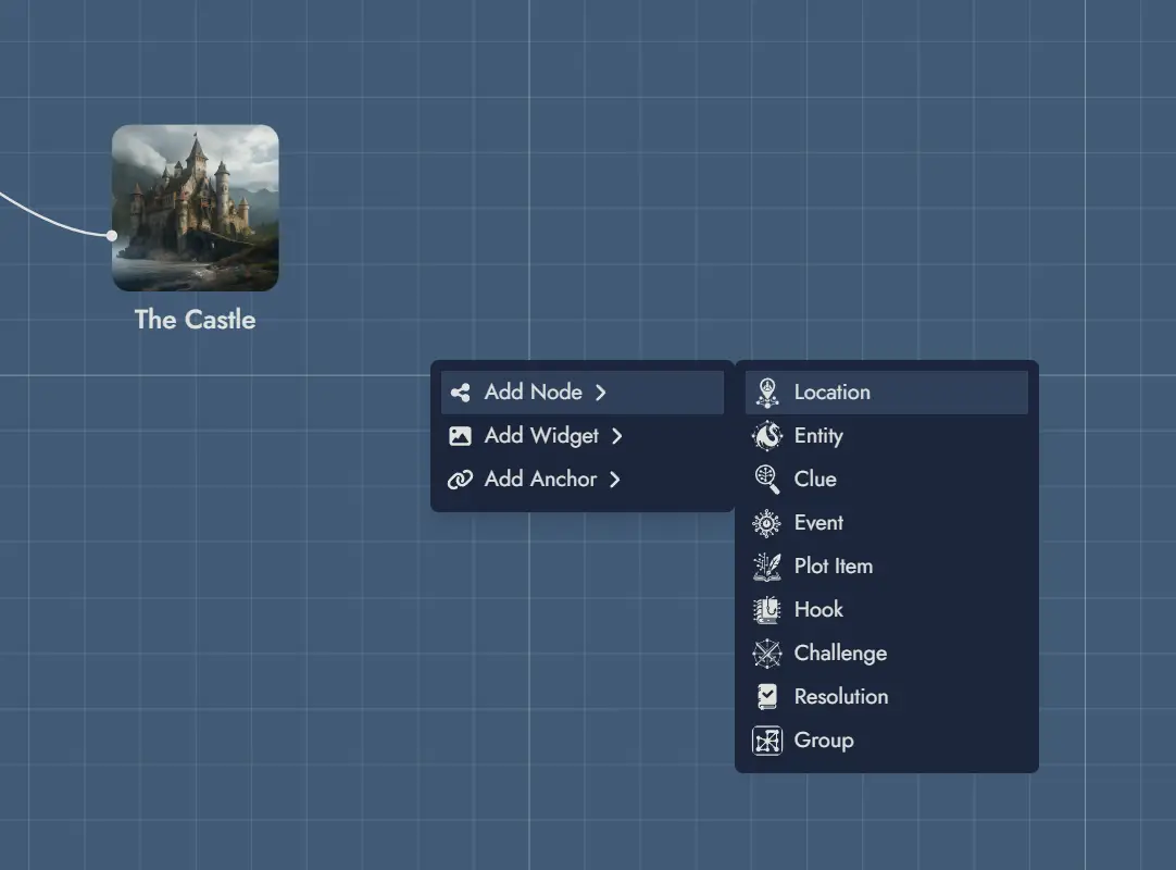
Clicking on the Board with the right mouse button will open a context menu. You can create new elements directly on the Board via this context menu.
When creating an Asset this way, a Token will be positioned directly where you invoked the menu (or, in the case of the mobile version, in the center of the screen).
Beyond asset creation, the context menu gives access to board-level settings (toggle grid, toggle snapping, toggle floating toolbars, set the board grid color, open the Board settings panel) and View actions: Save as View captures the current viewport as a new View, Show / Hide all Views toggles the visibility of all View Tokens on the Board, and Open View Manager opens the View management panel. When one or more Tokens are selected, Create View from selection is also available, creating a View bounded by the selected Tokens. When inside a Module Collection, an Open Module Panel option is available too. See the Views page for more details.
When the current Module is a Module Collection, the context menu also includes an Add to Collection action, which opens a Module picker to assign any eligible Module as a child of the collection.
As a shortcut, double-clicking on any empty Board space creates a new Node directly at that position. By default the Node uses the Generic type; you can configure a different default type in the Board Settings using the Preferred Node Type setting.
Press F2 to rename the focused item directly on the Board. This works for Node Tokens, Widget Groups, Text Widgets, and Link Token labels.
Adding Assets to the Board
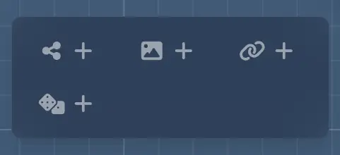
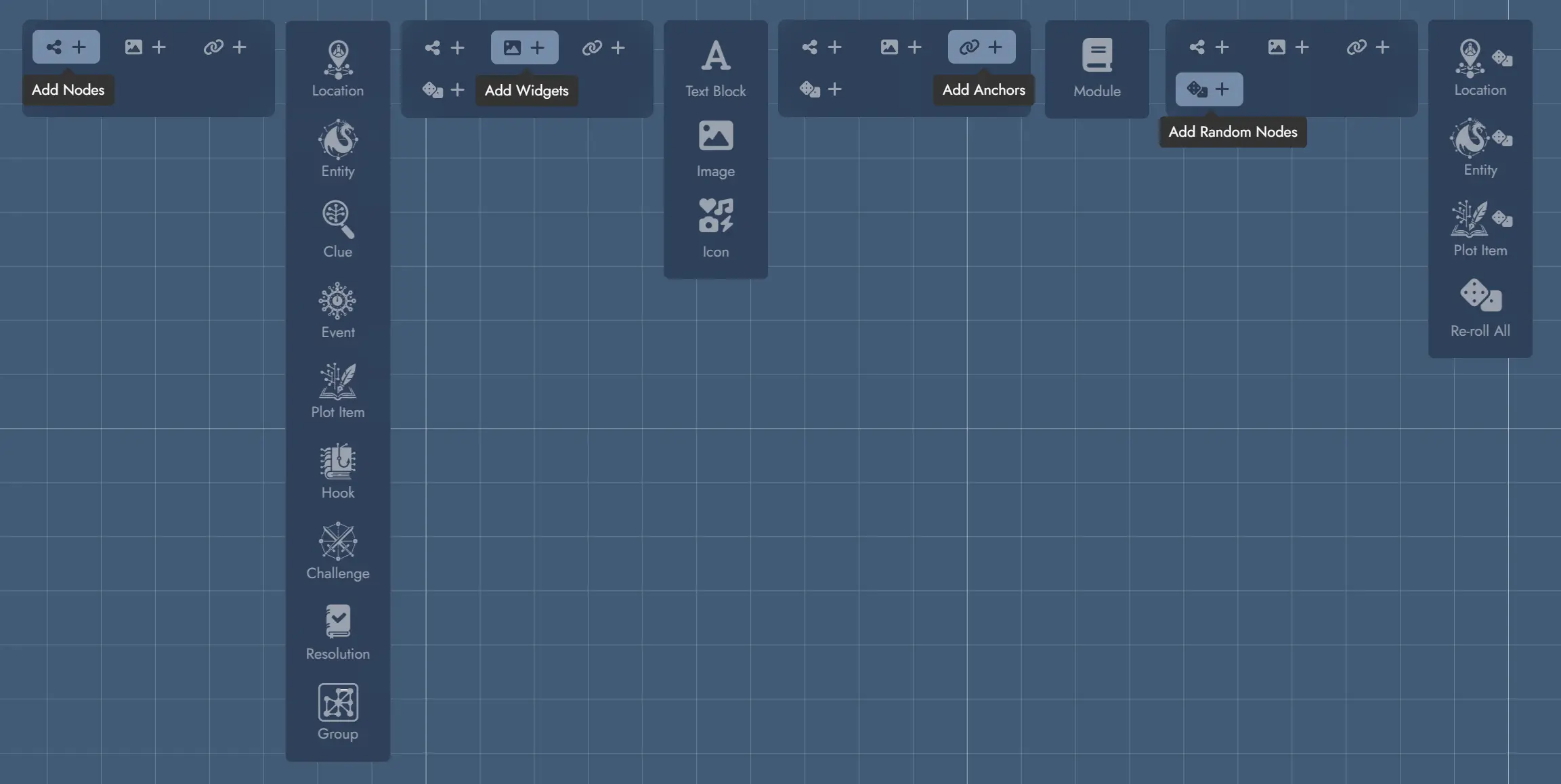
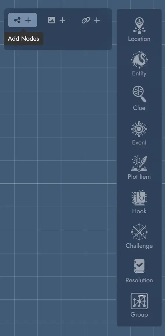
Each toolbar button on the left of the interface is a switch that displays or hides functions grouped by theme. Most of the functions accessible here are used to add components to the Board: Nodes, Widgets, Anchors and Random Nodes.
Each set of functions let you add the different types of Assets from each category.
The last set, Random Nodes, provide handy functions to spawn Nodes pre-configured with Random Tables. This is designed to get an efficient access to the most generic Random Tables. It also provides a special command allowing you to re-roll every Random Node in the Module.
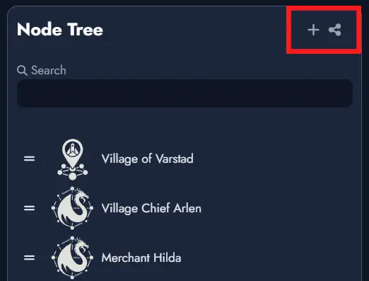
Asset Tree
The Asset Tree gives you quick access to all the components in your Module. It features three tabs for the three types of elements available: Nodes, Widgets and Anchors. A contextual menu shows the different actions possible for each type of Asset.
For Assets that may have several Tokens, the Asset Tree also lets you manipulate each one individually.
Hovering the pointer over an item in the Asset Tree will highlight its corresponding Token on the Board if it is in the currently visible part of your screen. Double-clicking on one of the elements will select its corresponding Token and position the camera over it. If the Asset has several Tokens on the Board, double-clicking several times will loop through them.
The “Nodes” tab lets you limit the display to a specific type of Node via a drop-down menu, as well as filtering by name via a text input field.
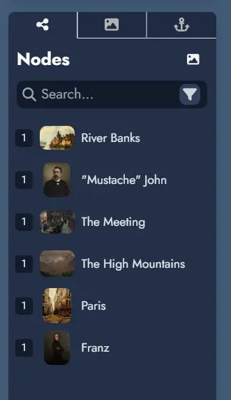
The number displayed to the left of each Node or Anchor indicates the number of Tokens it contains. Widgets do not display such a number because they can only contain one Token.
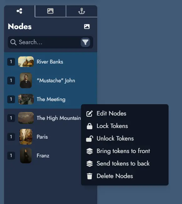
Right-clicking on an Asset in the tree will display a contextual menu with various actions (or a long press on touch devices). Most of these actions can also be applied to a selection of Assets. To select multiple Assets, hold down the Ctrl key while clicking.
Search
The Node Tree includes a search function. The text field allows you to search within the names of the Nodes in your module.
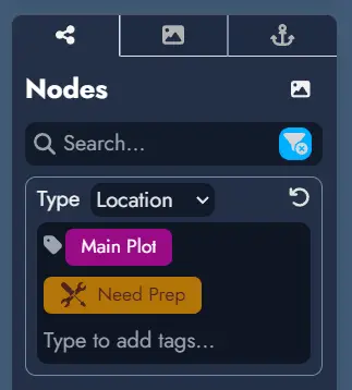
A filter button on the far right of the search field provides additional filtering options. You can filter Nodes by type or select specific Tags if they are available in the Module. The filter button turns blue to indicate when a filter is active.
Beyond the Node Tree, you can open a dedicated search window using the search button in the top toolbar or by pressing the Ctrl + Shift + F. keyboard shortcut.
This search window offers an interface similar to the Node Tree search, allowing for quick access to Nodes across your Module. Each result shows the Node name, type, Tags, a content preview, and the source Module name (results from the current Module do not show a source label).
When the current Module belongs to a Module Collection, the search window includes a scope toggle.
Switching to Collection searches across every Module in the collection at once. Results from sibling Modules display the source Module name alongside the Node name, type, Tags, and a content preview.
Depending on the scope, you can do various actions. For local Nodes, you can either center the Board on the Node or open it in the Editor. In Collection scope, you can navigate directly to any Node, which opens the source Module and scrolls to that Node.
Quick Navigation
When the current Module belongs to a Module Collection, a quick navigation button appears at the bottom right of the Board. Clicking it opens a menu listing all Modules in the collection. Selecting any Module from the list immediately navigates to it.
This provides a fast way to move between Modules in a collection without returning to the Lobby.
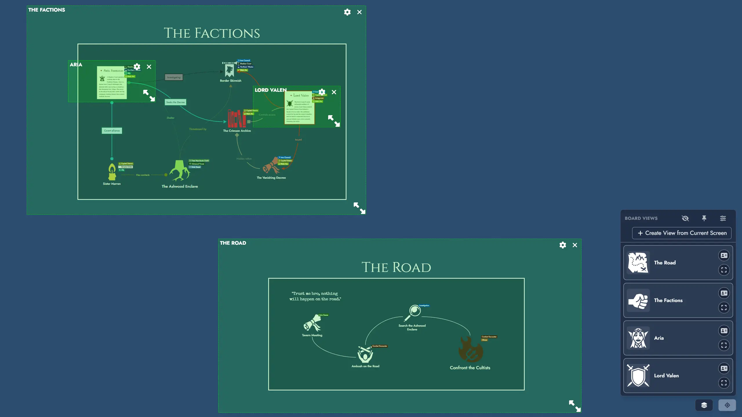
Views
A View Shortcut button in the bottom-right corner of the Board gives quick access to all saved Views for the current Module. Views are named navigation shortcuts that smoothly pan and zoom the Board to a specific region of the canvas.
You can also open the Module Panel at any time with the keyboard shortcut Ctrl + Shift + M.
See the Views page for the full documentation on creating and managing Views.
Undo/Redo
Most actions in Alkemion Studio can be undone (and redone). Use the "undo" and "redo" buttons in the interface or the keyboard shortcuts:
- Ctrl + Z to undo the last action
- Ctrl + Y (or Ctrl + Shift + Z) to redo the last action
Undo and redo are context-sensitive. You can only undo or redo actions within the same interface where the action occurred. For example, actions on the board can be undone while on the board but not while the Editor is open. Each context has its own undo/redo history.
The list of actions currently stored in the undo/redo stack is displayed in the Action History panel, right under the Node Tree.
NB: reloading the application will clear the undo/redo action stack.
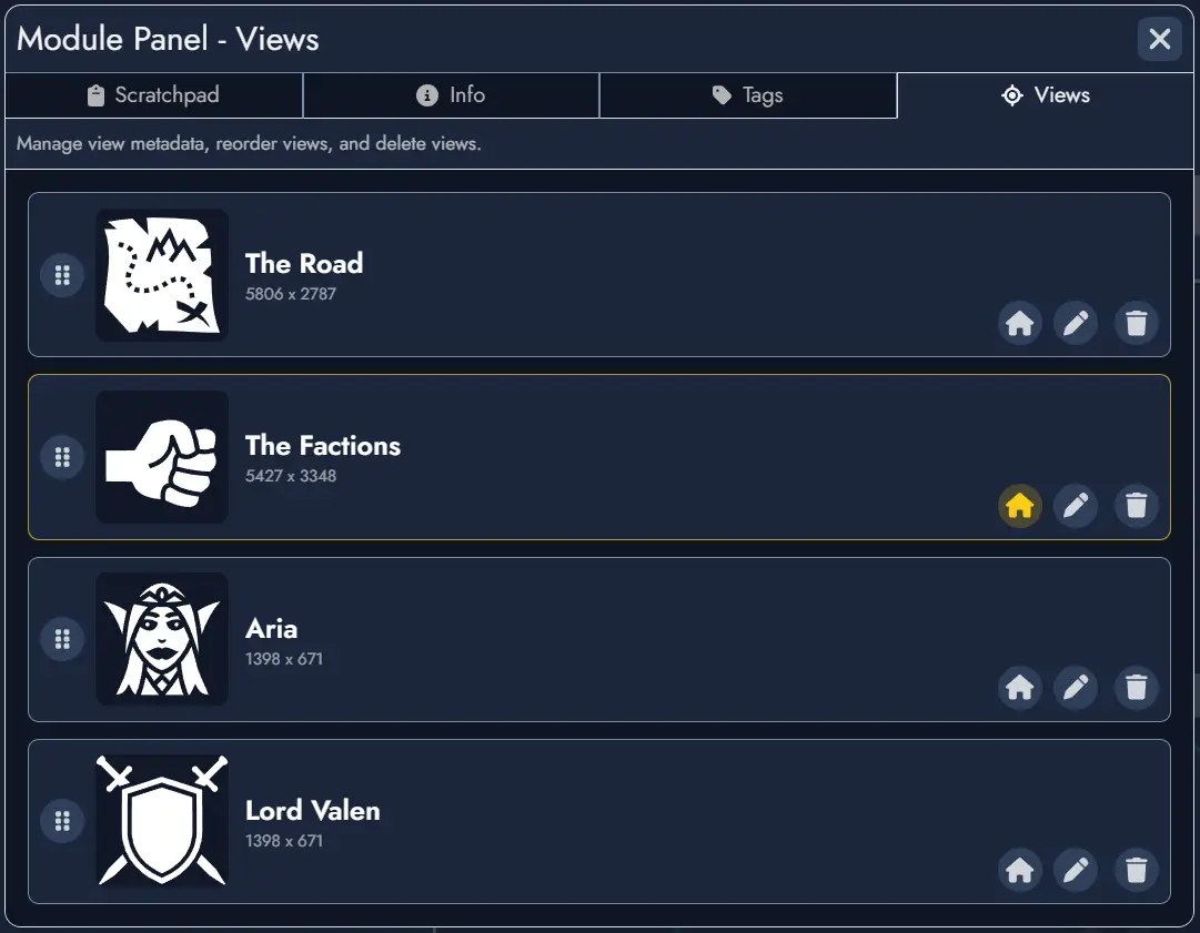
Views
Views let you save named navigation shortcuts to specific regions of the Board canvas. Activating a View smoothly pans and zooms the Board so that the defined area fills your screen, no matter what device you are on.
Views are purely a navigation tool. They do not group, filter, or affect the tokens inside them. Visual grouping remains the responsibility of Group Widgets and other layout assets.
Any View can also be used as the target of a Module Anchor. When activated, the Anchor navigates to the Module and immediately zooms to the targeted View. See the Anchors page for details.
Creating a View
From the current screen
Click the Create View button inside the View Shortcut Dropdown, use the Save as View option in the Board's context menu, or press the keyboard shortcut (Ctrl + Alt + V). A creation modal opens where you can:
- Enter a name for the View (required).
- Set a featured image, and choose a background, font, or icon color.
- Check Set as default opening view to make this View the one the Board navigates to each time the Module is opened.
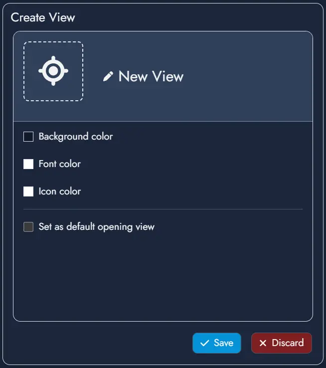
Confirming the modal creates a View using the current visible area of the Board as its boundary. The new View is added to the top of the Views list.
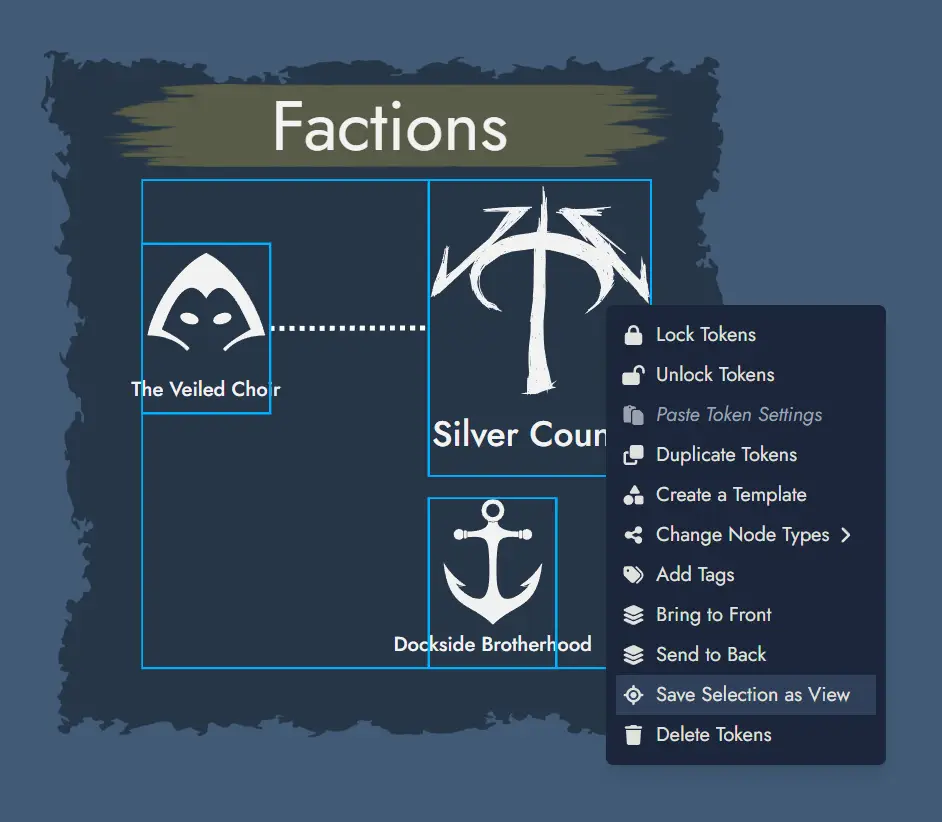
From a token selection
Select one or more Tokens on the Board, then open the context menu and choose Create View from selection. The same creation modal appears, including the Set as default opening view option. When confirmed, the View boundary is calculated from the bounding box of the selected Tokens, with a small automatic padding added around them.
When a single Token is selected, the modal pre-fills the View name and featured image from that Token's parent Asset.
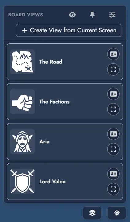
View Shortcut Dropdown
The View Shortcut button sits in the bottom-right corner of the Board. It is always visible, even if no Views have been created yet.
Clicking the button opens a dropdown listing all Views defined in the Module. Each entry displays its featured image, name, and custom color accents. Clicking a View entry smoothly pans and zooms the Board to bring that View's region fully into focus.
Each View card in the dropdown also features action buttons:
- Edit: opens the View edition modal, where you can update the View's name, featured image, colors, and default opening view setting.
- Show on Board / Hide from Board: toggles the visibility of that individual View Token directly from the list, without closing the dropdown.
A settings button at the top of the dropdown opens the View Manager.
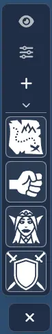
Pinned Mode
The View Shortcut Dropdown has an alternative pinned mode that keeps View shortcuts persistently visible on the Board without requiring the dropdown to remain open.
Activate pinned mode using the pin button inside the dropdown. In pinned mode, the shortcuts are rendered as a compact vertical panel anchored to the right edge of the Board, directly above the View Shortcut button. Each View appears as a small button showing only its featured image.
The pinned panel also includes a collapsible menu at the top containing three actions:
- Settings: opens the View Manager.
- Show / Hide Views on Board: toggles the visibility of all View Tokens on the Board at once.
- Create: opens the View creation modal.
Clicking a View button in the pinned panel navigates to that View. The panel stays visible after navigation. To exit pinned mode, click the close button that replaces the View Shortcut button while the panel is active.
View Manager
The View Manager is a panel for managing the full list of Views in a Module. You can open it from:
- The settings button at the top of the View Shortcut Dropdown.
- The Board Settings panel.
From the View Manager, you can rename any View, update its featured image and colors, reorder Views by drag and drop, and delete them. The order defined here determines the sequence in the View Shortcut Dropdown.
You can also designate a default Opening View: when set, opening the Module will navigate directly to that View instead of restoring the last saved camera position.
Edit Mode
A View has no visible presence on the Board during normal use. To reposition or resize the area a View covers, enter edit mode for that View by clicking the Edit button on its card in the dropdown, or using the Show on Board button. This reveals the View Token on the Board: a transparent green rectangle with a resize handle, the View name, and two buttons:
- Edit: opens the View edition modal to update the View's metadata (name, featured image, colors, default opening view).
- Close: hides the View Token without deleting the View.
You can freely move and resize the View Token to redefine its boundary. Changes are saved automatically.
A global Show all Views toggle lets you reveal all View Tokens simultaneously for spatial reference or bulk repositioning. It is available as an option in the Board's context menu or as a button in the View Shortcut Dropdown. The label updates to Hide all Views when at least one View Token is visible. Turning it off hides all View Tokens again.
Opening View
You can configure which View the Board navigates to when a Module is opened. By default, the Board restores the last saved camera position (Last Position).
The Opening View can be set in three places:
- The UI Preferences section of the Board Settings panel, via the Opening View dropdown.
- The View Manager, using the dedicated option on each View.
- The View edition modal, using the Set as default opening view checkbox, accessible from the creation modal or the Edit button on any View card.
Sharing and Templates
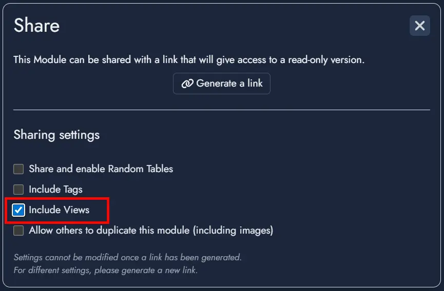
When sharing a Module via a read-only link, an optional toggle in the share settings controls whether Views are included. When included, viewers can use the View Shortcuts to navigate the shared Board. They cannot create, edit, reorder, or delete Views.
When exporting a Module as a Template, an optional toggle in the export dialog controls whether Views are packaged with the Template. When included, Views are restored when the Template is used to create a new Module.
Tokens
Tokens are visual representations of elements on the Board in Alkemion Studio. They serve as the graphical instances that you interact with during the creation and organization of your Modules. Each Token corresponds to an Asset on the Board: a Node, a Widget or an Anchor.
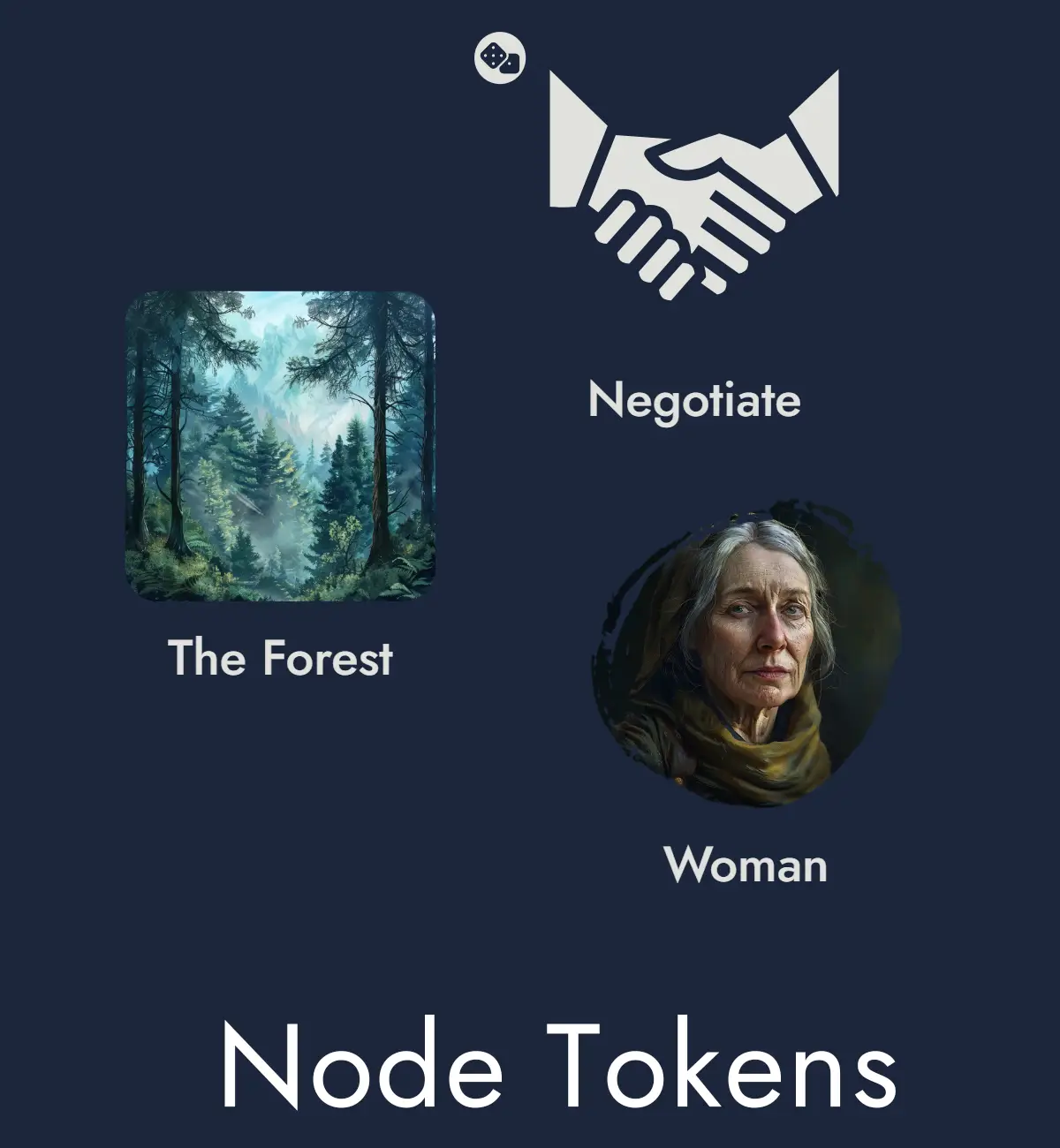
Node Tokens
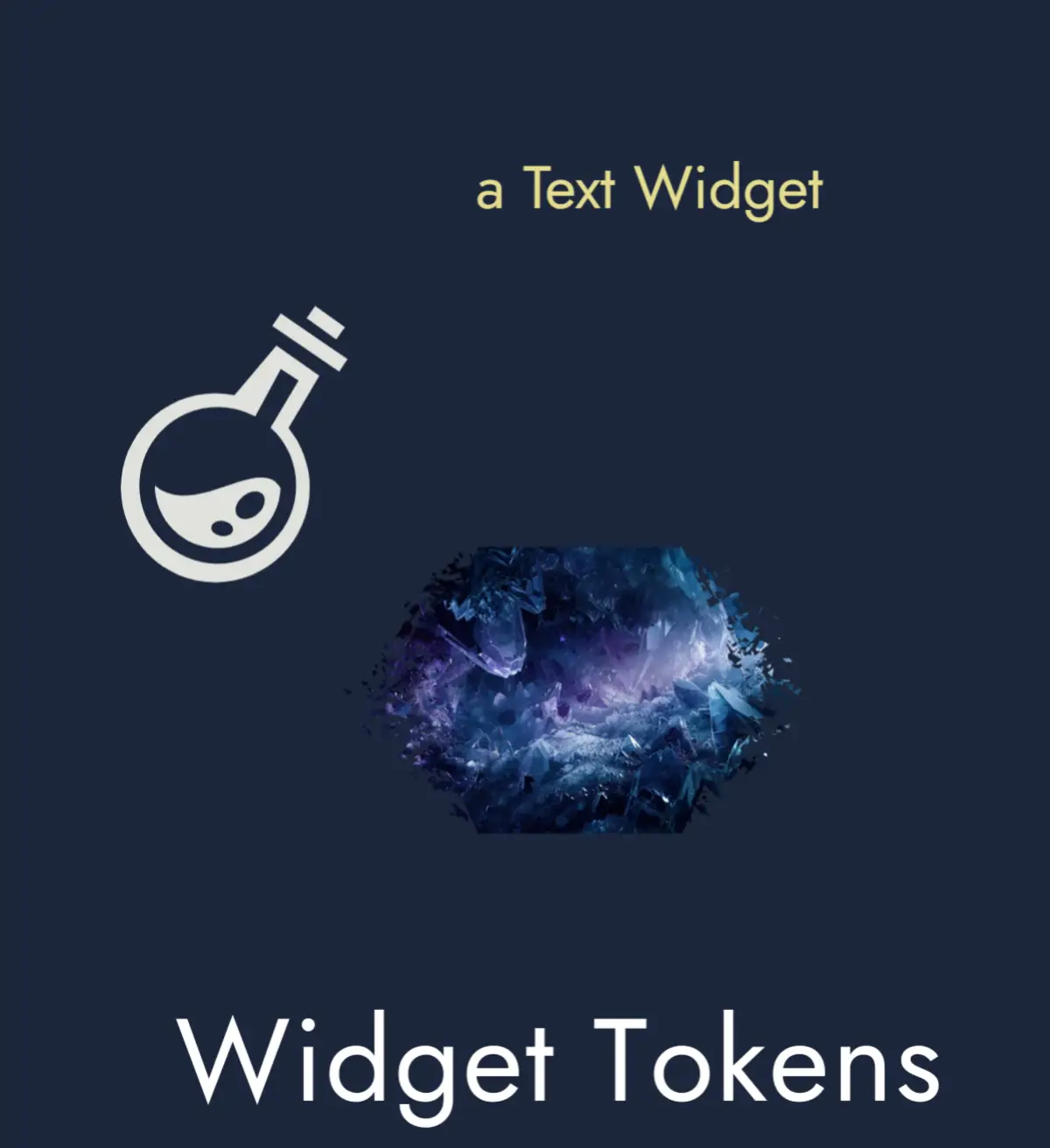
Widget Tokens
Anchor Tokens
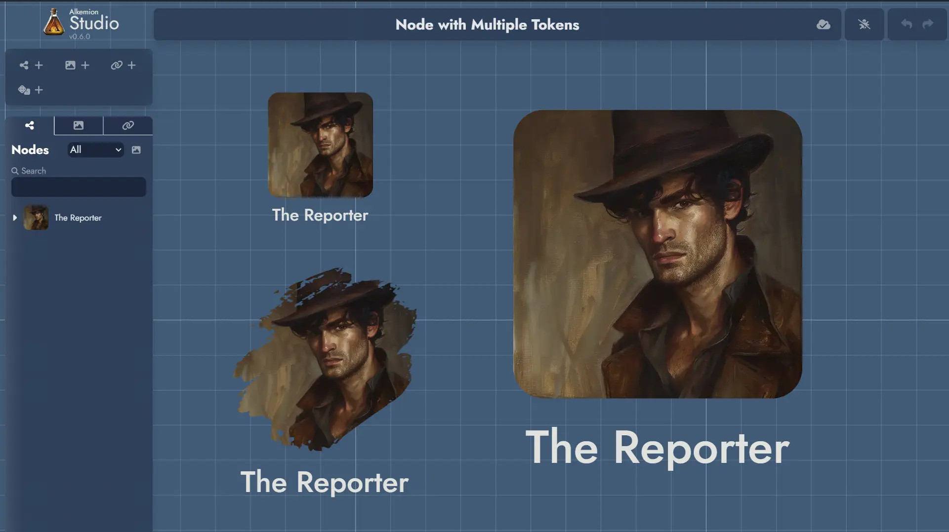
Multiple vs Unique Tokens
Nodes can have several Tokens on the Board to represent them. In addition, each Token belonging to the same Node share the same image, but can have its own visual customization settings.
An Anchor can be represented by several Tokens on the Board, and just like Node Tokens, each can have its own visual customization settings.
A Widget is different in nature from a Node in that it is merely a decorative or illustrative element within a Board. This nature makes the Widget a Token in itself, and it exists only through its unique representation on the Board.
Adding a Widget to a Module imposes its presence on the Board via its unique Token. And deleting a Widget's Token from a Board means deleting the Widget from the Module.
Floating Token Toolbars
Every Token on the Board has a floating toolbar that appears when the Token is selected. It gives you quick access to the most common actions and settings without opening the full Settings Panel.
Floating toolbars can be toggled on or off globally from the Board Settings panel or the Board context menu. When disabled, Tokens continue to behave normally; the toolbar simply does not appear on selection.
In reader mode (shared modules), Node Tokens display a minimal toolbar with View and Info buttons, giving viewers quick access to open the Node's content or details without full editing controls.
Token Selection
To select a Token, click (or tap) on it.
To select multiple Tokens, hold down the Ctrl key, or click on the board and create a selection area by dragging the mouse. The same can be achieved on touch devices by tapping and dragging.
Once Tokens are selected, several actions can be performed: they can be deleted by pressing the Del key or dragged across the Board.
Additional actions are available in the Contextual Menus.
Contextual Menus
Right-clicking on a Token will display a contextual menu with various actions (or a long press on touch devices). Some of these actions can also be applied to a selection of Tokens (see Token Selection).
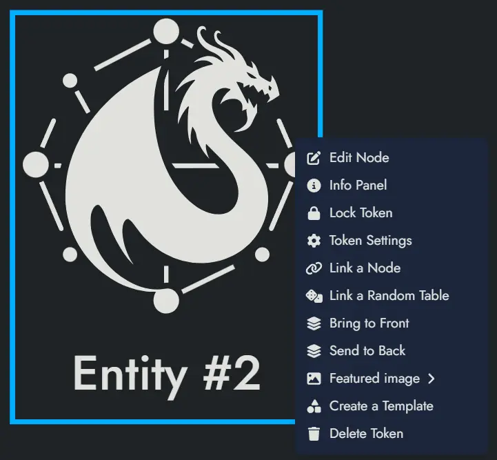
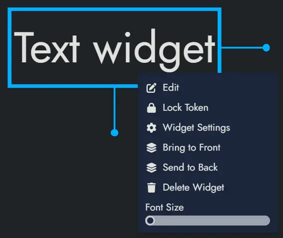
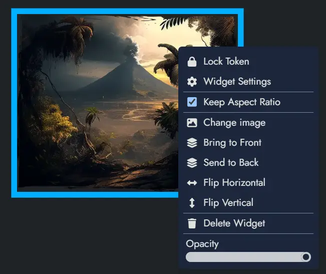
The details of the available actions are described below:
Lock Token and Unlock Token will respectively lock and unlock the Token. A locked Token cannot be moved or selected. A contextual menu with a limited set of actions can still be triggered on a locked Token.
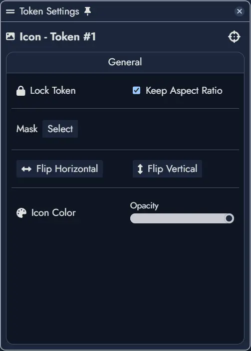
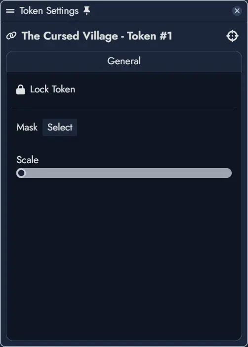
Token Settings will open the Settings Panel for the Token. The panel offers visual customization options and link configurations that vary by Asset type; Node Tokens and Widget Tokens each provide different settings.
Duplicate Token will create a new Token with the exact same settings and position it right next to the original.
Bring to Front and Send to Back will change the display layer of the Token so that it appears on top of or below any overlapping Tokens. Also, both these actions can be done with PageUp and PageDown key shortcuts on a selection of Tokens.
Create a Template will open the Create Template dialog and let you create a new Template containing the Token (along with its parent Node), and any other selected Assets.
The following options are only available for Node Tokens:
Edit Node will open the Token's parent Node in the Editor.
Info Panel will open the parent Node's Information Panel in a floating window (or a modal window on small screens). This panel contains the essential information about the Node.
Link a Node and Unlink a Node will allow you to link the Token's parent Node to another Node or to remove one of the current links. The first action will open a Node selection modal, whereas the second will directly list the current links in a sub-menu.
Link a Random Table, Change Random Table and Unlink the Random Table: The first option will allow you to link the Node to a Random Table. A modal window will let you select one of the available Random Tables. The second option will let you change the linked Random Table with the same modal window. The third option will unlink the currently linked Random Table.
Featured Image will open the Image Browser and let you pick a new Featured Image for the Token's parent Node.
Delete Token will delete the Token, but it won't delete the parent Node.
The following options are only available for Widget Tokens:
Delete Widget will delete the Widget and its unique Token.
The following options are only available for Anchor Tokens:
Travel to Module will transport the Board to the Module set in the Anchor.
Delete Token will delete the Token, but it won't delete the parent Anchor.
Duplicating Tokens
To duplicate one or more Tokens, first select the Tokens you wish to duplicate (see Token Selection for more details about this).
Once selected, you can duplicate the Tokens in two ways:
- Right-click to open the contextual menu and choose the 'Duplicate Tokens' option.
- Use the keyboard shortcut Ctrl + D.
The duplicated Tokens will appear adjacent to the original ones and will retain all the same settings and properties as the originals.
Customizing Tokens
The Token Settings Window, accessible via a Token's contextual menu, provides various customization options specific to the selected Token.
If a Node contains multiple Tokens, the settings will apply only to the currently selected one. Available customization options in this window depend on the Asset type.
Below are the options available to a Node Token:
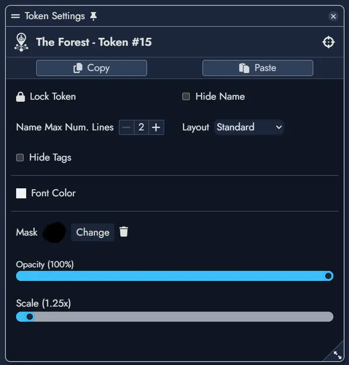
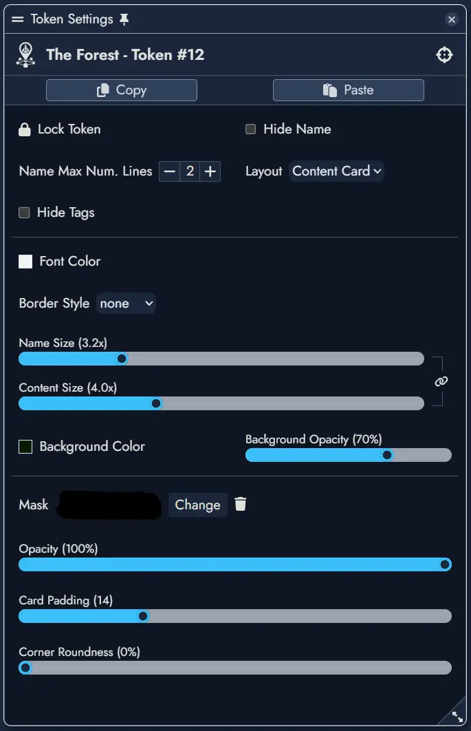
Left window is for a standard layout, right is for a content card layout.
Below are the options available to a Widget Token:
Below are the options available to an Anchor Token:
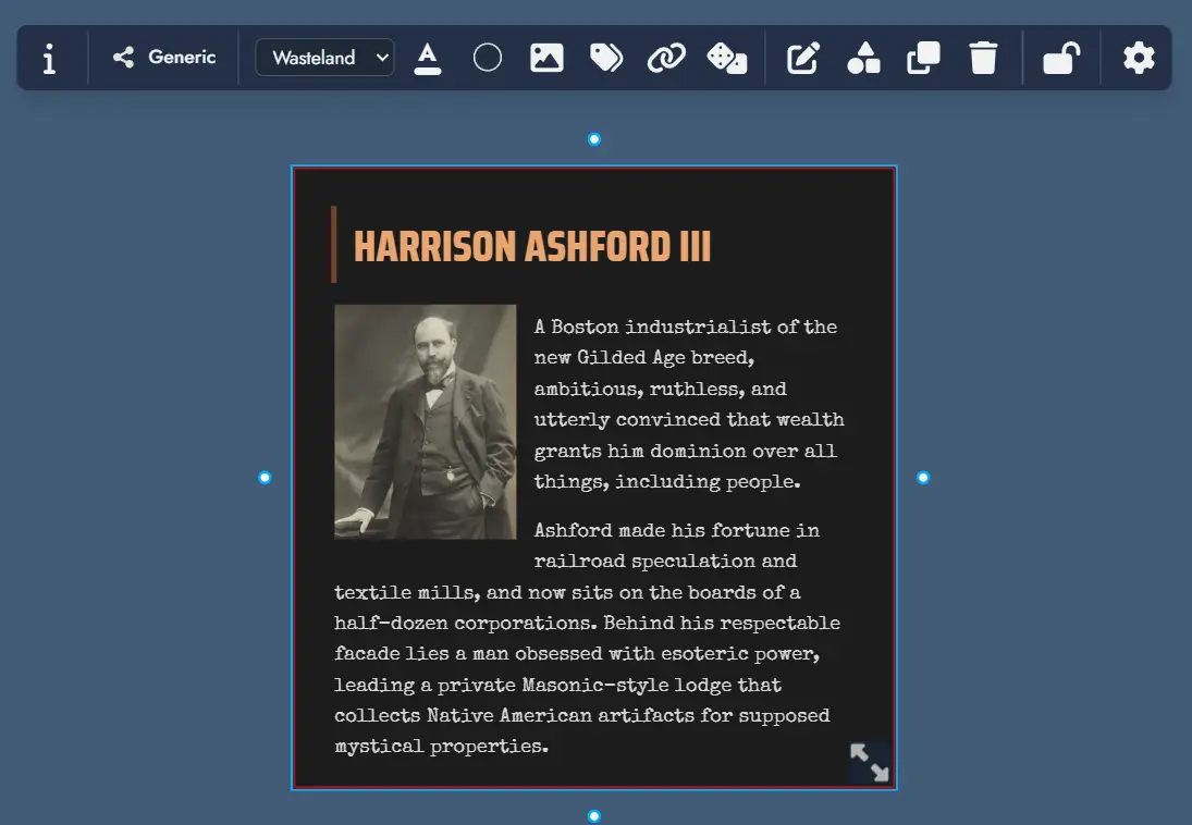
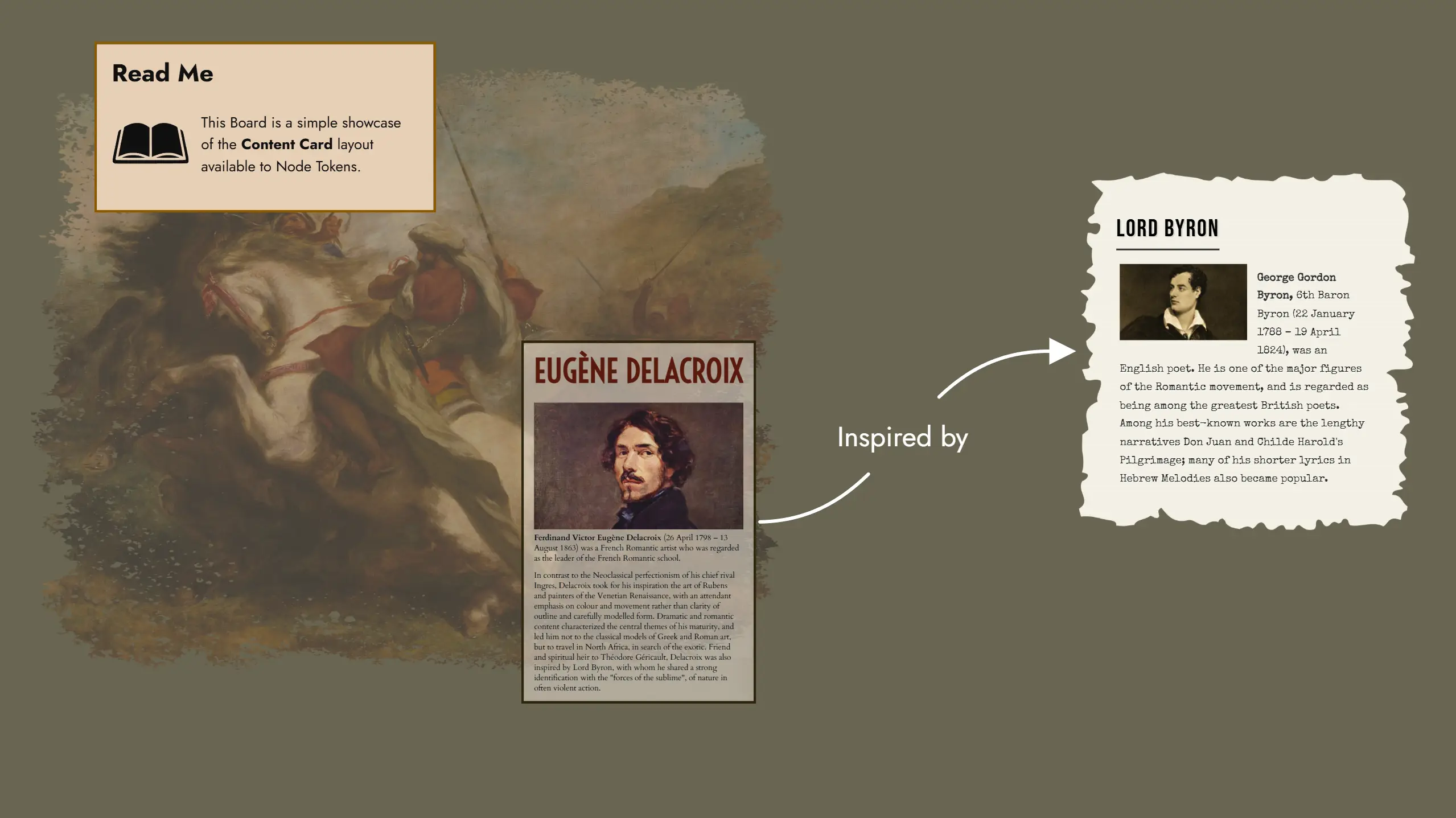
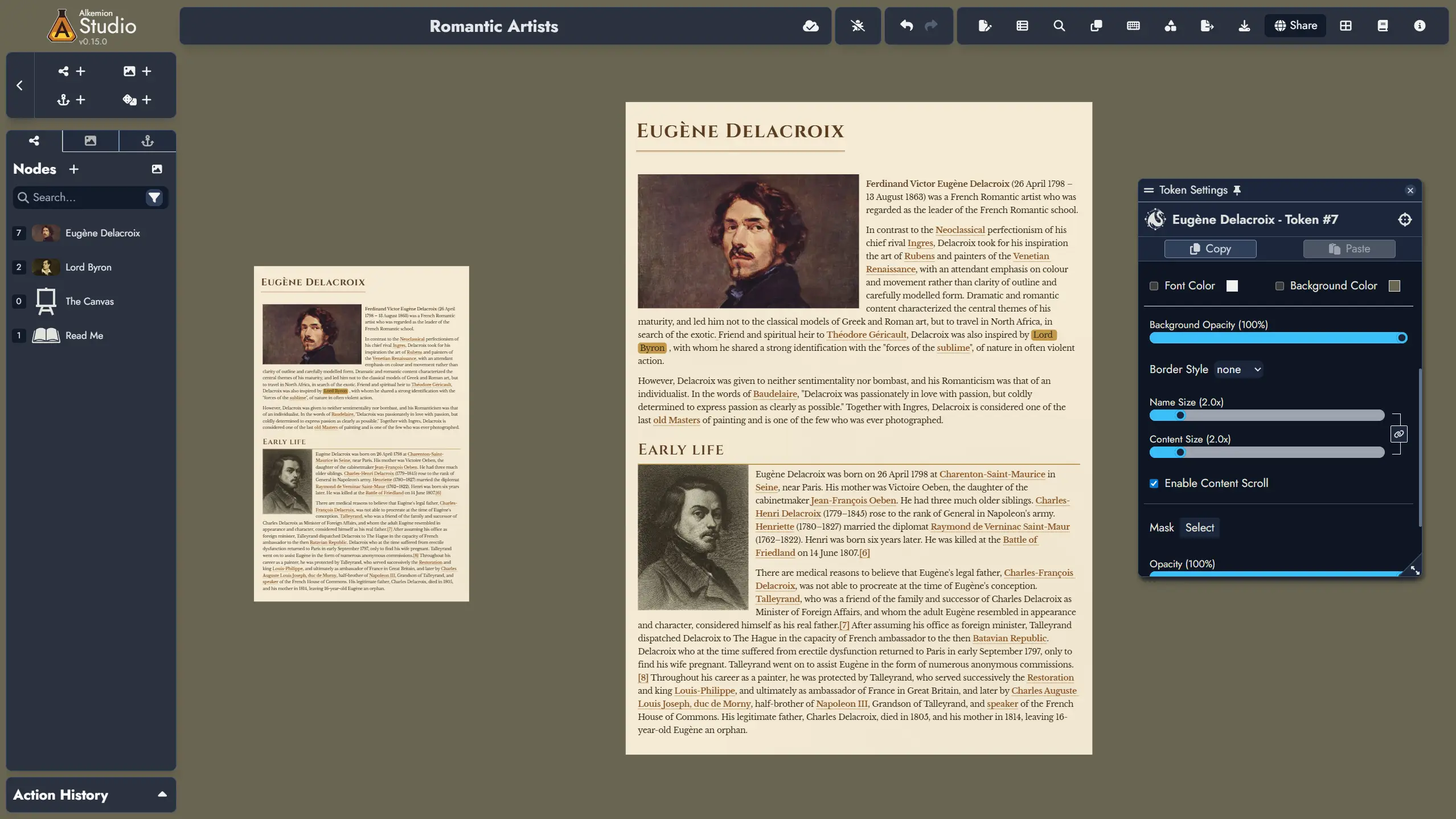
Content Card Layout
The Content Card layout is a specialized Token layout that displays not only the Node's name but also its rich text content directly on the Board. Unlike the Standard layout which only shows the name and featured image, Content Card tokens render the actual content of the Node, making it visible without needing to open the Editor.
This layout is particularly useful for displaying narrative text, descriptions, or any content you want readily visible while navigating your Module on the Board.
Theme Selection
Content Card tokens display their content using a Theme, similar to how content appears in the Editor. You can select any available theme for each Content Card token independently of the theme used in the Page Editor. This allows you to visually differentiate different types of content or simply match the aesthetic of your Board.
Responsive Scaling
The content displayed in a Content Card token scales according to two dedicated slider settings: Name Size and Content Size. These settings allow you to independently control the size of the Node's name and its content text, or you can adjust them in sync to maintain consistent proportions. This flexibility ensures optimal readability while allowing you to create visual hierarchy within your cards on the Board.
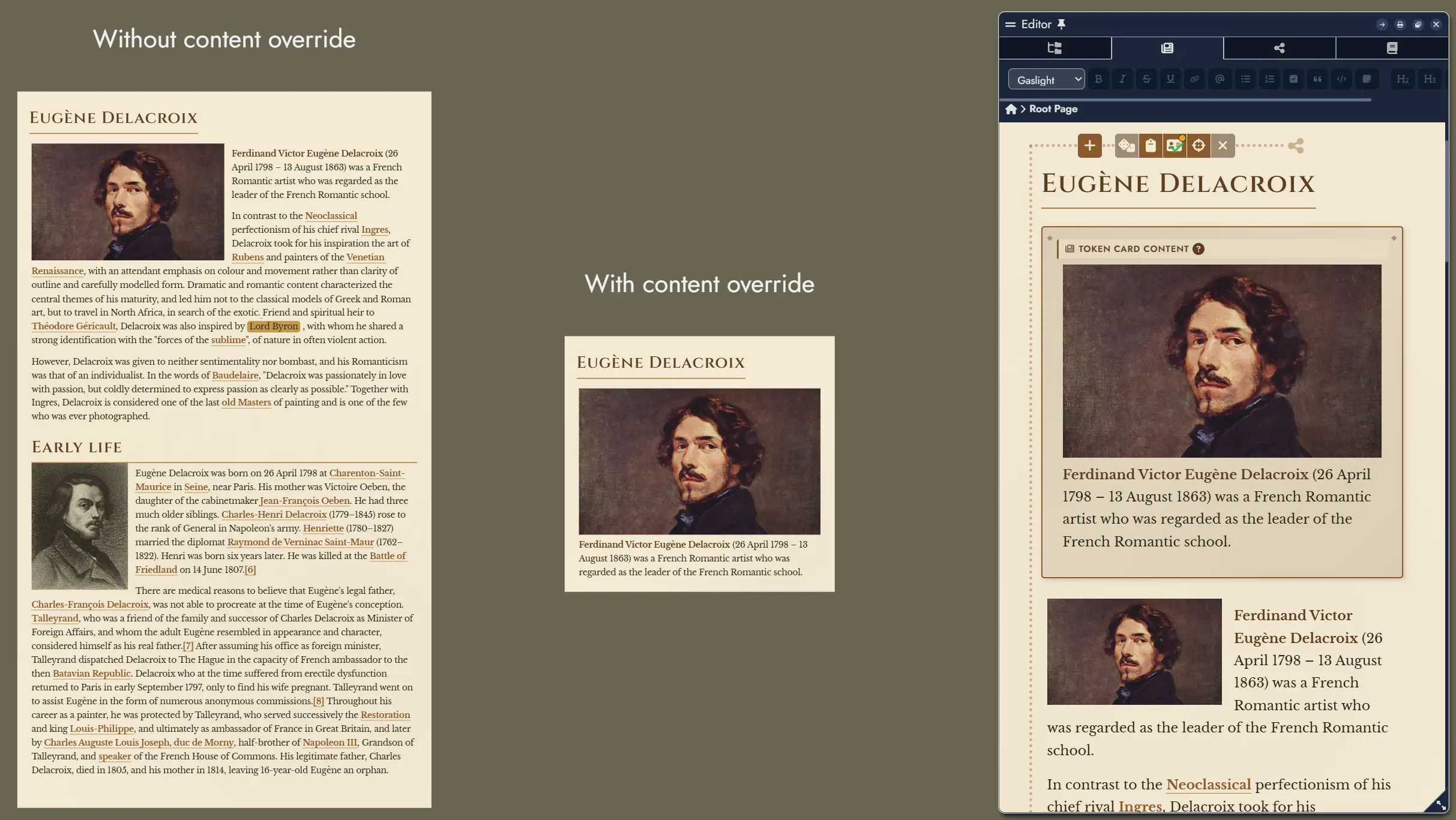
Content Override
By default, a Content Card token displays the full content of its parent Node. However, you have two levels of content override available:
- In the Editor, you can specify alternative content for any Node that will be displayed in all Content Card tokens of that Node, overriding the original content. You can hide and display this alternative content in the Editor using the button in the Node's toolbar.
- In the Token Settings, you can use the "Don't override token content" checkbox to force an individual token to display the original Node content, ignoring any Editor-level override.
Customization Options
The Token Settings Window for Content Card layout provides extensive customization options:
Header Settings:
- Hide Name: Toggle the visibility of the Node's name at the top of the card.
- Emphasized Header: When enabled, the name uses h1 styling instead of h2 for greater prominence.
- Name Alignment: Position the Node's name horizontally (left, center, or right).
- Name Size: Adjust the size of the name text using a slider.
Content Display:
- Content Size: Adjust the size of the content text using a slider.
- Enable Content Scroll: When checked, a vertical scrollbar appears when content overflows the card boundaries, allowing you to see all content within a fixed token size.
Theme Override:
- Font Color: Override the theme's default font color with a custom color of your choice.
- Background Color: Override the theme's default background color with a custom color.
- Background Opacity: Control the transparency of the background, from 0% (fully transparent) to 100% (fully opaque).
Card Appearance:
- Border Style: Choose from various border styles (none, solid, dashed, dotted) to frame your card.
- Card Padding: Adjust the inner spacing between the card's border and its content.
- Corner Roundness: Control the border-radius to create rounded corners on the card.
Tags Display:
- Hide Tags: Toggle the visibility of any Tags assigned to the Node.
- Tag Scale: Adjust the size of tag overlays displayed on the token.
The Editor
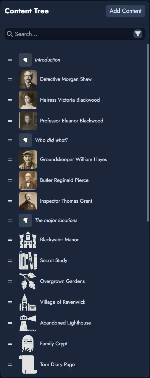
The Editor facilitates the organization and detailed editing of your Module's content. It consists of three main components: the Editable Page, the Content Tree, and the Details Panel. Use this interface to arrange Nodes, edit their rich-text content, and prepare your Module for in-game access, printing, or sharing.
The Editor can be opened in full screen or as a resizable window within the Board, letting you write while navigating your visual structure.
Editable Page
The Editable Page displays the contents of the currently selected Page from the Content Tree. You can switch between multiple Pages within your Module. Each Page is an independent document-like space where you can arrange content blocks.
A Page can include an ordered mix of Node Blocks (content tied to a Node) and Text Blocks (standalone content not linked to any Node). Within this area, you can edit Node content using rich-text tools, add or format standalone text, insert images, and build your Page's layout block by block.
At the end of each Page, a placeholder Text Block is automatically shown to let you begin typing without needing to manually add a block. This placeholder is only converted into a real Text Block when you start entering content. If the last block on the Page is already a Text Block, no placeholder is added.
A dotted line indicates the selected Content Block. When a Node is selected, additional functions appear, such as rolling the linked random table , toggling notes , or inserting new blocks .
When the Editor is in windowed mode, a “Center on Board” button is available; clicking it will center the Board on the selected Node’s token. If the Node has multiple tokens, repeated clicks will cycle through them.
Each Content Block can be shown or hidden in the page using the context menu available on each block in the Content Tree.

The toolbar includes the following functions:
The button lets you switch between multiple visual themes, with support for custom themes planned in a future update.
toggles reader mode, hiding overlay buttons.
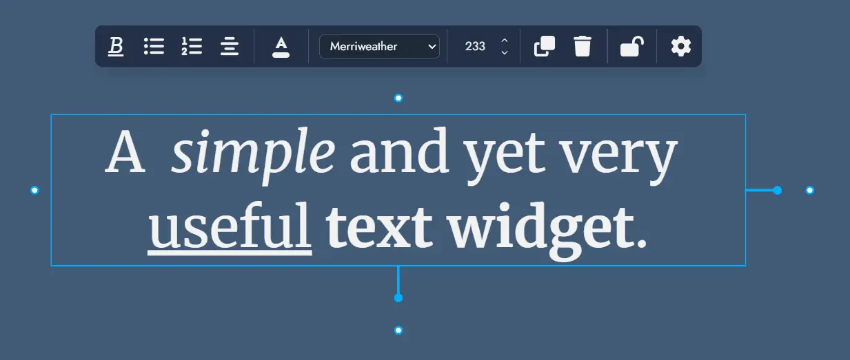
Standard formatting tools include bold , italic , strikethrough , underline , bullet and numbered lists , and headers .
inserts a secure link (https only).
inserts a Mention to another Node. See the Mentions section.
applies a sticky-note style to a paragraph.
inserts an image from your Library.
inserts the Node's featured image.
Selecting an image by clicking on it displays a toolbar dedicated to that image.
The and buttons can be used to change the size of the image, while the alignment buttons lets you position the image on the left, right or center of the content.
Finally, the magnifying glass button lets you zoom in on the image, while the trash button lets you delete the image from the content.
Mentions
Mentions create inline references to other Nodes, providing a soft-link for narrative or organizational purposes.
Inline Mention: While typing in the Editor, press the "@" key to trigger the Mention feature. This action opens a floating search window, allowing for immediate searching of Nodes by name. Navigate the search results using the arrow keys and select the desired Node to insert a Mention. After selection, you can continue typing without interruption.
Toolbar Mention Button: To use this feature, first position your text cursor where you wish to insert a Mention or select existing text to be linked. Clicking the button on the toolbar will open a selection window. Here, you can choose the appropriate Node to link to the selected text. If the caret is positioned within a word, the entire word will be automatically selected and linked as a Mention.
Clicking on a Mention in the Editor will select the referenced Node in the Node Details Panel. If you press the Ctrl key while clicking, the Editor will also scroll to bring the referenced Node into view, assuming it is included in the current active Page. This provides seamless navigation when referencing related material.
Content Tree
The Content Tree lets you manage multiple Pages inside your Module. Pages act like documents or folders, similar to file browsers in tools like Obsidian or Notion.
Pages can contain a combination of Node Blocks and Text Blocks, organized into a nested folder structure if desired. You can rearrange Pages or Blocks using drag-and-drop, and use right-click (or long press on mobile) for contextual actions like renaming, deleting, or inserting new content.
Selecting a Node Content Block will display its details in the Node Details Panel.
You can move content blocks between Pages or folders, and freely reorganize your Module's structure. You can also move or copy selected page content to another page directly from the Content Tree context menu. A Node can be included in multiple Pages (but only once per Page).
The “Search” input field will let you search throughout the Module content. A settings button on the far right of the search field provides additional search and filtering options.
The and buttons at the top right of the Content Tree let you add a new folder or Page. The new item will be created inside the currently selected folder or Page in the structure, or at the end of the tree if nothing is selected.
Right-clicking on a Content Block in the tree will display a contextual menu with various actions (or a long press on touch devices). Some of these actions can also be applied to a selection of Content Blocks. To select multiple Content Blocks, hold down the Ctrl key while clicking.
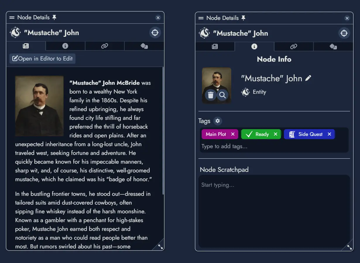
Node Details Panel
Provides meta-information and available actions for the currently selected Node. These are divided into three tabs:
Information Tab : features general information about the Node such as its title, type and its Featured Image. It will also display two input fields dedicated to notes:
- The Tags section contains a Tag Box you can use to manage the Tags associated with this Node. You can find more information about managing a Node's Tags in the dedicated page.
- The “Node Scratchpad” lets you store any kind of notes you want to associate with this Node.
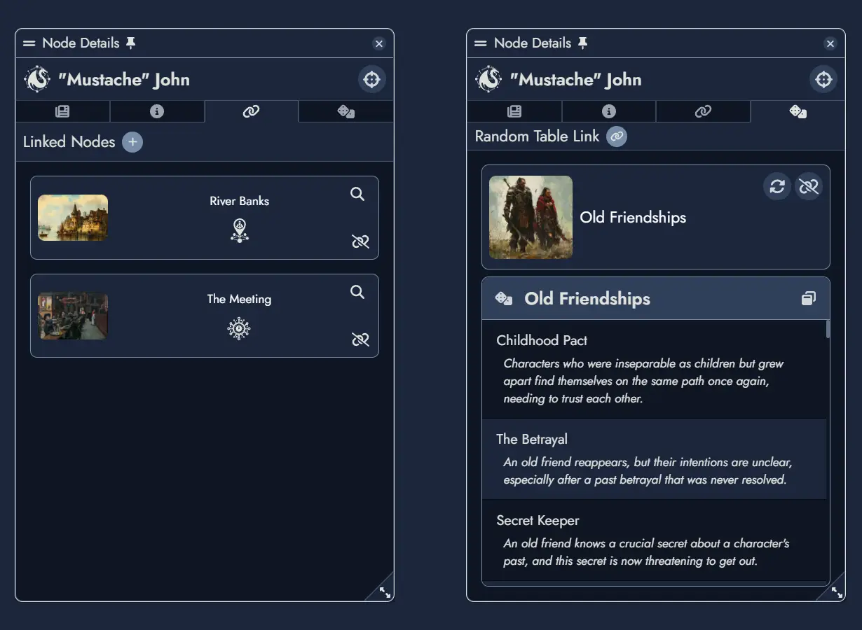
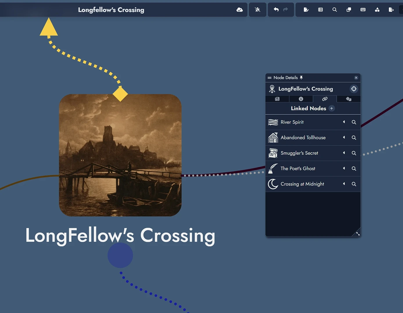
Linked Nodes Tab : features the list of Nodes connected to the one selected in the Node Details Panel. From this tab you can remove any of the connections, or you can add new ones. Any of the listed Node can also be selected.
Random Tab : this is where you can link the selected Node to a Random Table. When the selected Node is linked to a Random Table, it will be featured here, and you will be able to remove the link or change it for another Random Table. In this tab you also have the possibility to roll the linked Random Table.
Print/PDF Preview
The Print/PDF Preview feature allows you to review how your Module will appear when printed or exported as a PDF. It opens a modal with two panels: the left panel displays the Editor with your Nodes, and the right panel shows the page layout with page breaks.
The right preview panel can be zoomed in or out to adjust the display for your convenience.
- Preview Panel: When activated, this panel shows a visual representation of your Module’s content divided into pages. The display updates automatically as you modify the content.
- Page Breaks: You can manually insert page breaks using the dedicated button Page Break in the toolbar or adjust page breaks by dragging them in the left Editor panel.
- Content Control: Only Nodes visible in the Editable Page will be included in the preview. You can toggle Node visibility using the Content Tree in the Editor.
- Export Options: Once satisfied with the layout, use the print button to open your browser’s print settings and either print the module or save it as a PDF.
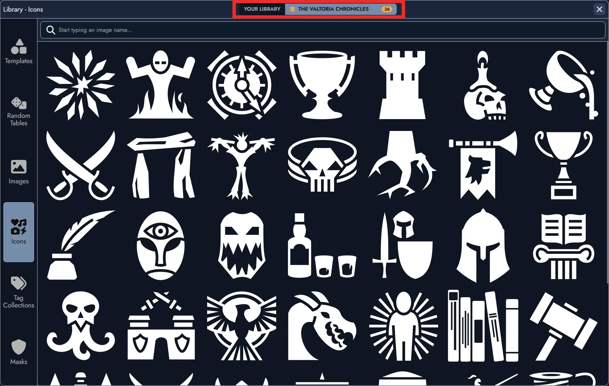
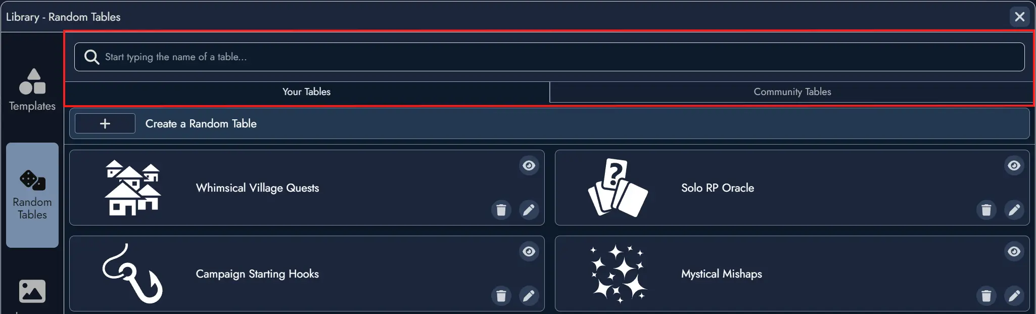
The Library
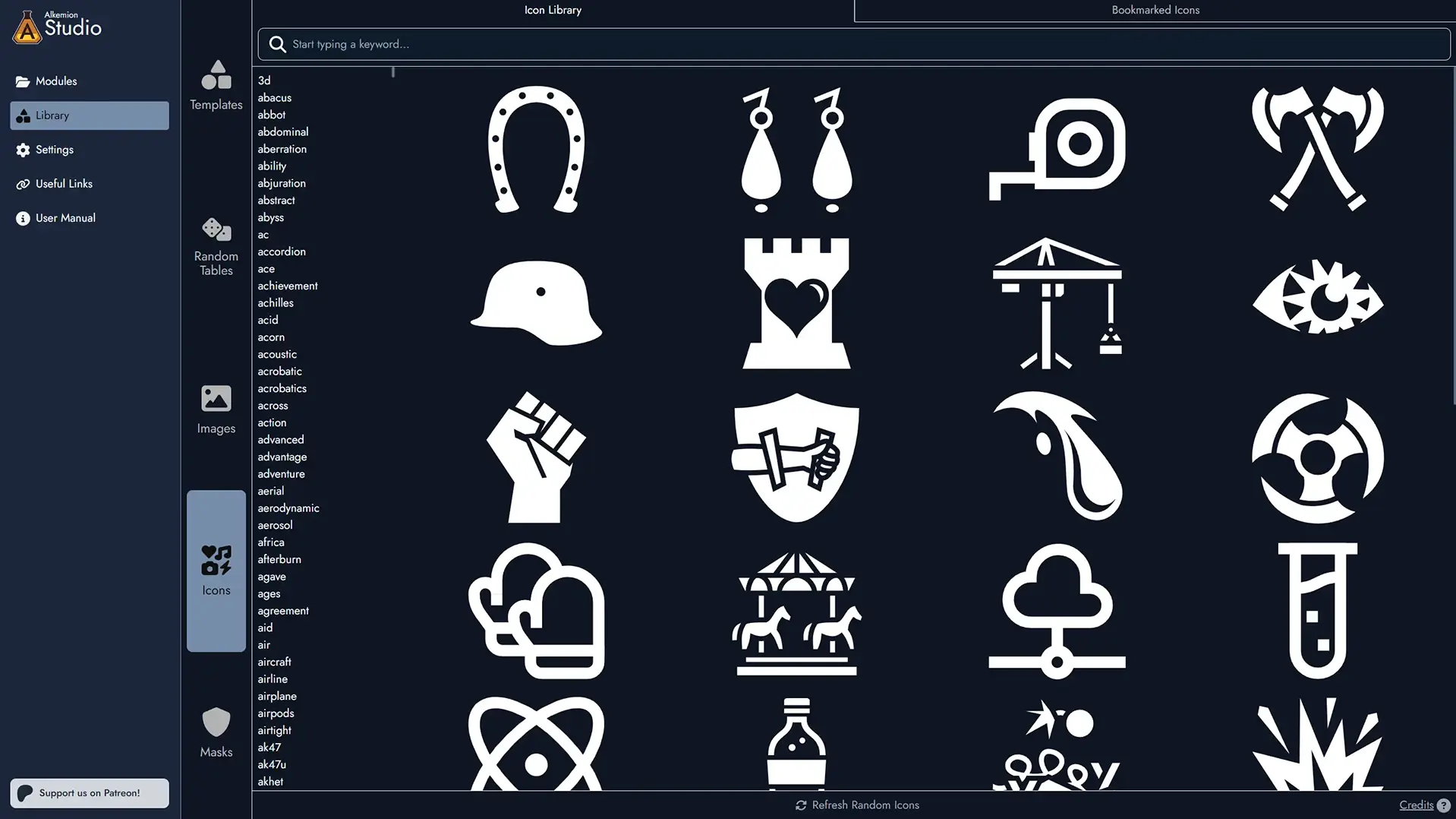
The Library gathers the assets available to all your Modules into a single window. This includes all visuals (images, icons, and masks), templates, and random tables. The Library is accessible from the Lobby via its dedicated tab, and from inside any open Module by clicking the dedicated button in the upper toolbar or by pressing the "L" key.
The Library contains both your own assets and the ones provided by Alkemion as resources and examples. Later on, you will be able to access assets shared by the community.
In addition to allowing you to find specific elements to add to your board, the Library can also serve as a great source of inspiration. Simply browsing through the visuals or rolling a couple of random tables could spark a new idea or get you started on a project.
Content Types
The Library is organized by content types. You can access the different sections via a series of tabs:
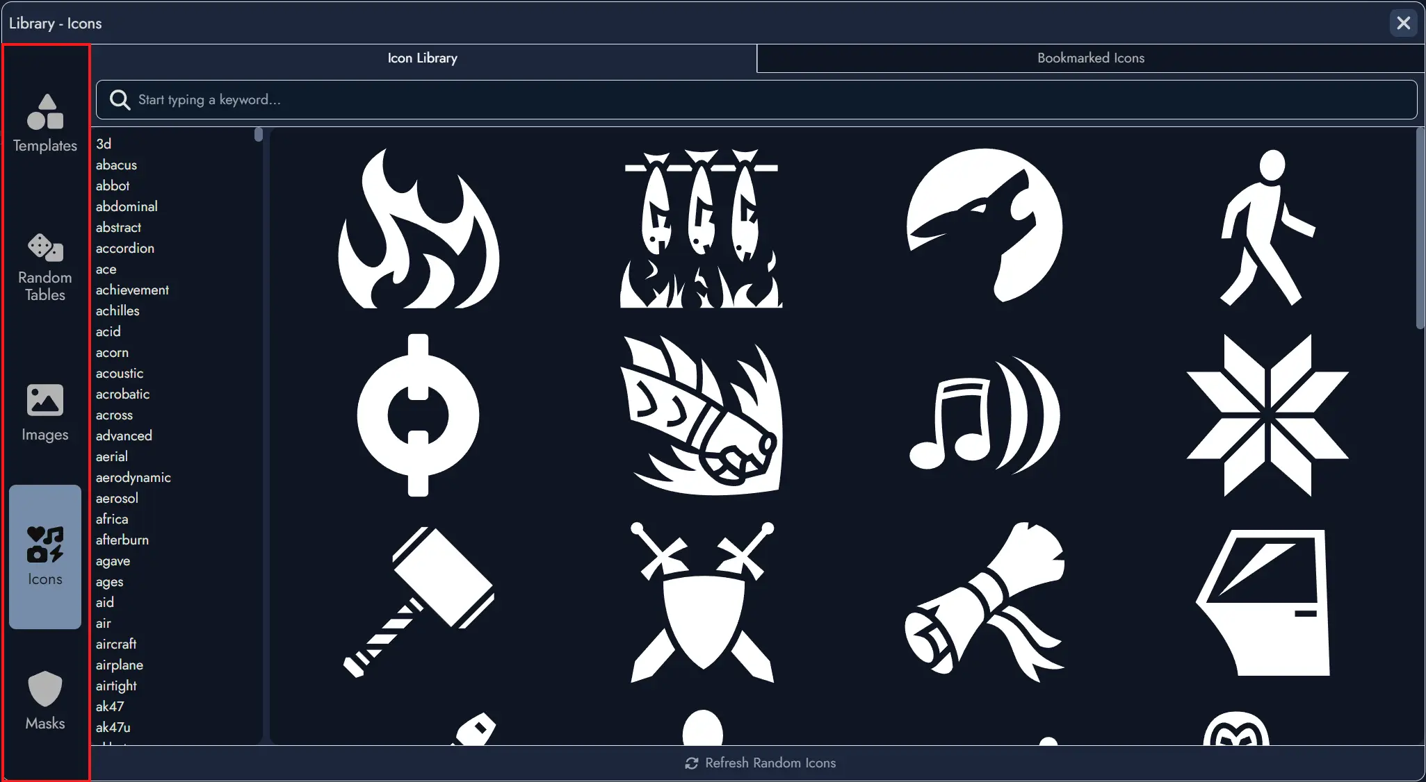
Search Filters
Most categories feature a search field to help filter content, which is further divided between your own assets and those shared by the community.
Additionally, the Image category features a list of keywords for browsing.
Create New Assets
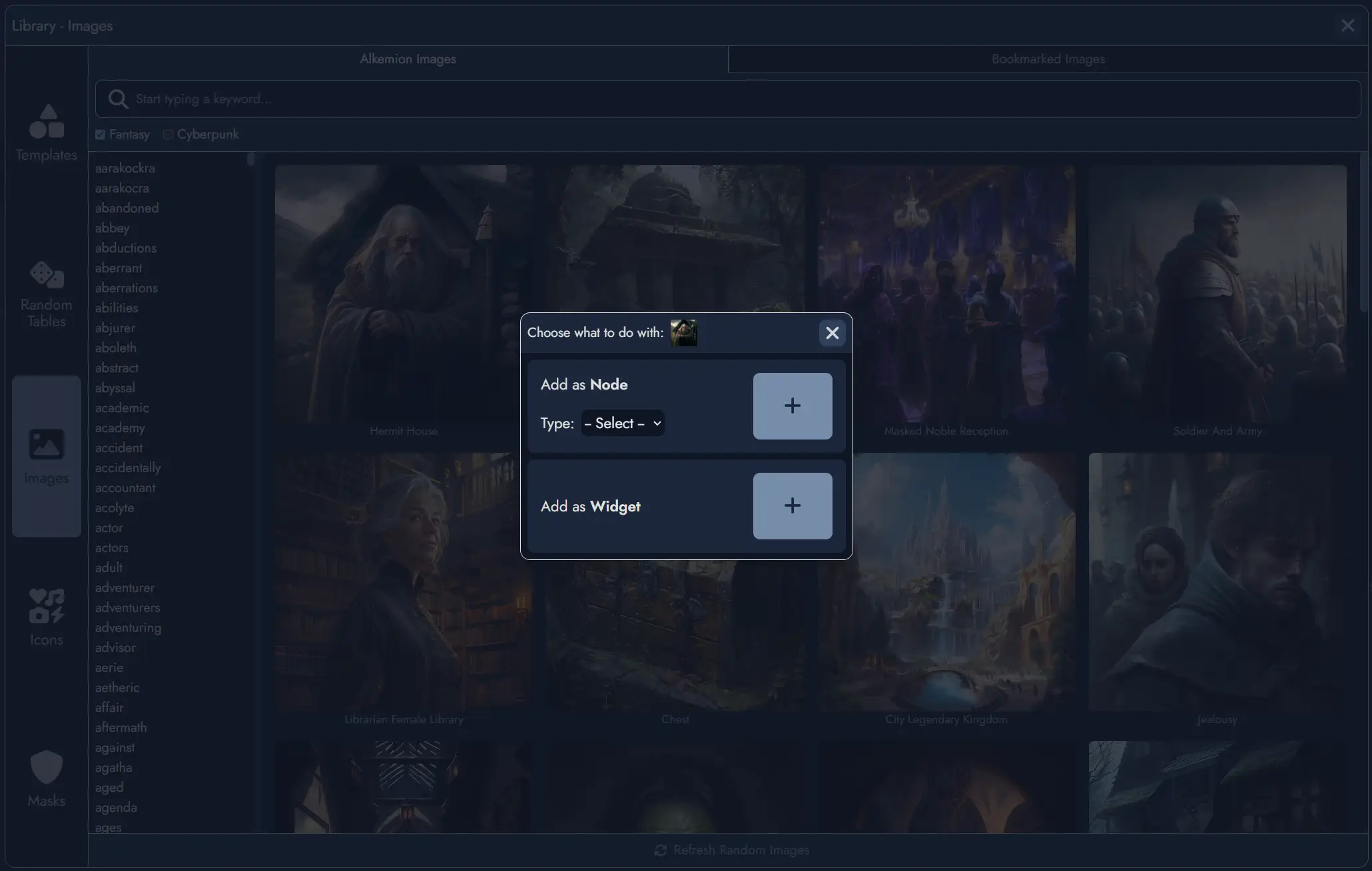
When you find an interesting item in the Library, you can directly create a new Asset based on this item if it is a Random Table, an item from a Random Table, an Image, or an Icon.
Selecting a Template allows you to import it directly into your board and create all the Assets it contains.
Collection Library
When a Module belongs to a Module Collection, the Library panel displays a toggle switch labeled with the name of the Module Collection. Using it switches the Library view between your full global Library and the curated assets for that collection.
This makes it easy to find the assets most relevant to your current project without having to search through your full Library. Any asset type can be curated: Templates, Tag Collections, Images, Icons, Masks, and Random Tables.
To curate an asset for the collection, open the Library while inside any Module belonging to the collection (including the Module Collection itself). Each asset displays a Curate for collection toggle. Assets already curated show a visual indicator in the Library.
Removing an asset from the curated selection does not affect the asset itself. Demoting a Module Collection clears all its curated asset associations, but the underlying Library assets are not deleted.
Random Tables
The Random Tables section offers additional options. You can select a Random Table to view the items it contains. In the "Your Tables" section, you have the option to create a new Random Table, edit an existing one, or delete one. More information can be found in the dedicated Random Tables page.
Tag Collections
The Tag Collections section lets you build and manage reusable sets of Tags. A Tag Collection can be imported into any Module, giving you a consistent set of labels across multiple projects without recreating them from scratch each time. More information can be found in the dedicated Tags page.
Nodes
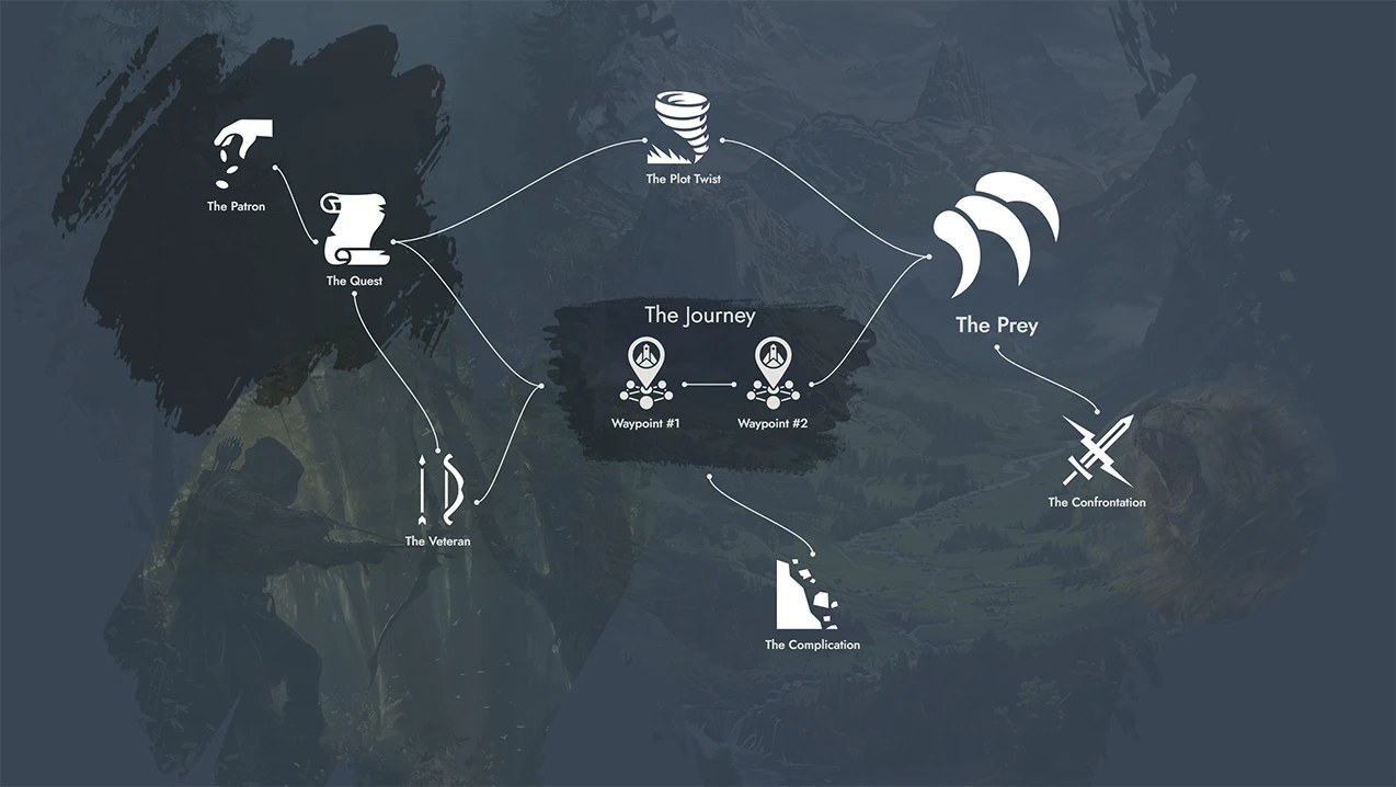
A Node represents any interactive element within a Module that players can engage with during a tabletop role-playing game. Types of Nodes include Locations, Entities, Plot Items, Clues, Events, Challenges, Resolutions, and Plot Hooks. Each Node serves a specific purpose, contributing to the overall structure and flow of the adventure by providing information, challenges, or narrative progression.
Nodes are designed to be flexible and interconnected, encouraging non-linear exploration based on player choices and dynamic storytelling.
Using Nodes in Your Creative Process
Nodes help you break down complex stories into manageable parts. By creating Nodes for key elements like locations, characters, and plot points, you can organize your thoughts and ideas more effectively. This method helps ensure that every part of your story is well-developed and easy to reference.
When brainstorming, think of each Node as a building block. Start with the main elements of your adventure and gradually add more details. For example, begin with a Location Node for a village, then add Entity Nodes for the village chief and local merchants, Plot Item Nodes for important objects, and Clue Nodes to guide players through the story.
Creating Nodes (and their Tokens)
There are several ways of creating Nodes in Alkemion Studio:
1) From the Board’s toolbar. Each toolbar button on the left of the interface is a switch that displays or hides functions grouped by theme. The first button is dedicated to adding new Nodes.
Using one of the toolbar buttons to create a new Node will automatically create a new Token for this Node on the Board, at the center of the current view.
2) From the Board’s context menu. Clicking on the Board with the right mouse button will open a context menu (on mobile the context menu can be open with the three dots button at the bottom). You can create new Nodes directly on the Board via this context menu.
When creating a Node this way, a Token will be positioned directly where you invoked the menu (or, in the case of the mobile version, in the center of the screen).
3) From the Editor. The context menu available in any Page, or any existing Content Block in the Content Tree will give you the option of creating a new Node. A "plus" button is also available from the selected Page, in the toolbar above any selected Content Block.
Using this button to create a new Node will offer the user the option of creating a Token for this Node in the process.
4) By double-clicking on empty Board space. Double-clicking on any empty area of the Board creates a new generic Node at that position. A Token is automatically placed where you double-clicked.
Node Types
Every Node has a type that describes its role in the adventure: Location, Entity, Plot Item, Clue, Event, Challenge, Resolution, Plot Hook, or the default Generic type. The Generic type is used when no specific category fits, or when you want to decide later.
Node Types are flexible. You are not locked in at creation time and can change the type of any Node at any point. There are several ways to do this:
- Click on the type field inside the Node Info panel to select a new type.
- Use the context menu of any Token for that Node.
- Select multiple Tokens and use the context menu to change the type of all selected Nodes at once.
Nodes vs Tokens
Tokens are visual representations of elements on the Board in Alkemion Studio. They serve as the graphical instances that you interact with during the creation and organization of your Modules. Any of your Node can have any number of Tokens present on the Board. Removing a Token won’t delete its parent Node.
More about Tokens can be found here.
Node Details Window
The Node Details can be triggered from any of the Node's tokens, either from its context menu or by hovering the mouse over it.
It features four tabs, each showing a different information about the Node.
The content tab () shows the content created in the Editor for the Node. A button is available at the top to open the Editor for this Node.
The information tab () lets you change the featured image and the Tags assigned to the Node. It also contains a scratchpad where you can add any kind of notes you want to associate with this Node.
The link tab () features a list of all the Nodes connected to this one. You can add new connections, or remove any the existing ones.
The random tab () shows the Random Table linked to this Node, if any. You can roll the table, change it or unlink it.
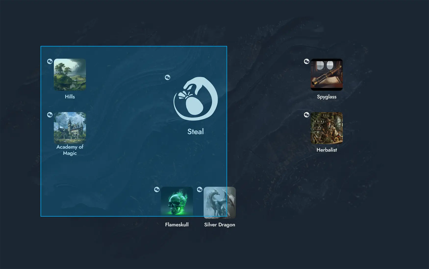
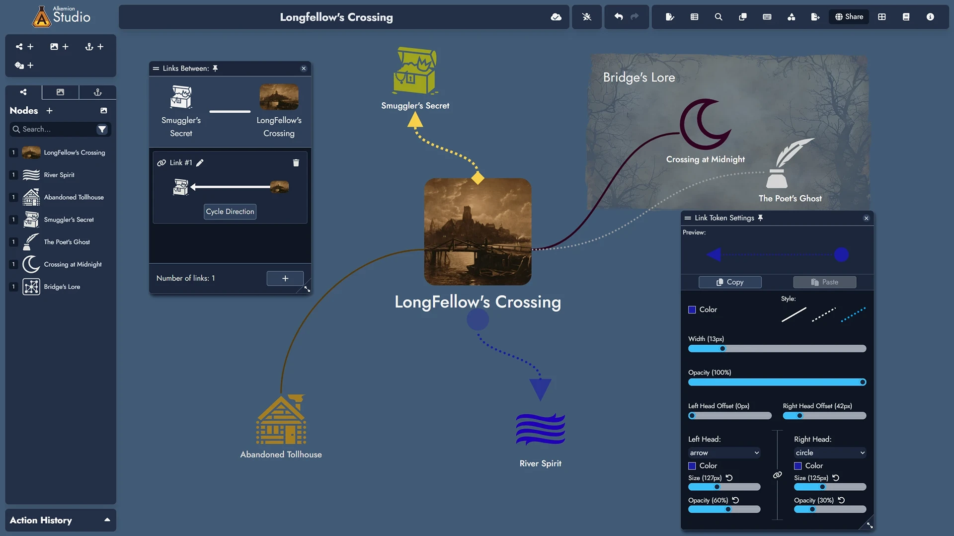
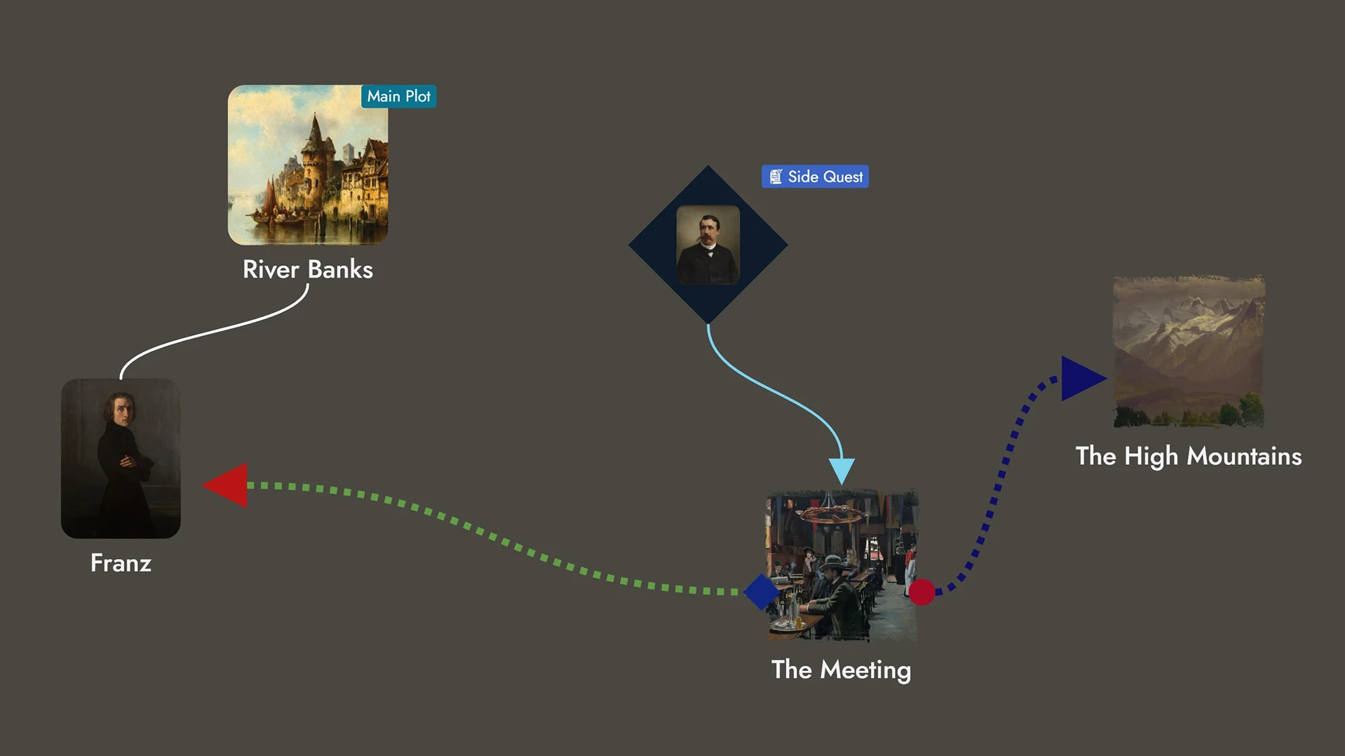
Links
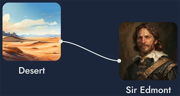
Links connect Assets in your Module to show how different parts of your adventure relate to one another, whether through clues, relationships, consequences, or transitions.
In node-based design, structure comes from connections. Links let you define how players might move between Nodes, without locking them into a fixed path. You can also connect non-Node assets such as Widgets and Anchors. This makes Links useful not just for play-related structures but also for annotating and organizing your board.
You can create multiple independent Links between the same pair of Assets to represent different kinds of relationships. Each Link can include a direction and a short description to clarify its role.
Links can also be shown on the Board through Link Tokens, giving you a visual map of your Module’s structure. You can customize each Link Token’s color, style, and width to make different types of connections easy to recognize at a glance.
Creating Links
You can create a Link in two main ways:
- From the Links tab in the Node Details Panel: use the "+" button and choose the target Node. This way can only create links between Nodes.
- By dragging the mouse between two Tokens on the Board using the side handles. This works with both Node Tokens and non-Node Tokens (Widgets and Anchors).
You can create multiple Links between the same pair of Assets. Each Link is treated as a distinct object.
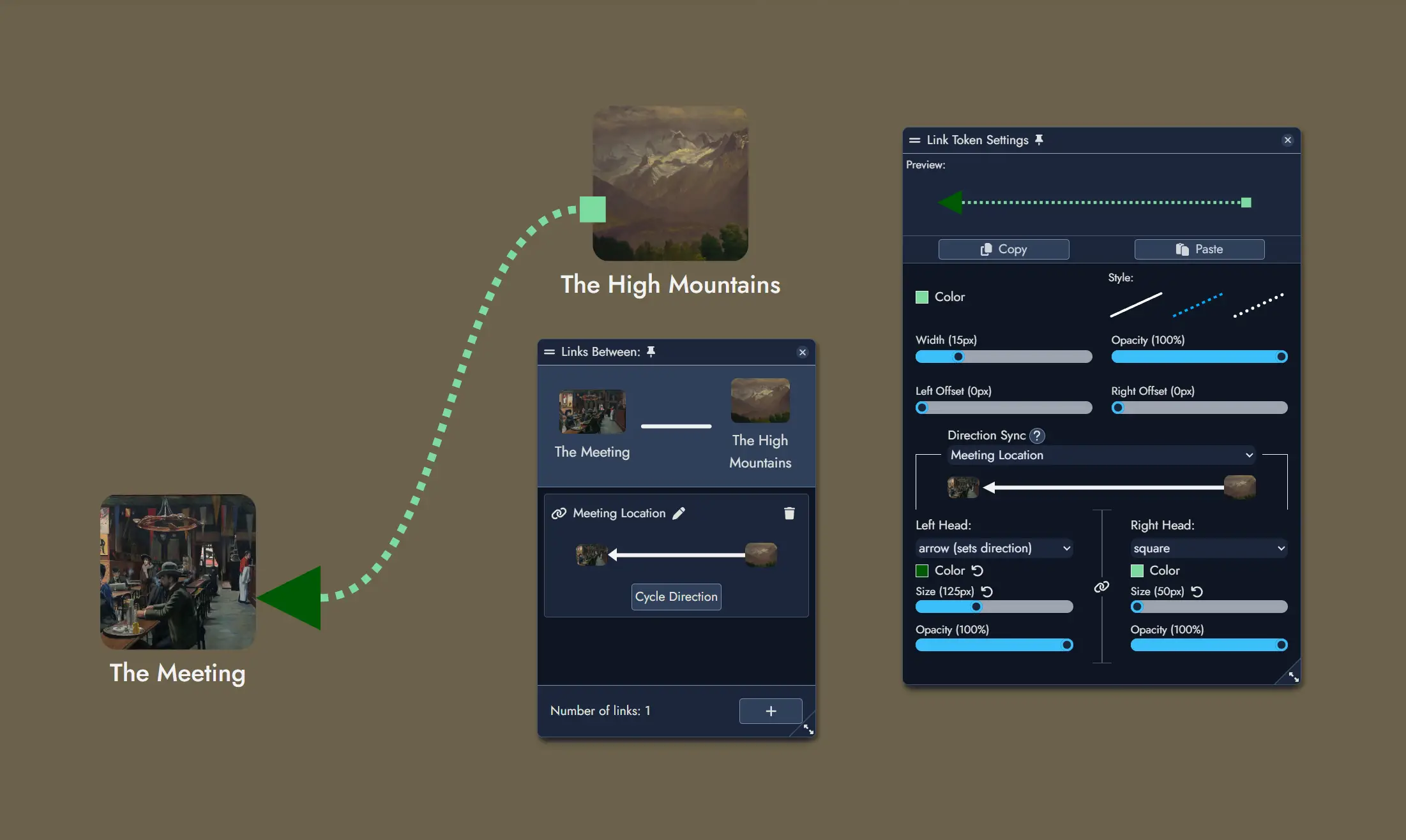
Managing Links
You can manage a Node’s Links from the Node Details Panel or manage Links directly between any pair of Assets by double-clicking a Link Token on the Board.
From the Node Details Panel
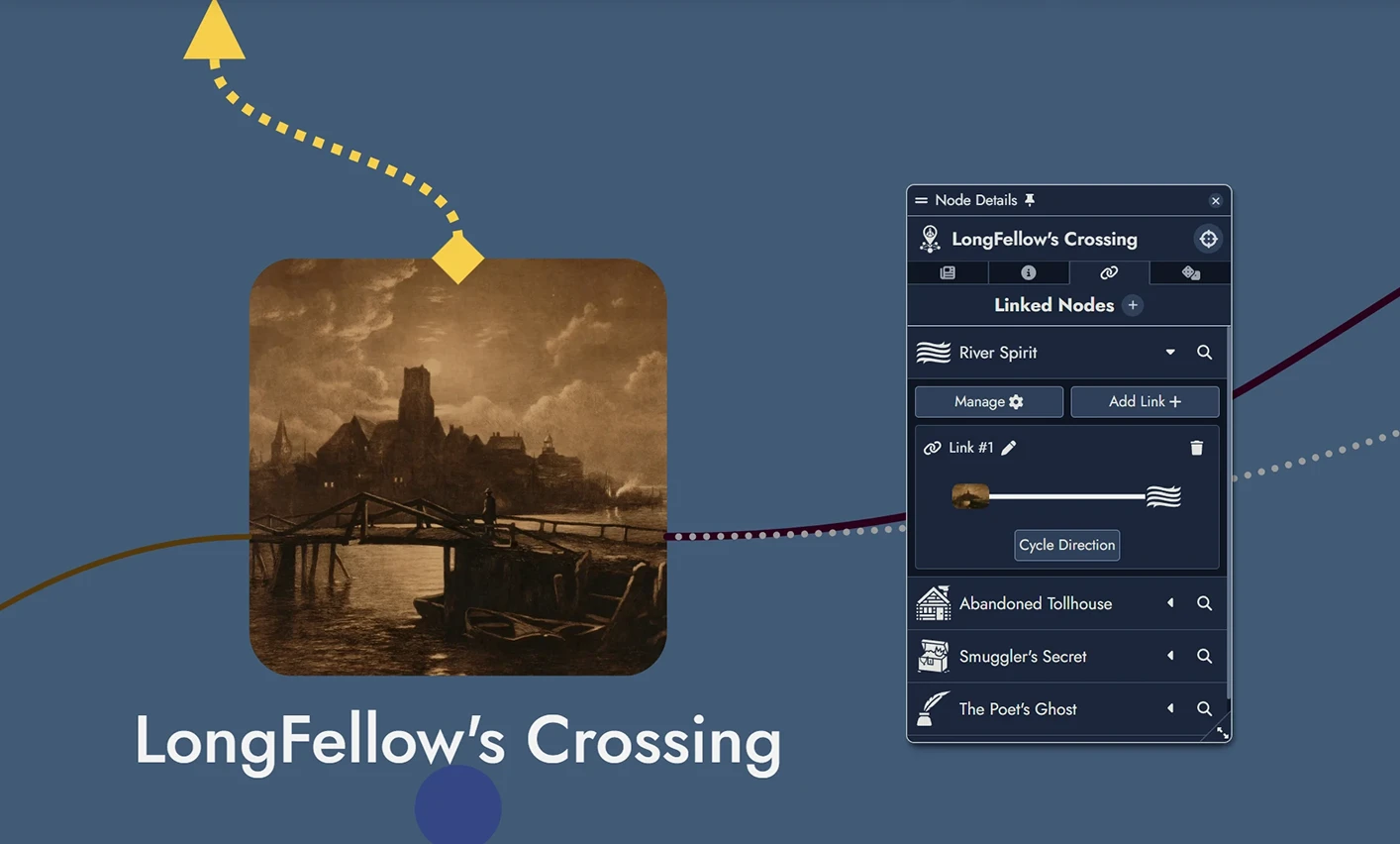
In the Linked Nodes tab, each connected Node includes:
- A Manage button to list all Links with that Node.
- An Add Link + button to create a new Link.
- Editable Link fields for description and direction.
- A delete icon to remove individual Links.
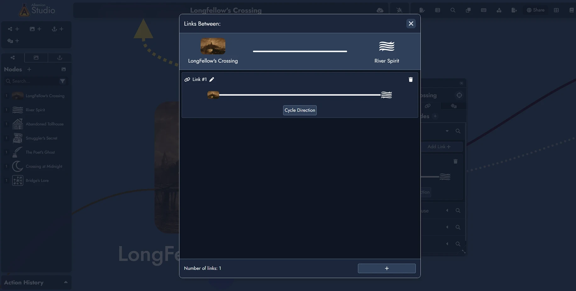
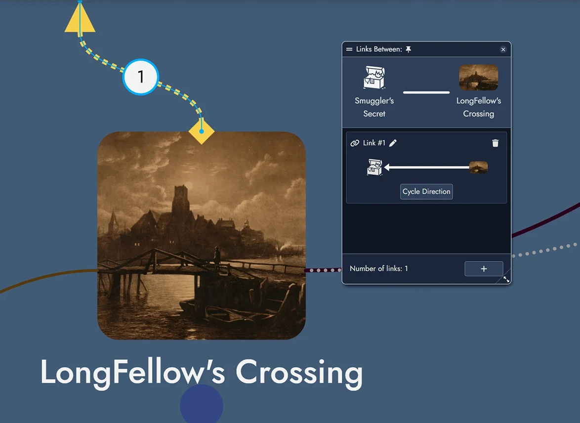
Using the Link Management Window
Click Manage to view all Links between two Nodes.
- Edit or delete any Link.
- Toggle direction using Cycle Direction.
- Add new Links with the + button.
- Total number of Links is displayed below the list.
From a Link Token on the Board
Double-click a Link Token to manage Links between two Assets (Nodes, Widgets, or Anchors).
- Edit or delete existing Links.
- Add new ones.
- Adjust direction and description.
All changes are instantly applied to the Board and Details panels.
Link Tokens on the Board
Links can be visually represented with Link Tokens between Tokens on the Board. These are optional and per-token.
Each Link can have multiple Link Tokens on the Board, just like Nodes can have multiple Node Tokens.
Customizing Link Tokens
Use a Link Token Visual Settings panel to change its appearance: color, style (solid, dashed, dotted), width, opacity, and line-end offsets. Offsets support both positive and negative values, giving you finer control over Link Token positioning in dense or overlapping layouts.
These changes apply only to the selected Token, not the Link itself or its other Tokens.
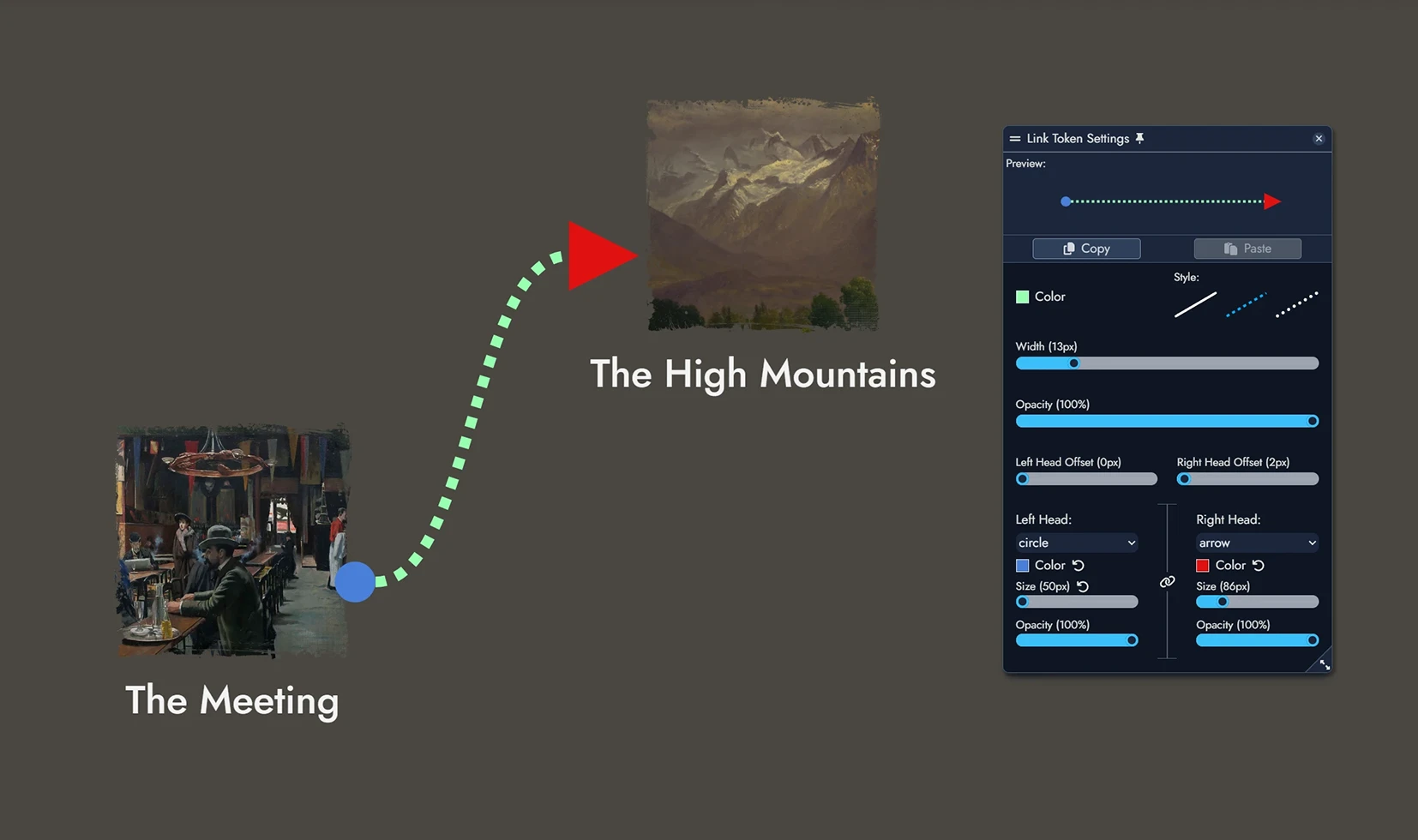
You can set each Head (left and right) to: Arrow, Circle, Square, Diamond, or None. Each Head can be styled independently.
Use the button to link both Heads. Changing one updates the other.
Optional Head settings include color, size, and opacity. If left blank, they inherit from the Link Token.
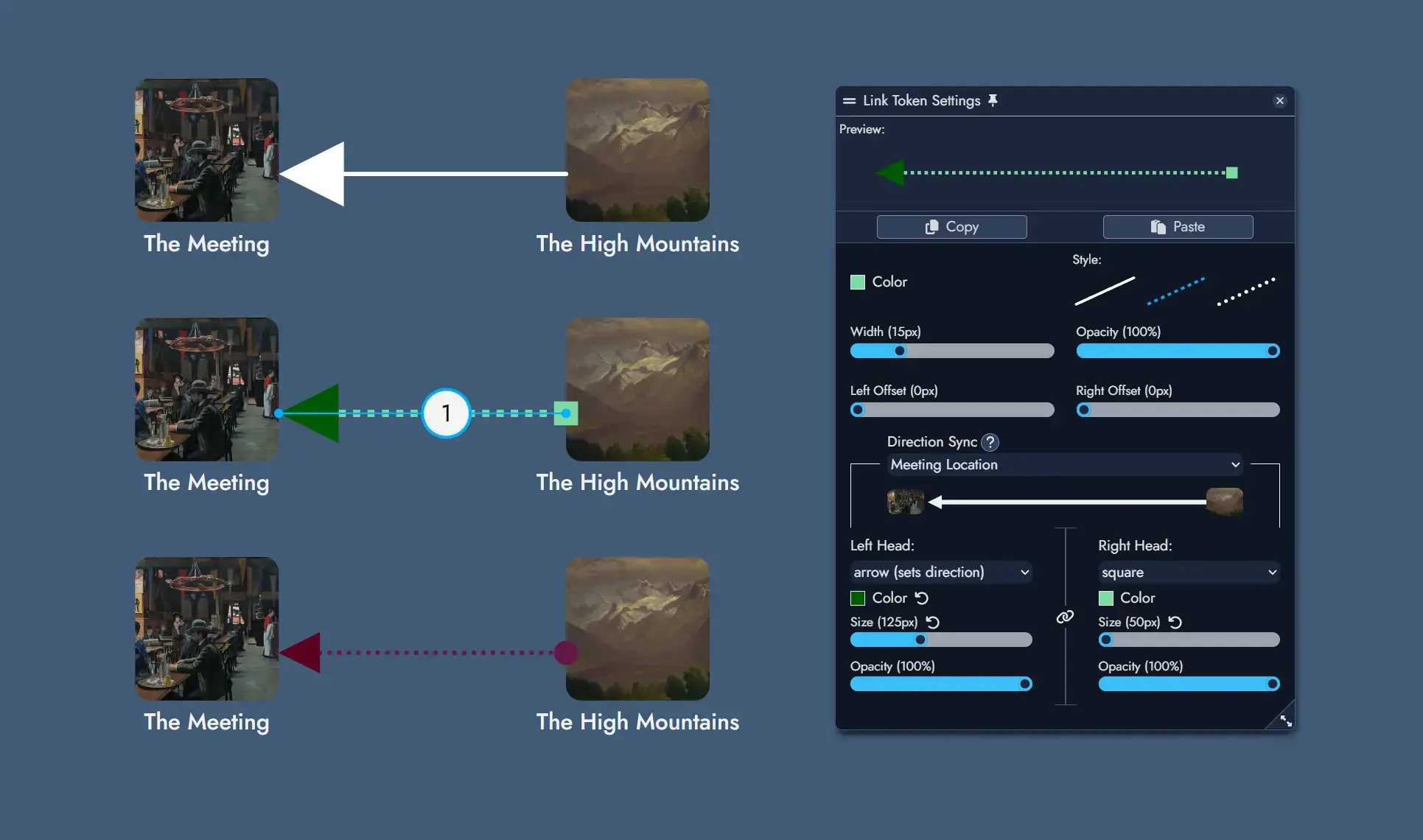
Direction Sync links the Token's direction to a specific Link between the two Assets it connects. Updating one updates the other.
Setting a Token Head to Arrow updates the Link’s direction. All Tokens synced to it are updated accordingly.
Labels allow you to display either the name of a Link between two Assets, or a custom text.
Editing a Label corresponding to a Link's name will update it directly.
Labels can be styled with font size and color, background color, border, opacity, and independent horizontal and vertical inner padding.
A Label Offset slider lets you reposition the label along the connection, sliding it from one end to the other.
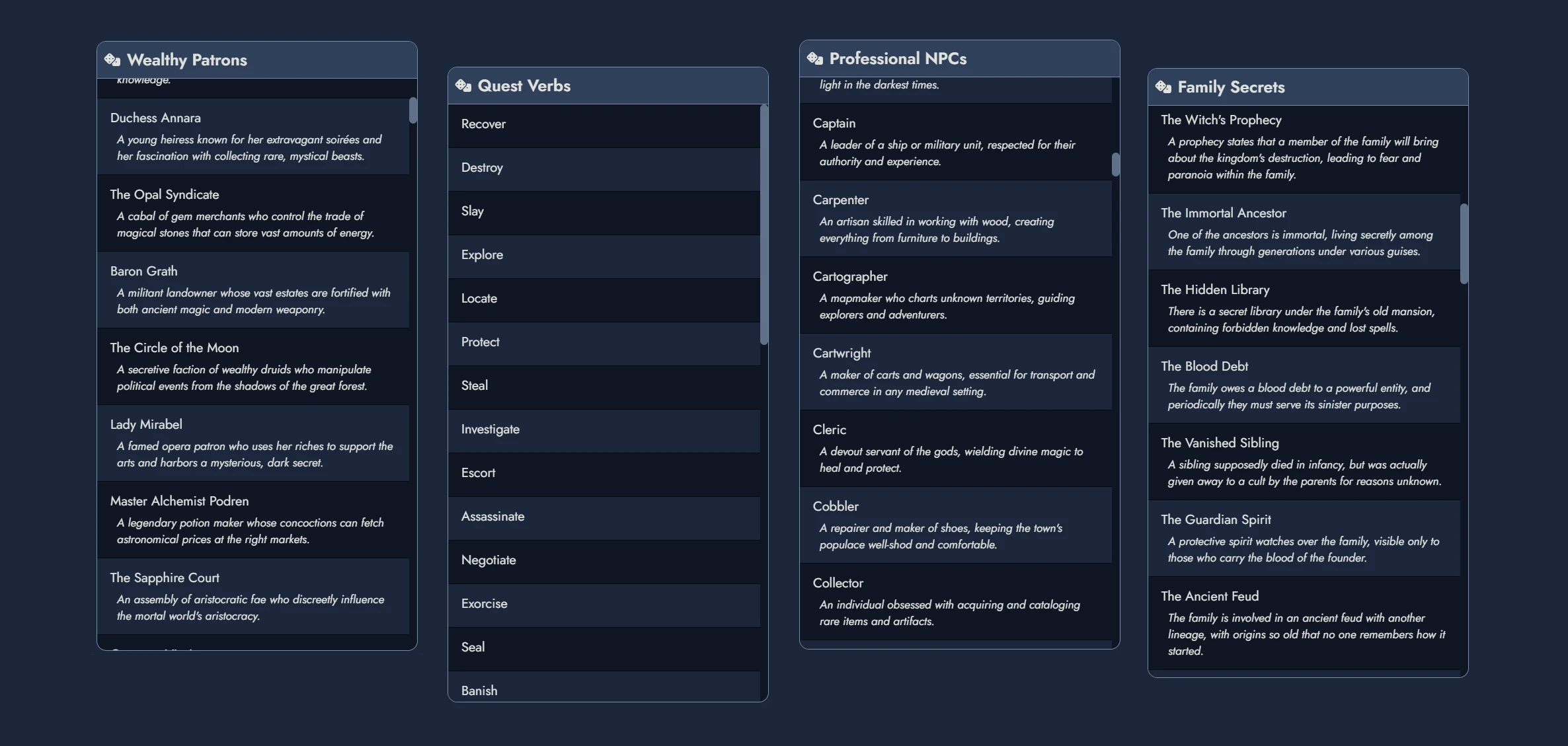
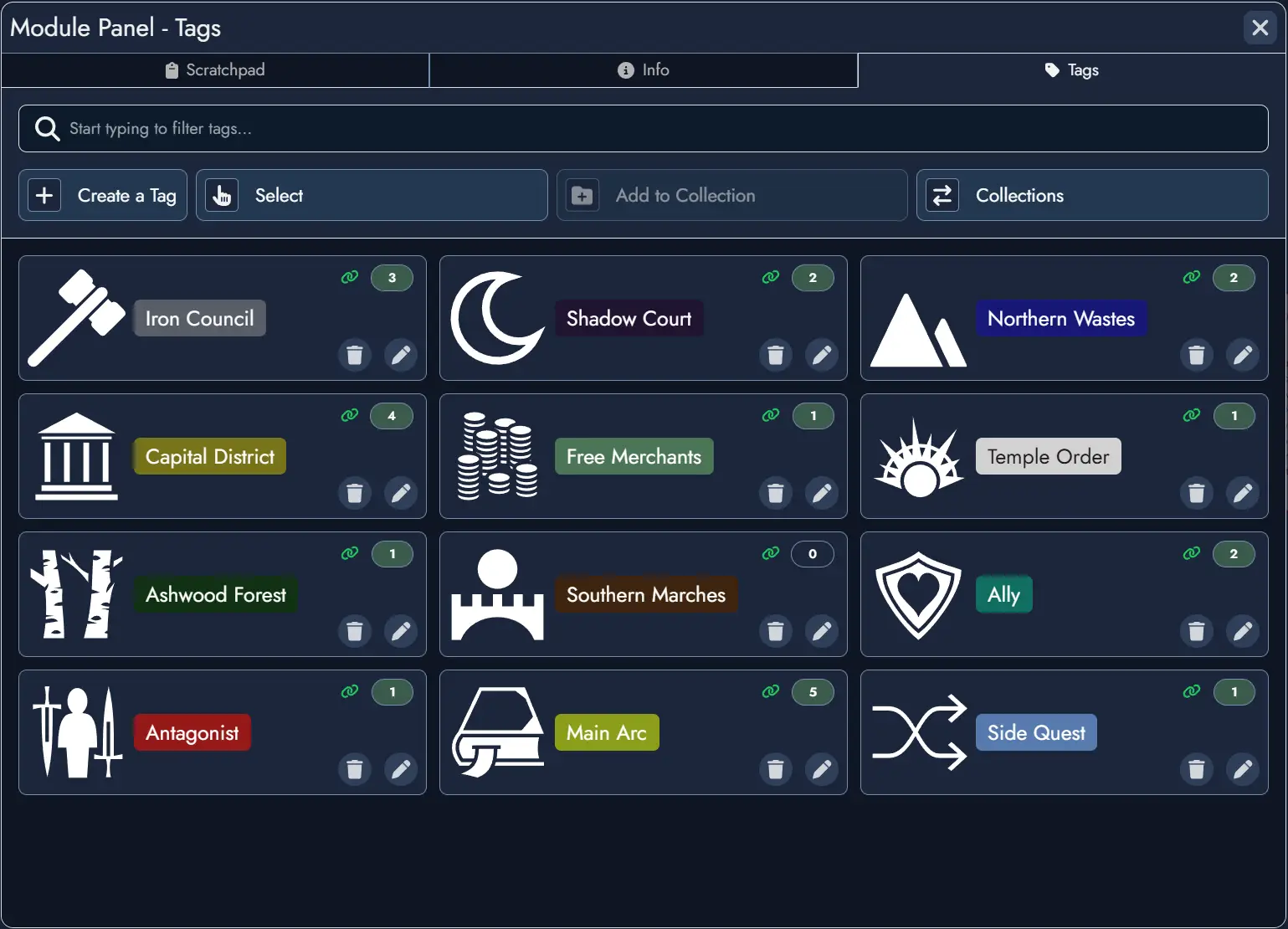
Tags
Tags are customizable labels you can assign to Nodes to categorize and organize content within your Modules. They allow for quick filtering, searching, and visual organization across Nodes on the Board.
Each Tag includes a name and can optionally feature a color, icon, or description. Tags help you highlight specific themes, topics, or status indicators for your Nodes, making it easier to manage and view relevant content at a glance.
You can also build reusable sets of Tags using Tag Collections, stored in your Library and importable into any Module.
Managing a Node's Tags
You can manage the Tags of any Node in your Module through its Tag Box, located in the Node's Information Panel.
The Tag Box displays the Tags currently assigned to the Node. Clicking on a Tag opens the Tag Editor, where you can modify its properties.
To add an existing Tag to a Node, use the dropdown menu in the Tag Box. Typing in the text field filters available Tags for quick selection. Once selected, the Tag will be assigned to the Node.
You can also create new Tags directly in the text field. Type a new name, press Enter, and the Tag will be created and automatically assigned to the Node.
To remove a Tag from a Node, simply click its close button: .
Adding Tags in Batch
You can add Tags to multiple Nodes at once using context menus. Select one or more Node Tokens on the Board, nodes in the Asset Tree, or content blocks in the Editor's Content Tree, then use the context menu to choose the Tags to apply to the parent Nodes of your selection.
Editing a Tag
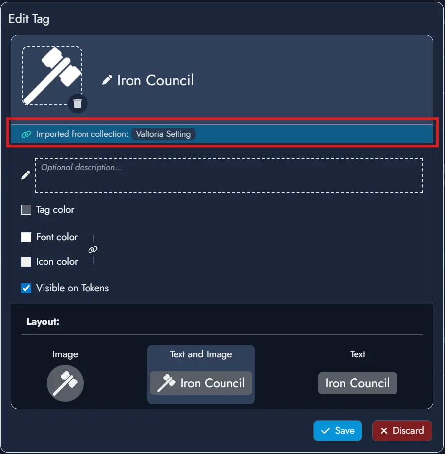
Clicking on a Tag in the Tag Box opens the Tag Editor, where you can set or modify various properties:
- Featured Image: Click the image box to set an image or icon as the Tag's Featured Image. This visual can optionally appear on the Tag Chip, the visual representation of the Tag across the application.
- Description: Use this optional field to describe the purpose or theme of the Tag.
- Tag and Font Colors: These values customize the style of the Tag Chip. An additional Icon Color setting lets you independently control the color of the Tag's icon. A lock option is also available to modify the icon and font colors simultaneously.
- Visible on Tokens: Check this box to display the Tag Chip on the Node's Tokens. This setting can be customized for each Token in its Token Settings panel.
- Layout: Choose the Tag Chip style by combining the Tag's name and visual. Note that layout options using a visual can only be selected if a Featured Image has been set.
To save your changes, click Save. Click Discard to cancel any modifications.
The Tag Manager
The Tag Manager, located in the Module Panel, lists all Tags available in your Module. Each Tag card displays the number of Nodes that currently use it, giving you a quick sense of how widely each label is applied.
Right-clicking any Tag card opens a context menu with quick access to the most common actions. You can also select multiple Tags at once and apply actions in batch across your entire selection using the same context menu.
Tags Filtering
A filter button on the far right of any search field provides filtering options. You can filter Nodes by type or select specific Tags if they are available in the Module. The filter button turns blue to indicate when a filter is active.
Tag Collections
Tag Collections let you build reusable sets of Tags in your Library and import them into any Module. This is especially useful when you want to apply a consistent set of labels across multiple projects without recreating them from scratch each time.
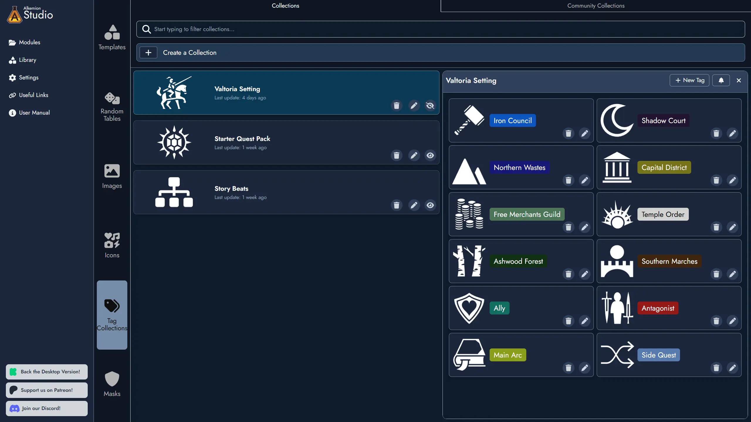
Creating and Managing Collections
Tag Collections are managed from the Tag Collection Manager, located in the Library. It is accessible from both the Lobby and from inside any open Module.
To create a new Collection, open the Tag Collection Manager, give the Collection a name, and optionally assign a Featured Image to help identify it at a glance. You can then add Tags to the Collection and edit or remove them at any time. Collections can also be renamed, have their image changed, or be deleted directly from the manager.
When working inside a Module, navigation shortcuts are available to move quickly between the Tag Collection Manager in the Library and the Tag Manager in the Module Panel.
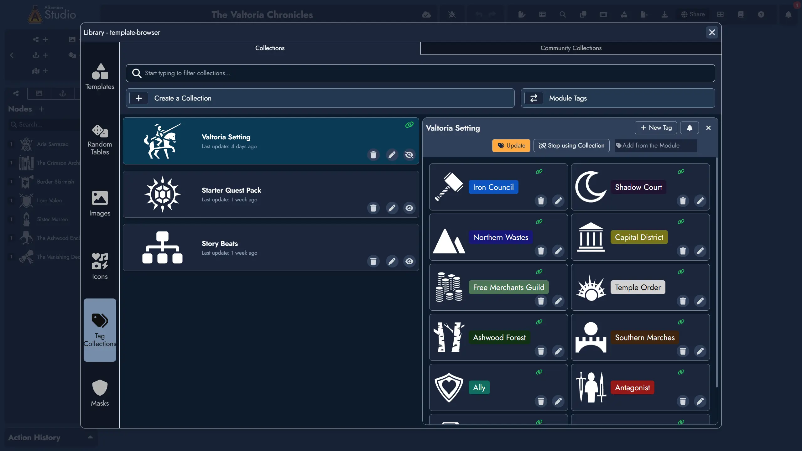
Importing a Collection
You can import a Tag Collection into any open Module directly from the Tag Collection Manager. When importing, you can select which Tags from the Collection to bring in.
Imported Tags behave exactly like local Tags: you can edit or delete them freely without affecting the source Collection. A link icon on both the Collection card and each imported Tag card makes these connections easy to spot at a glance. The Tag Editor also indicates which Collection a subscribed Tag originates from.
Synchronization is one-directional: changes flow from the Collection to the Module, never the other way around. To update the source Collection, edit it directly in the Tag Collection Manager.
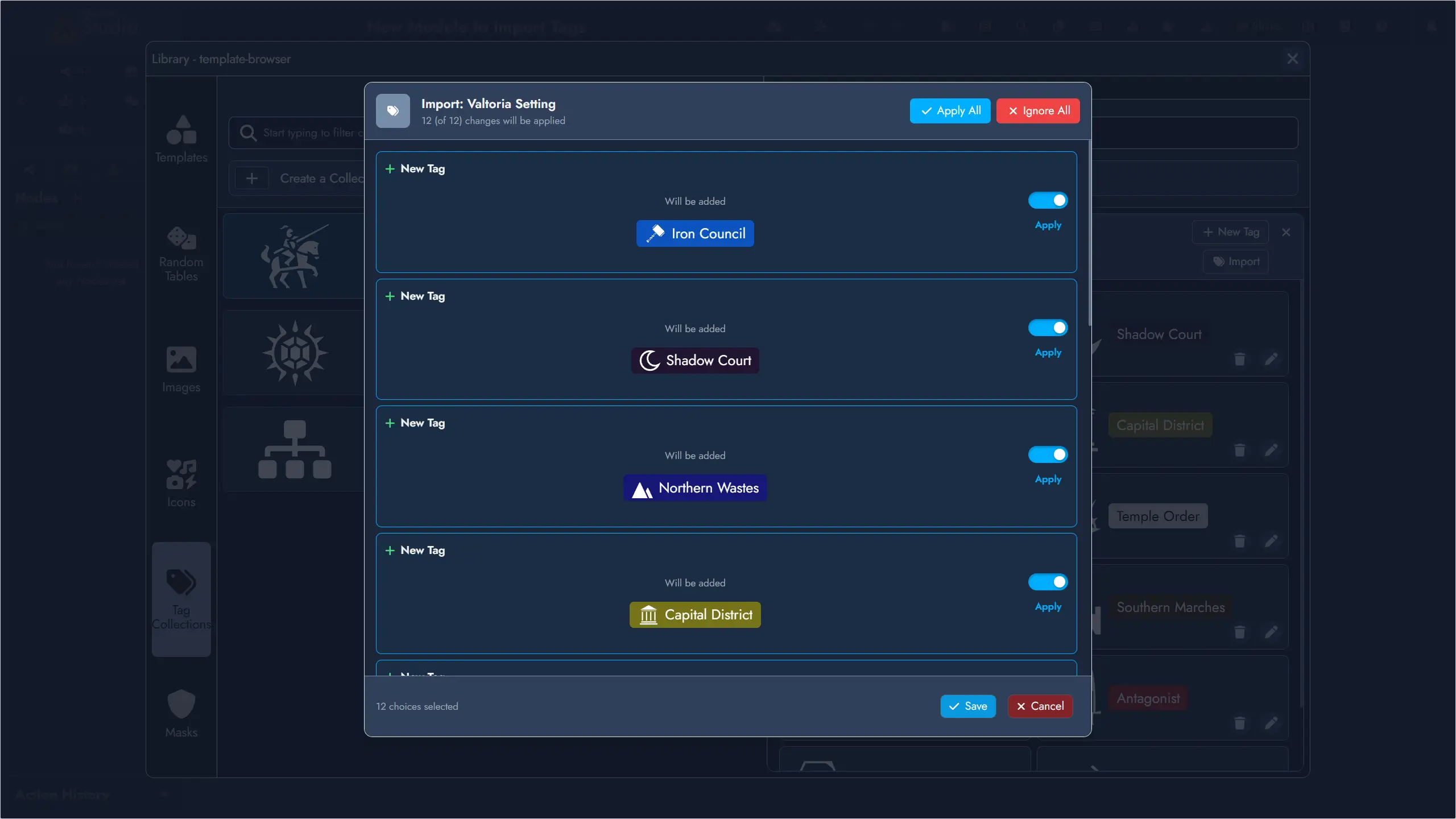
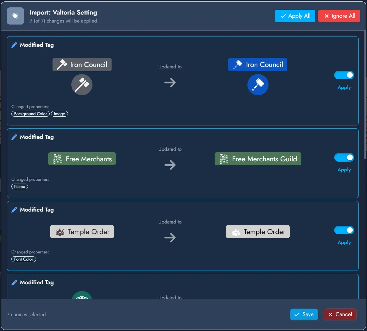
Keeping Tags Up to Date
When you update a Tag Collection, any Module that has imported Tags from it will show a soft notification on next load if there are pending changes to review. You can dismiss the notification and come back to it later, or open the update panel immediately to review each change individually and choose to apply or ignore it.
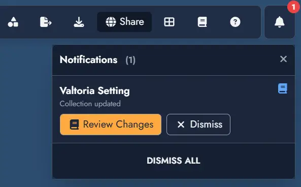
The update panel can always be accessed from the Update button on the Collection card in the Tag Collection Manager, even after dismissing a notification.
Widgets
Widgets are visual elements that enhance the aesthetics of your Board. Unlike Nodes, Widgets do not participate in the adventure mechanics; they are purely for visual aid and context. They serve as decorative or informational additions without impacting the functional structure of your adventure design.
Widgets include image widgets, icon widgets, text widgets, and group widgets.
Unlike Nodes, each Widget exists as a single Token on the Board. Deleting a Widget's Token removes the Widget from the Module entirely. Widgets can be named for easy identification in the Asset Tree, and they can be connected to other Assets using Links.
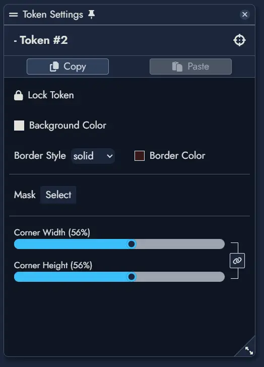
Image Widget
An Image Widget places an image directly on the Board as a decorative or illustrative element. Use it to add maps, illustrations, background art, or any visual that supports the atmosphere of your module without attaching it to a Node.
Images are selected from the Library, which includes your uploaded images and any images you have bookmarked from the icon collection or external sources.
Image Widgets support the following customization options:
- Border style and border color
- Corner width and corner height (independent controls for precise shape)
- Mask overlay
Icon Widget
An Icon Widget places a single icon on the Board. It is useful for quick visual markers, decorative elements, or symbolic annotations that do not require text or a full image.
Icons are selected from the Library, which contains tens of thousands of icons covering a wide range of themes and genres.
Icon Widgets support the following customization options:
- Icon color
Text Widget
A Text Widget places a text label or annotation directly on the Board. Use it for section headings, captions, notes, or any freestanding text that is not tied to a Node.
Text Widgets support rich text formatting. The following formatting options are available directly in the widget:
- Bold, italic, underline, and strikethrough
- Numbered lists and bullet lists
Text Widgets also support the following customization options:
- Font selection (any font available in the Editor themes)
- Font size
- Border style and border color
- Corner width and corner height
Group Widget
Group Widgets are a special Widget type designed for visual and organizational grouping on the Board. They let you visually delimit areas of your board, label regions, and apply background images or colors to create a clear spatial structure.
Unlike Nodes, Group Widgets hold no content of their own. Their purpose is layout and emphasis: meaning and structure remain within Nodes and Links.
Linking a Group Widget to a Node
A Group Widget can optionally be linked to a Node. When linked, double-clicking the Group Widget opens that Node directly in the Editor, making it a convenient shortcut to the Node's content while keeping the visual structure separate.
Customization
Group Widgets support the following customization options:
- Background image
- Background color
- Border style and border color
- Corner radius
- Title font selection
- Name Size: adjusts the font size of the Group Widget title. Title spacing adjusts naturally as the size changes.
- Horizontal and Vertical Offset: sliders that let you reposition the title freely within the Group Widget bounds.
- Masking
Migration from Group Nodes
Prior to version 0.17.0, grouping was handled by Group Nodes. Group Nodes have been retired and replaced by Group Widgets. Existing modules are automatically migrated: each legacy Group Node is converted into a Group Widget on the Board. Because Group Nodes could hold text content, a new generic Node is created for each migrated Group Node to preserve that content.
Anchors
Anchors are Assets that act as navigational links on the Board. They come in two types: Module Anchors, which link to another Module, and External Link Anchors, which link to an external URL.
Like Nodes, Anchors can have multiple independently styled Tokens on the Board. Activating an Anchor Token opens the linked destination. Anchors can also be connected to other Assets using Links.
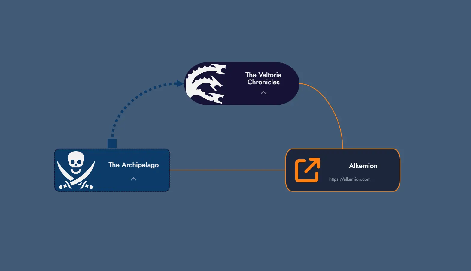
Module Anchors
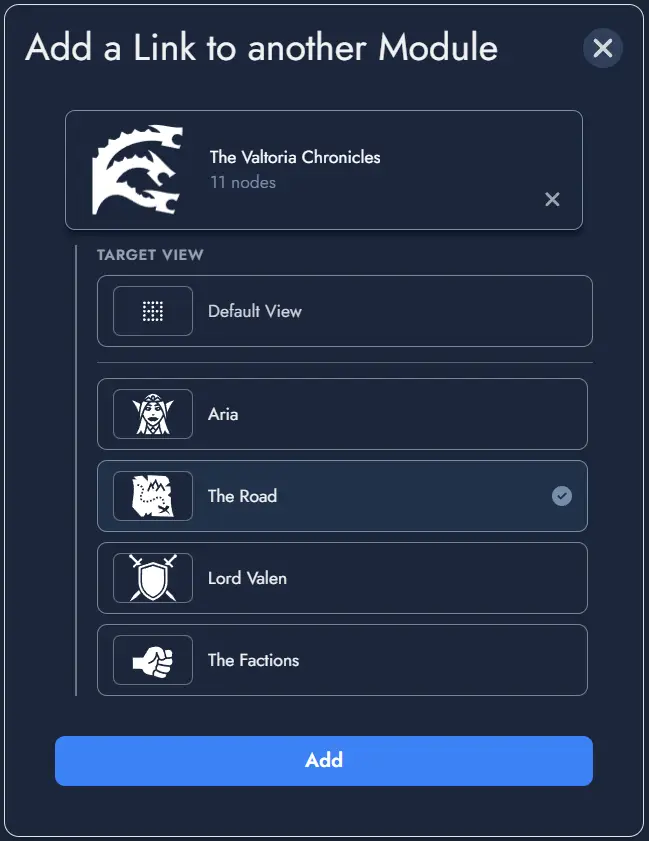
A Module Anchor links to another Module in your account. Double-clicking a Module Anchor Token, or using the Travel to Module option in its context menu, navigates directly to the linked Module's Board.
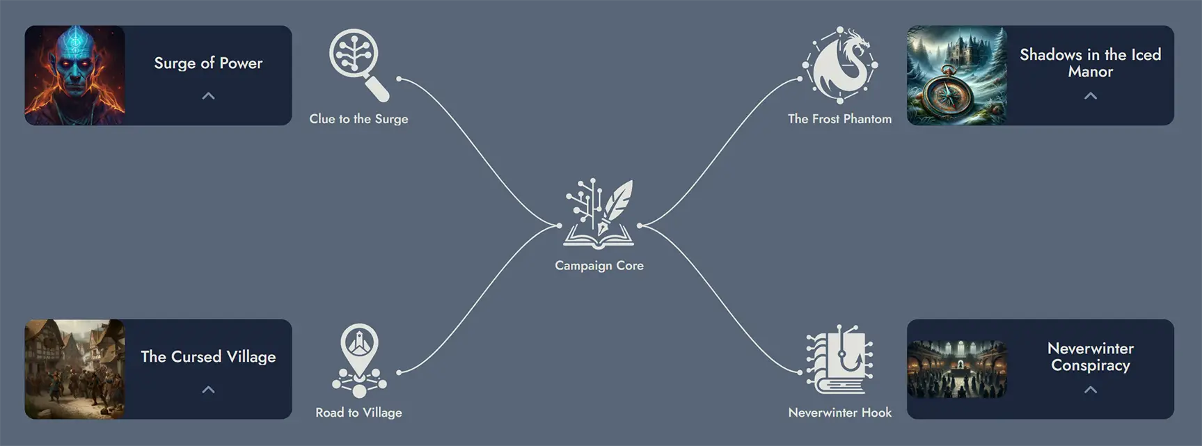
Module Anchors are particularly useful for building campaign hubs: a central Module that connects to individual adventure Modules, letting you jump between them with a single click.
Targeting a View within a Module
When configuring a Module Anchor, you can optionally target a specific View within the destination Module, rather than just the Module itself. When the Anchor is activated, it navigates to the Module and immediately zooms to the targeted View using the standard fit-to-screen behavior.
In the target selection modal, Modules that have Views defined immediately list their available Views as selectable targets. The selected target is displayed in the Anchor settings as Module Name > View Name.
If the targeted View is later deleted from the destination Module, the Anchor falls back gracefully to navigating to the Module without any View-specific zoom. The Anchor itself is not broken.
External Link Anchors
An External Link Anchor stores a URL instead of a Module reference. Double-clicking its Token opens the linked URL in a new browser tab. The same action is available from the Token's context menu.
Use External Link Anchors to reference rulebooks, maps, reference sheets, or any online resource relevant to your Module.
Anchor Tokens
A single Anchor can have any number of Tokens on the Board. Each Token is an independent visual instance of the same Anchor and can be customized separately. Deleting a Token does not delete the parent Anchor.
The following customization options are available per Anchor Token:
- Featured image or icon
- Font color and background color
- Border style and border color
- Corner width and corner height (independent controls)
You can set a featured image or icon on any Anchor Token. The custom image replaces the default one displayed on the Token. Removing it restores the default automatically.
Anchor Tokens have their own Token Settings window, accessible from the context menu. The settings available differ slightly between Module Anchors and External Link Anchors.
Context Menu Actions
Right-clicking an Anchor Token opens a context menu with the following actions specific to Anchors:
- Travel to Module (Module Anchors only): navigates immediately to the linked Module's Board.
- Open Link (External Link Anchors only): opens the stored URL in a new tab.
- Delete Token: removes this Token from the Board without deleting the Anchor itself.
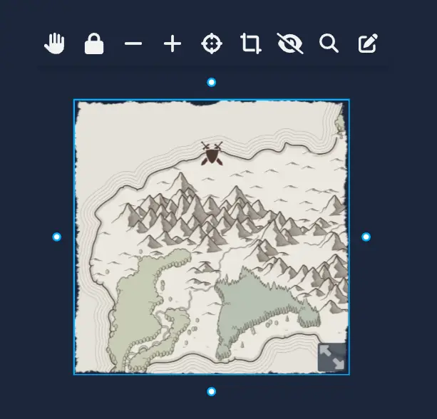
Maps
Maps allow you to create interactive maps within your Module. Maps provide a visual reference point that can be annotated with Points of Interest and linked to your Nodes. While they're perfect for geographical layouts, they can represent anything visual: a relationship diagram, a timeline, a conspiracy board, or any image where you want to highlight and connect specific areas.
Maps can be placed on the Board as Map Tokens, where they can be explored interactively. Editor integration is coming soon. Each map can be customized with markers, zoom levels, and visual styling to suit your needs.
Multiple Tokens of the same Map
Creating a Map
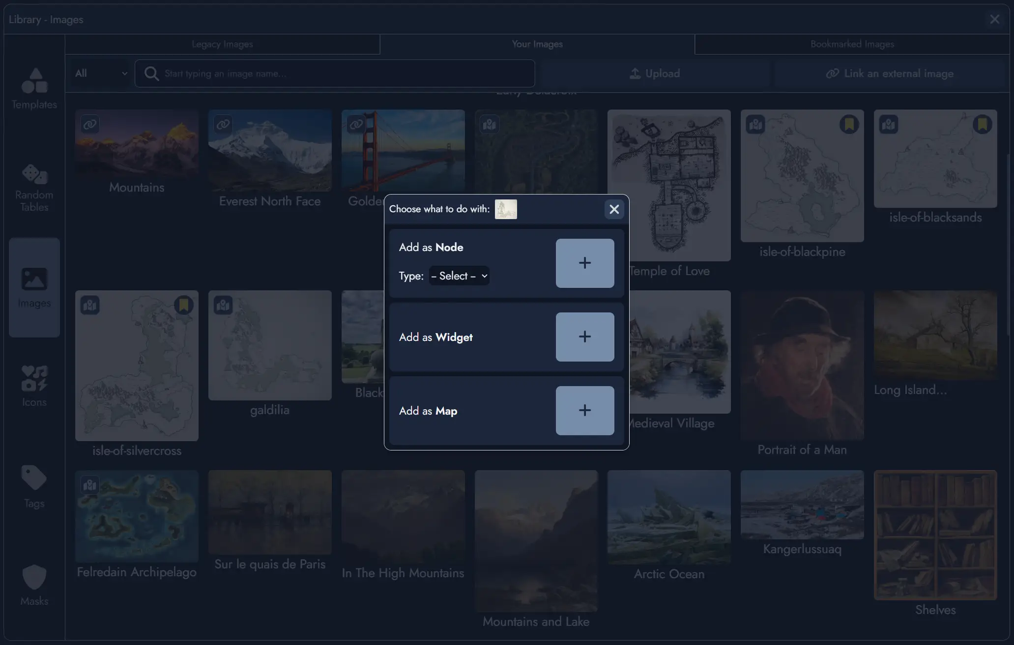
To create a Map, you must first have an image uploaded to your Image Library. Only user-uploaded images can be used to create maps. Images from external URLs or the default icon library are not supported for this feature.
There are three ways to create a new Map:
- From the Library: Open the Library (via the button in the top toolbar, from the mobile menu, or with the shortcut Ctrl + L). Navigate to the Images section and select the image you want to use as a map. Click the button on the image, then select "Add as Map" in the modal window.
- From the Board's context menu: Right-click (or long press on mobile) anywhere on the Board to open the context menu, then select "Add Map". You will then be prompted to select a user-uploaded image from your Image Library.
- From the Board's toolbar: Click the "Add Maps" button in the Board's toolbar. You will then be prompted to select a user-uploaded image from your Image Library.
The newly created Map will be added to the Board as a Map Token. You can then open it in the Map Editor to begin adding Points of Interest and customizing the map.
The Map Editor
The Map Editor is a dedicated interface for editing your maps. By default, it opens in full-screen mode, providing maximum space to work with your map, but it can also be displayed as a floating window within the Board using the windowed mode button .
The Map Editor features a toolbar at the top with the following controls:
- and buttons to zoom in and out.
- button to center the map in the viewport.
- button to fit the entire map within the visible area, resetting both zoom level and position.
- / toggle to show or hide all Points of Interest.
- button to add a new Point of Interest.
- button to search for specific Points of Interest by name.
- button to toggle between full-screen and windowed mode.
- button to close the Map Editor.
While in the Map Editor, you can navigate the map by dragging with your mouse or touch gestures, and zoom using your mouse wheel or pinch gestures on touch devices.
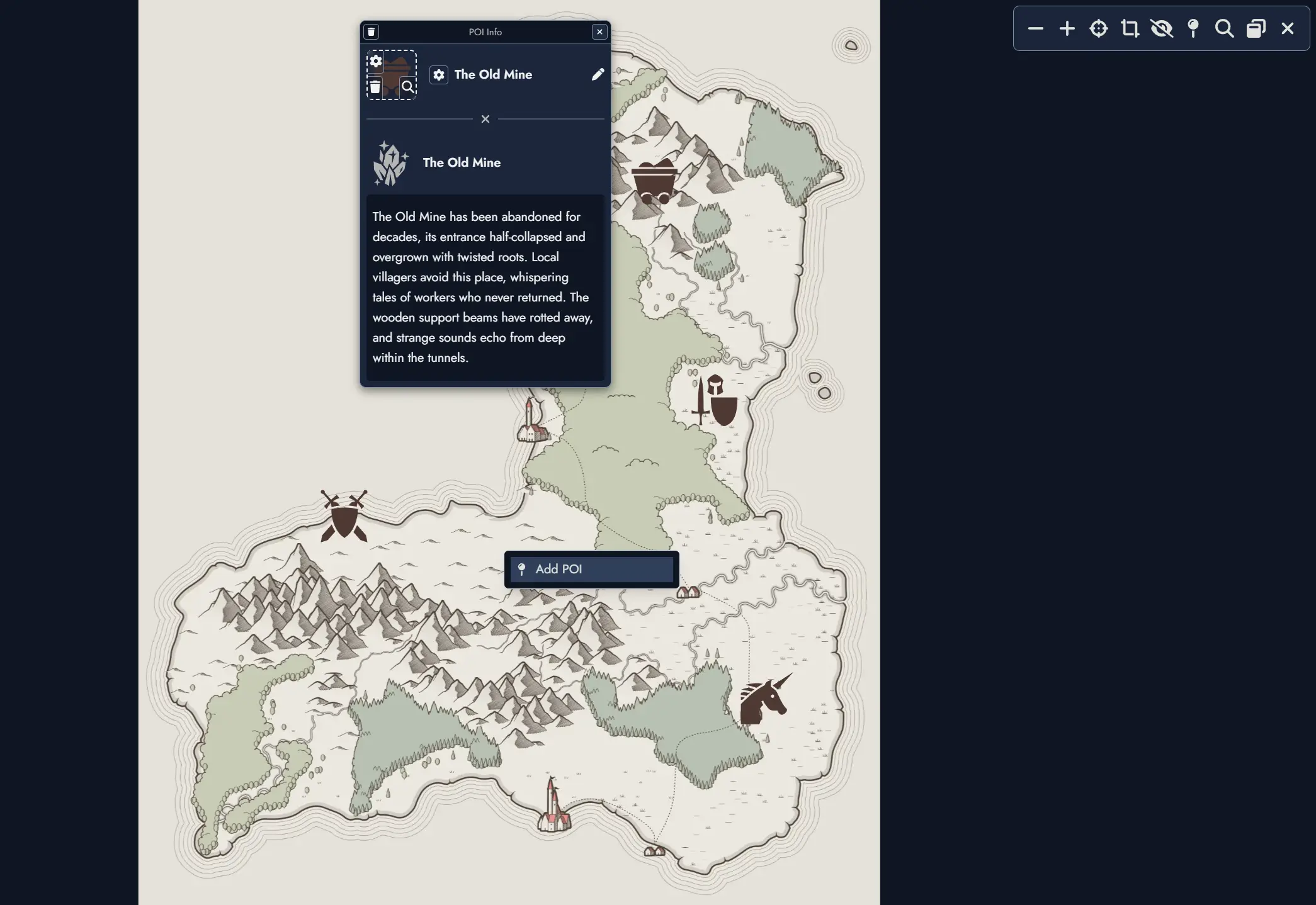
Points of Interest (POI)
Points of Interest are markers you place on your maps to highlight important locations, encounters, or narrative elements. Each POI can have a name, a featured image or icon, and can optionally be linked to a Node in your Module.
Adding a Point of Interest:
- Click the button in the Map Editor toolbar.
- Click anywhere on the map to place the marker.
- A POI configuration panel will appear, allowing you to set a name, choose an icon or image, and optionally link the POI to a Node.
- You can also add a Point of Interest by right-clicking (or long press on mobile) anywhere on the map to open the context menu, then selecting "Add POI".
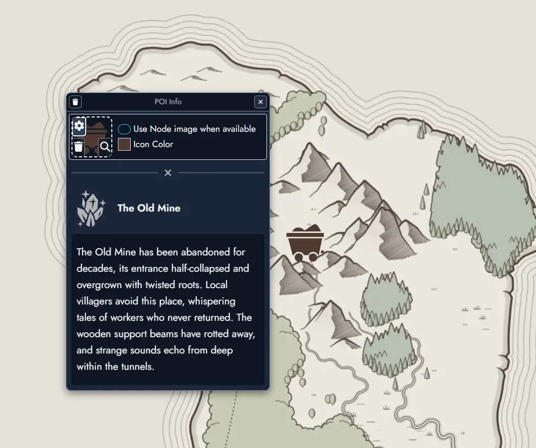
When a POI is linked to a Node, you can choose to automatically use the Node's featured image instead of a separate icon. Even when linked, the POI name and featured image remain fully customizable if you prefer to override the Node's defaults.
Interacting with Points of Interest: Clicking on any POI marker will display an information window showing its name and any associated details. This works both in the Map Editor and when viewing Map Tokens on the Board, whether the map is in interactive mode or not.
Map Tokens on the Board
Like Nodes, Maps can be placed on the Board through Map Tokens. A single Map can have multiple Tokens on the Board, each with independent positioning, sizing, and visual customization.
Map Tokens can be resized by dragging their corners or edges, and support the same visual customization options as other Tokens, including:
- Border style, color, and width
- Background color and opacity
- Corner roundness
- Image mask
Interactive Mode
By default, Map Tokens on the Board are not interactive. They can be moved and resized like any other Token, but cannot be explored or zoomed.
To explore a map interactively, you must enable Interactive Mode. This can be done in two ways:
- Click the button in the Map Token's floating toolbar.
- Double-click directly on the Map Token.
When Interactive Mode is active, you can drag the map to explore it and use the mouse wheel (or pinch gestures on touch devices) to zoom in and out. The Map Token itself cannot be moved or resized while in this mode.
To exit Interactive Mode and return to normal editing, click the button again or click outside the Map Token.
Map Token Toolbar
Each Map Token on the Board features a floating toolbar that appears when you hover over or select the Token. This toolbar provides quick access to common map controls without needing to open the Map Editor. In reader mode (shared modules), a compact version of the toolbar is also available, providing quick access to Interact, Zoom, Fit, and Open Map controls.
- Toggle Interactive Mode on or off.
- / Lock or unlock the Token to prevent accidental movement.
- Toggle Interactive Mode on or off.
- / Lock or unlock the Token to prevent accidental movement.
- and Zoom in and out.
- Center the map in the Token's viewport.
- Fit the entire map within the visible area, resetting both zoom level and position.
- / Show or hide Points of Interest.
- Search for specific Points of Interest.
- Open the map in the Map Editor.
These controls allow you to explore and present your maps directly on the Board, making them ideal for session play, collaborative planning, or visual storytelling alongside your Nodes and other Assets.
Timelines
Timelines are a Construct Asset, the second after Maps. A Timeline represents a sequence of events or narrative beats arranged horizontally. It is not a calendar tool. Its purpose is to serve as a sequence-based or order-based lens on the Nodes of a Module, helping you understand how events relate to each other, see parallel threads across characters and factions, and reason about the shape of your world, adventure, or campaign.
A Module can hold as many Timelines as you need. Timelines can be placed on the Board as Timeline Tokens, allowing you to view and interact with your sequence directly in your workspace.
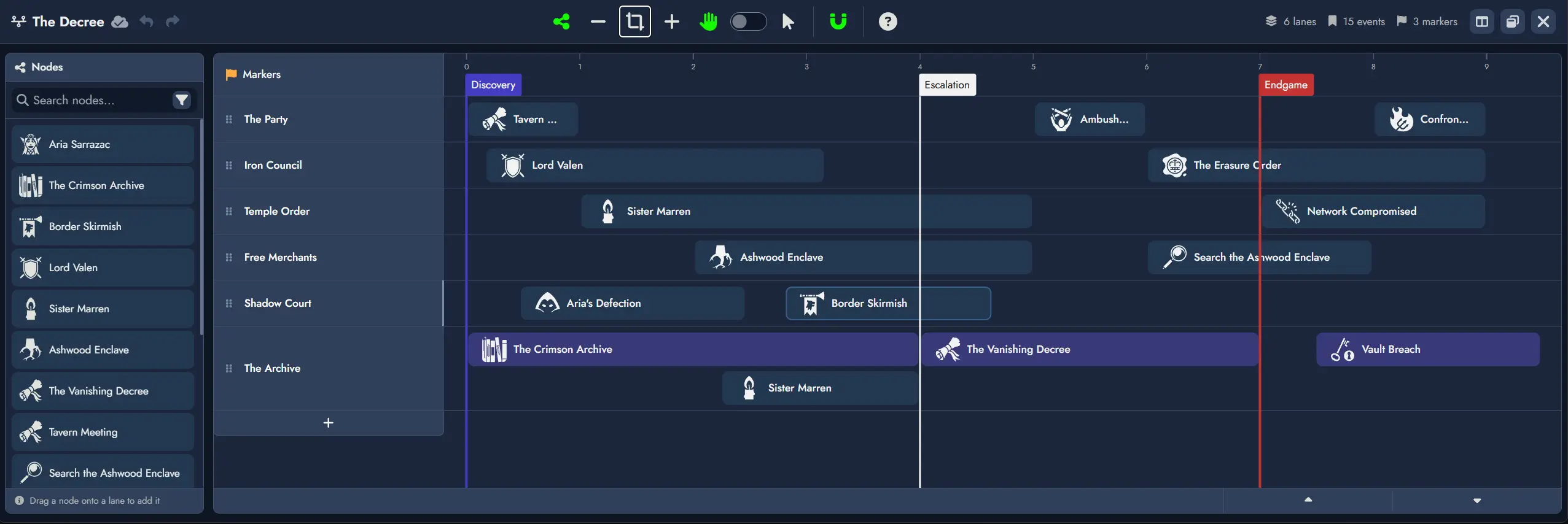
Elements
Every Timeline is composed of three types of elements: Lanes, Markers, and References.
Lanes
A Lane is a horizontal track that groups References visually. A Lane may represent factions, character arcs, parallel plots, sessions, or any other grouping you find useful.
- Lanes have a label, a color, and a featured image, all customizable.
- Lanes can be collapsed and expanded. A collapsed Lane displays only its header row, hiding all References while remaining visible so you can expand it at any time. The Lane header shows a compact Reference count (e.g. "(5 refs)") when collapsed.
- Lanes can be reordered vertically.
- Lane height grows dynamically to accommodate overlapping References, giving a visual signal of denser or more complex periods.
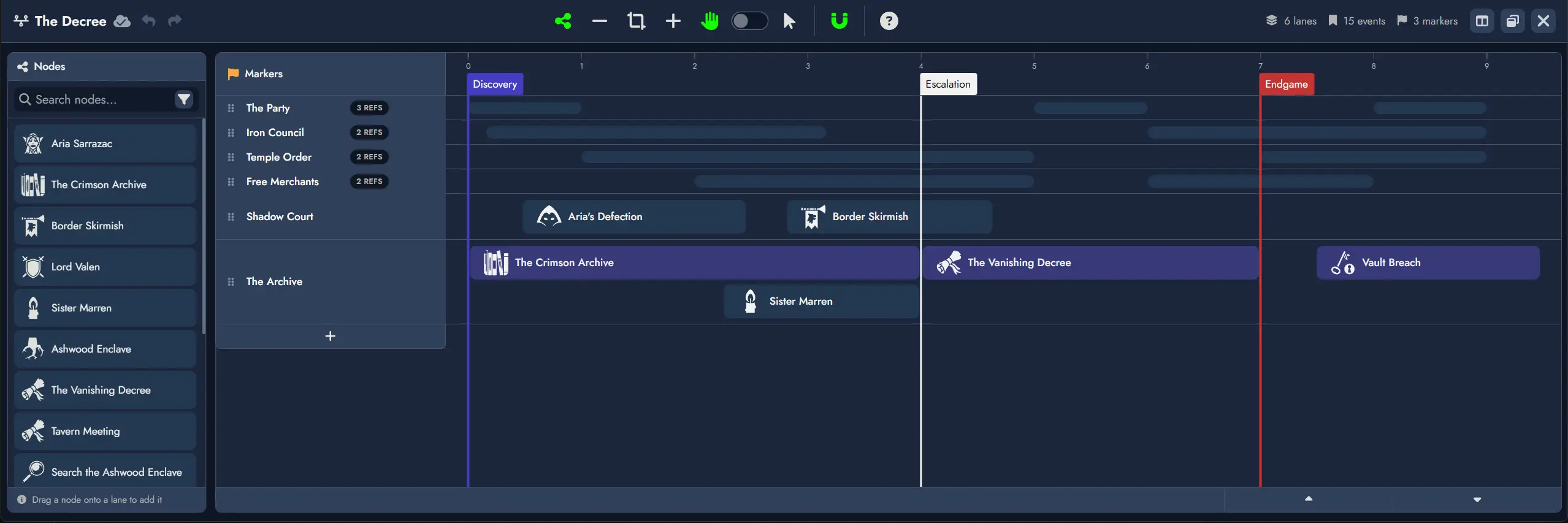
Markers
A Marker is a vertical line placed on the horizontal axis that divides the sequence into labeled sections. Markers are global to the Timeline and freeform: they do not enforce any specific unit of time or chronology.
- Markers have a label, a font color, and a background color, all customizable.
- Markers can be dragged along the axis without affecting References, which are positioned independently.
- Multiple Markers may share the same horizontal position. When stacked, each Marker keeps its own label and visual style and they display as a small stack.
- Markers span the full height of all Lanes.
References
A Reference is an item placed inside a Lane. Every Reference is linked to a Node.
- A Reference displays the Node's featured image (or default type icon if none is set) and the Node's name.
- Multiple References can be linked to the same Node.
- References can be customized with font color, icon color, and background color.
- Double-clicking a Reference opens the linked Node in the Editor.
- When viewing a Timeline Token on the Board, hovering over a Reference opens the Node Details panel.
Creating a Timeline
There are two ways to create a new Timeline:
- From the Board's context menu: Right-click (or long press on mobile) anywhere on the Board to open the context menu, then select "Add Construct" and then "Add Timeline".
- From the Board's toolbar: Click the "Add Timeline" button in the Board's Add Constructs toolbar: .
The newly created Timeline will be added to the Board as a Timeline Token. You can then open it in the Timeline Editor to begin adding Lanes, Markers, and References.
The Timeline Editor
The Timeline Editor is a dedicated interface for building and editing your Timelines. It opens in full-screen mode by default, and also supports windowed mode on the Board using the button. A Split view button lets you display the Timeline Editor and the Page Editor side by side in full screen.
On creation, a Timeline starts with a single Lane and no Markers or References.
Layout
The Timeline Editor is composed of four main areas:
- Top toolbar - global actions and stats (lane count, event count, marker count).
- Node Pool - left sidebar listing all Nodes available for placement.
- Markers row - the fixed top row of the timeline grid, showing Marker labels and where new Markers can be placed.
- Lane rows - the main editing area, one row per Lane.
Toolbar
The Timeline Editor toolbar includes:
- Hide/Show Node Pool toggle to display or hide the left Node Pool panel.
- and buttons to zoom in and out.
- Fit to Content button that automatically adjusts the zoom level so every Reference becomes visible on screen.
- Navigation mode toggle to switch between Drag Mode and Selection Mode. The V key can also switch between the two modes.
- Snapping toggle. When enabled, dragged References align to unit boundaries on placement, move, and resize.
Mouse Wheel Navigation
When the Timeline Editor has focus, the mouse wheel behaves as follows:
- Default: drags the timeline horizontally.
- Shift + scroll: scrolls timeline Lanes vertically (only when not all Lanes are visible).
- Ctrl + scroll: zooms in and out.
Node Pool
The Node Pool lists all Nodes in the Module and is the primary source for creating References. It defaults to showing all Nodes, and standard search filters are available (name, node type, tags). Drag a Node from the Node Pool onto a Lane to create a Reference at that position.
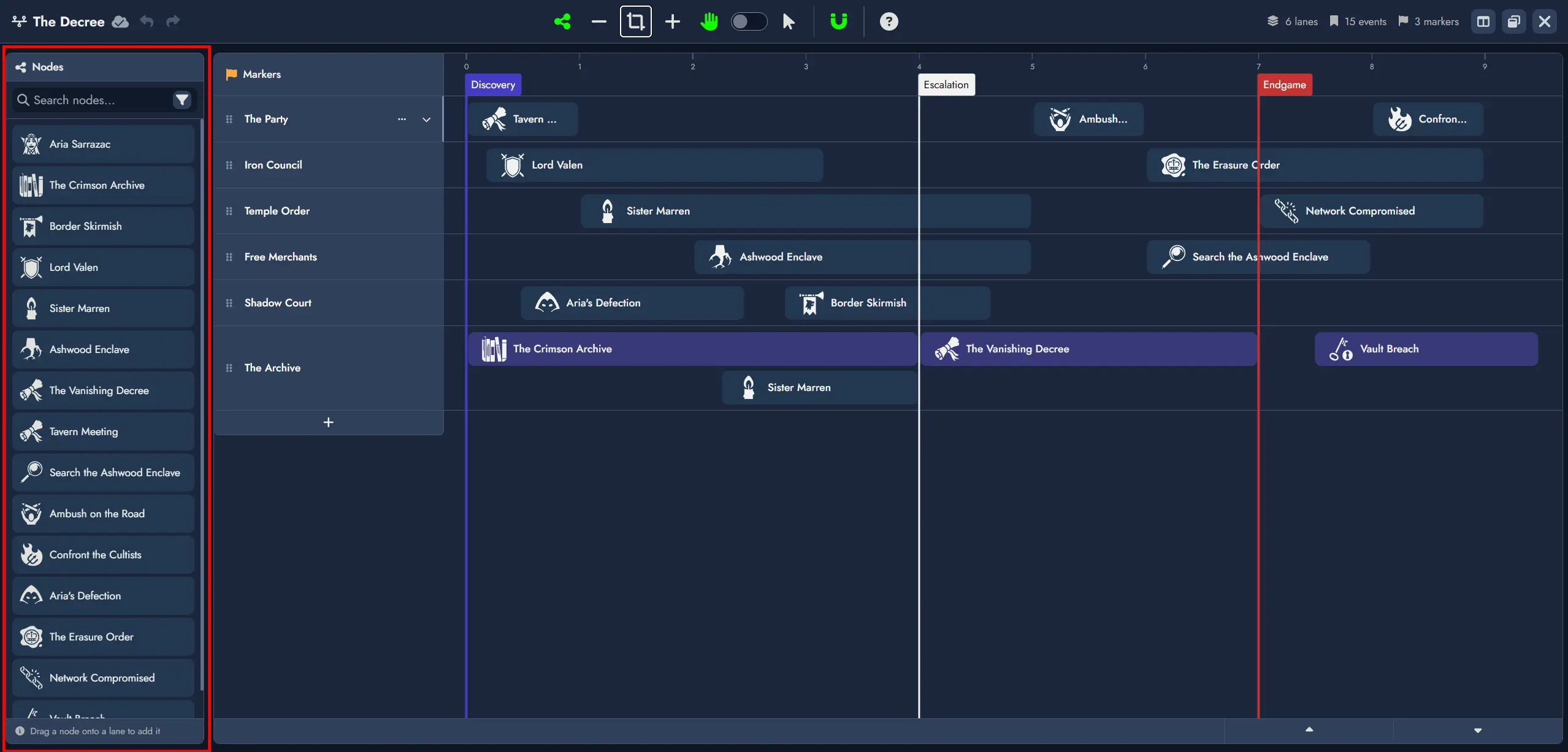
Markers
- Double-clicking on the Markers row places a new Marker at that horizontal position. Marker labels are editable inline after placement.
- In Selection Mode, Markers can be dragged horizontally to reposition them.
- Markers can be deleted via contextual action.
- When multiple Markers share the same position, they render as a small visual stack, each preserving its own label and colors.
Lane Management
- New Lanes are added via the + button below the last Lane header.
- Lanes can be renamed, reordered vertically, collapsed, and deleted.
Creating References
From existing Nodes
Drag a Node from the Node Pool onto a Lane to create a Reference at the drop position. The Reference snaps to the nearest unit boundary if snapping is enabled.
Creating a new Node directly from the Timeline
Double-clicking anywhere inside a Lane creates a new Event Node and places a Reference to it at that position. The Node is immediately accessible from the Board and the Editor like any other Node in the Module.
Reference Spans
References are not limited to a single unit. A Reference can span across multiple units to represent an event, arc, or condition that lasts over a period. On creation, a Reference occupies exactly one unit.
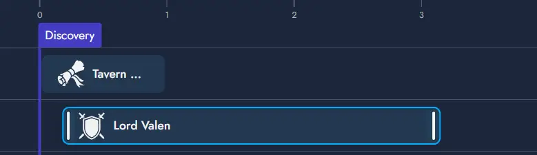
A Reference remembers where it starts and how wide it is, independently of any Marker positions. When snapping is disabled, a Reference can be positioned and resized freely at any point along the axis, without being constrained to unit boundaries.
Reference Interactions
Three gestures operate on a Reference: resize, horizontal move, and Lane change.
Resize
Thin vertical bars appear on the left and right edges of a Reference. Dragging the left handle adjusts the start position; dragging the right handle adjusts the end position. The opposite edge remains fixed. Both snap to unit boundaries on release when snapping is enabled.
Move
Dragging the body of a Reference (anywhere that is not a resize handle) moves the entire span left or right without changing its width. A ghost placeholder follows the cursor, indicating where the Reference will land. Snaps to unit boundaries on release.
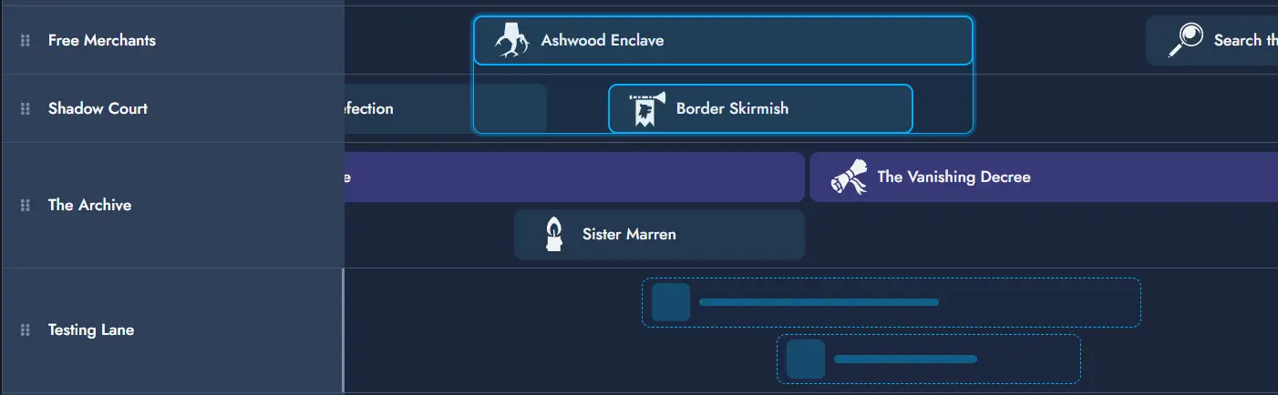
Lane Change
Lane changes are initiated from the same body drag as horizontal moves. By default, a body drag moves the Reference horizontally within its current Lane. If the drag crosses a vertical threshold (approximately half the Lane height), the Reference enters Lane change mode: the placeholder snaps to the target Lane row as the cursor moves vertically. Releasing drops the Reference into the target Lane at the current horizontal position.
Timeline Tokens on the Board
A Timeline Asset can have multiple independent Timeline Tokens on the Board. Each Token is a resizable viewport into the Timeline. Timeline Tokens can be moved, resized, and customized like other Tokens on the Board.
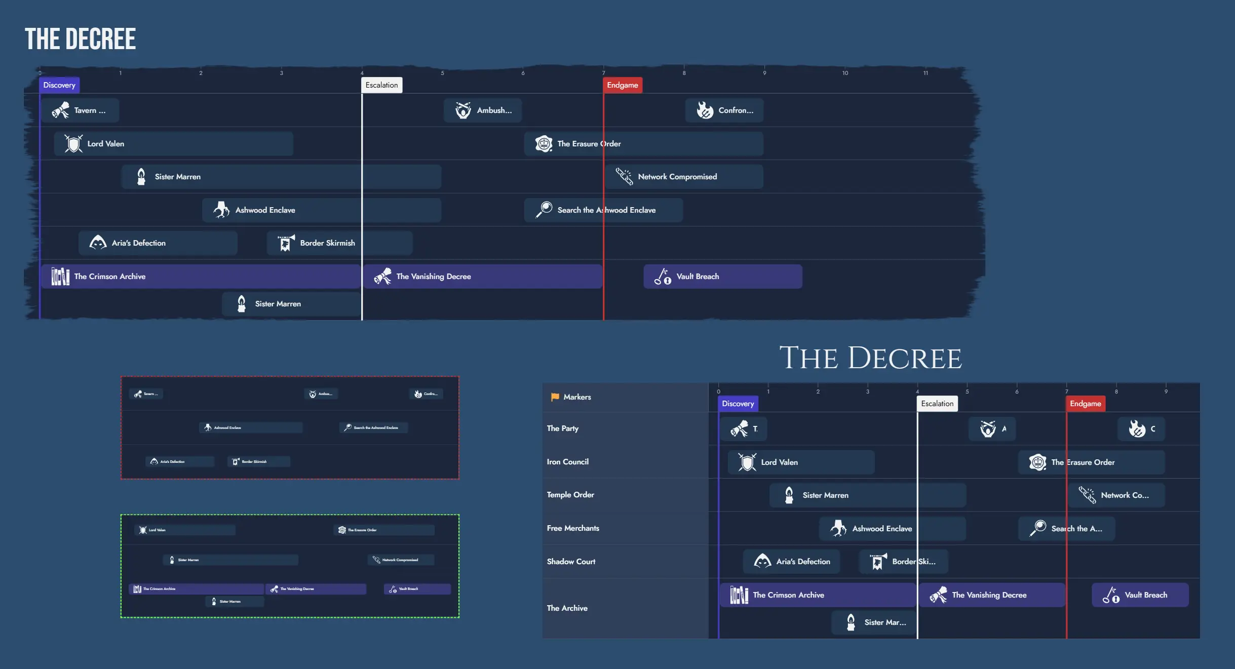
Interactive Mode
By default, Timeline Tokens on the Board are not interactive. To explore a Timeline interactively, enter interactive mode by double-clicking the Token. Press Escape to exit, or click outside the Token. Interactive mode is also automatically disabled after a brief period of inactivity.
Token Toolbar
Each Timeline Token features a floating toolbar with quick access to common actions:
- Interaction toggle: enables or disables interactive mode on the Token.
- Interaction Lock toggle: prevents usage of interactive mode.
- and Zoom controls: adjust the visible unit range within the Token viewport. Each Token maintains its own zoom level independently.
- Fit to Content button.
- Automatic Height toggle: when enabled, the Token automatically adjusts its global height to fit the Timeline's content at all times.
- Always fit content after resize toggle: when enabled, the Token automatically applies Fit to Content at the end of any resize operation, keeping the full Timeline visible.
- Edit Timeline: opens the Timeline in the Timeline Editor.
- Lock Token toggle: prevents any customization and interaction. Can only be unlocked from the context menu.
- Token Properties button: opens the Token Properties floating window.
Token Settings
The Token Properties window provides the following options:
- Title alignment (left, center, right).
- Hide name toggle.
- Name horizontal and vertical offsets.
- Name font and size.
- Border style selection.
- Keep Aspect Ratio toggle.
- Mask selection.
- Content Scale: proportionally scales the Token and all its inner components. This is a sizing property, not a navigation property, and has no effect on how many units are visible.
- Automatic Height toggle: when enabled, the Token always adjusts its global height to fit all displayed Lanes.
- Always fit content after resize toggle: when enabled, the Token automatically applies Fit to Content at the end of a resize operation.
- Show lane headers toggle: enables or disables the left column with the Marker and Lane headers.
- Lane visibility: per-Lane toggles to control which Lanes are visible in this Token.
- Marker visibility: per-Marker toggles to control which Markers are visible in this Token.
Lane and Marker visibility settings are independent per Token. This allows different Tokens to display different slices of the same Timeline. For example, one Token can show all Lanes while another shows only the player-facing Lane.
Random Tables
The application features a wide array of Random Tables covering various topics, and creating your own is simple. Each Random Table consists of a collection of themed entries, along with optional descriptions and visuals.
Random Tables are always accessible in the Library, where you can browse their content and make random rolls. Additionally, they can be linked to Nodes, transforming the Node into a Random Node with a “roll” function. You can roll for a new result at any time or manually select one from the table, updating the Node’s content (and visual, if applicable) with the chosen entry.
Using Random Tables
You can find Random Tables in the Library. Clicking on a Random Table opens a detailed panel displaying its contents, along with a “roll” button to select a Random Item from the table.
Selecting a Random Item gives you the option to create a new Node containing the item’s content by clicking the add button. The dialog window also allows you to link this new Node to the selected Random Table, making it a Random Node.
Some Random Items include multiple visuals. In such cases you can use the “picture select” button to change the one you see.
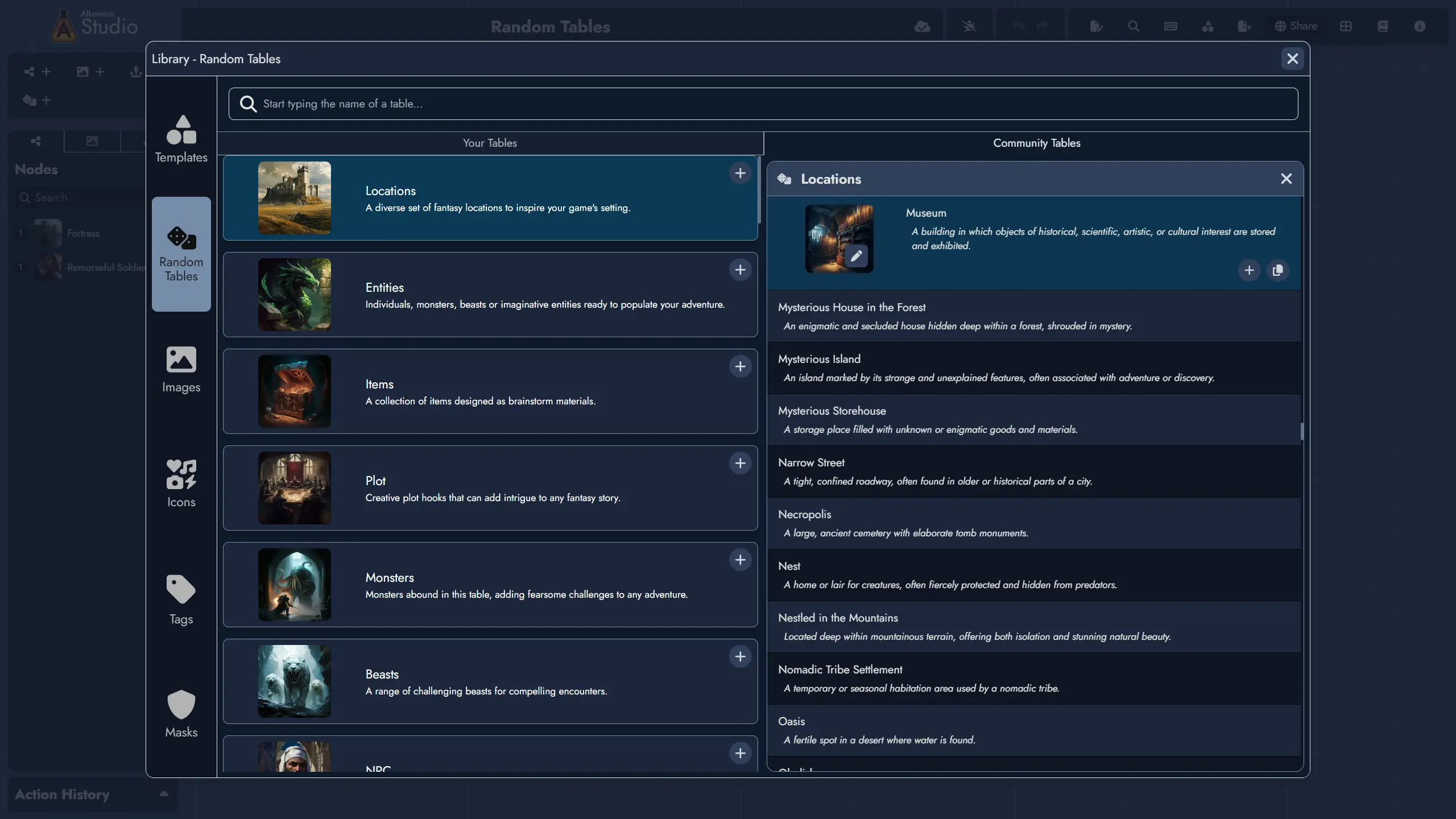
Random Nodes
Random Nodes are Nodes linked to a Random Table. They function like regular Nodes but include an additional “roll” button. Rolling a Random Node replaces its content with a randomly selected item from the linked table.
It’s important to note that rolling a Random Node completely replaces its content with the selected Random Item. If you’ve made changes to the Node’s content, the application will ask for confirmation before rolling, preventing accidental overwrites. Additionally, after rolling, you can undo the action using the undo button or the ctrl + z shortcut.
You can create a Random Node by linking a Node to a Random Table.
This can be done using the Add Random Table from several places in the application:
- In the context menu of any of its Tokens on the Board.
- In the Node’s context menu, available in the Board’s Node Tree or the Editor’s Content Tree.
- In the Random tab of the Node information panel within the Editor.
- In the Node Details floating window available from any of its Tokens on the Board.
Another easy way to create generic Random Nodes is to use the “Random Nodes” toolbar on the Board. This toolbar includes buttons for creating thematic Random Nodes, each pre-linked to a Random Table with an immediate roll result. Once created, these Random Nodes can still be fully customized.
The Random Nodes toolbar also includes a “Roll All” button, allowing you to roll all Random Nodes on the Board at once.
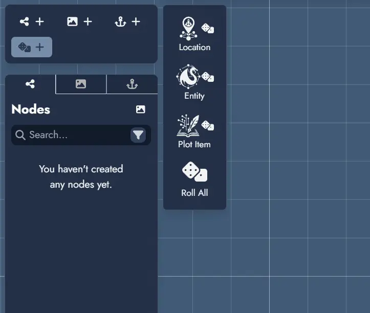
Creating or Editing a Random Table
To create a new Random Table, go to the “Your Tables” tab in the Random Tables section of the Library and click the Create a Random Table button.
This opens the Random Table editor, where you can set the table’s name and optionally select a visual. A valid Random Table requires at least two Random Items, which you can add using the button on the right.
Each Random Item must have a name. You can also add a visual and a description if desired. Once you’ve finished editing, click Save to create the new Random Table.
The same editor can be used to modify any Random Table you’ve created. Simply locate the table in your Library and click the Edit button.
Please note that the built-in Random Tables provided by Alkemion Studio cannot be edited.
Templates
Templates are versatile building blocks designed to facilitate your creation process in Alkemion Studio. They can be as broad as an entire Module or as focused as a single Node, with anything in between. Whether it’s a bustling village with pre-defined locations and NPCs or a set of treasures for players to uncover throughout an adventure, Templates make it easy to reuse, adapt, and remix content.
Exporting a Module as a Template
To turn an entire Module into a Template:
1) From the Lobby, open the Module you want to export as a Template.
2) Use the "Save as a Template" button from the top toolbar. In the options dialog, you can name the Template and select a Featured Image.
Note: You cannot have two Templates with the same name. If you try to export using an existing Template name, you’ll need to check “Overwrite any template with the same name” to replace the previous version.
3) Click “Save as a Template,” and your Template will be available in your Library immediately.
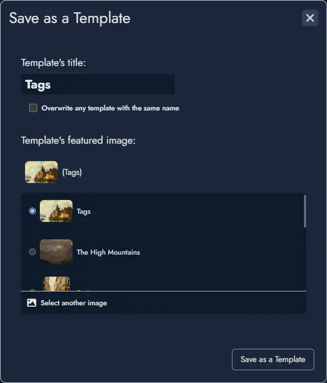
Creating a Template from a Selection
To create a Template from a selection of assets:
1) Select the Assets: On the Board, select the specific Tokens you want to include in the Template. This can include Node Tokens, Widgets, or Anchor Tokens. The application will automatically include the associated assets, Random Tables, and any relevant Links.
Note: Locked elements cannot be selected. Make sure to unlock any assets you’d like to include in the Template.
2) Choose Export Selection: After selecting, click on Export Selection to Template.
3) Name and Save: Enter a name for your new Template and save it.
This Template can now be imported into any Module.
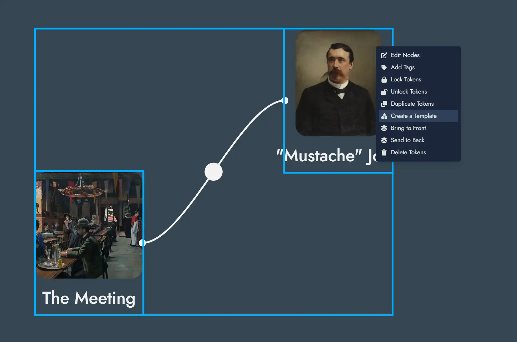
Starting a New Module from a Template
Templates make it easy to start a new Module with predefined content:
In the Lobby, select “New Module” and choose a Template from your Library.
A new Module will be created with all elements contained in the Template.
Importing a Template into a Module
Integrating an existing Template into a current Module is simple and adds flexibility to your design process:
1) Open the Module: From the Lobby, open the Module where you want to import the Template.
2) Access the Templates Library: Open the Library (via the button in the top toolbar, from the mobile menu, or with the shortcut Ctrl + L) and go to the “Tags” tab. Select any available Template.
3) Position the Placeholder: After selection, a placeholder representing the Template’s size appears on the Board. Place it where you want the Template content to be imported. You can click the Placeholder’s close button anytime to cancel the import operation.
4) Confirm the Import: Once you’re satisfied with the placement, confirm the import to integrate the Template’s Nodes and other assets into your current Module.
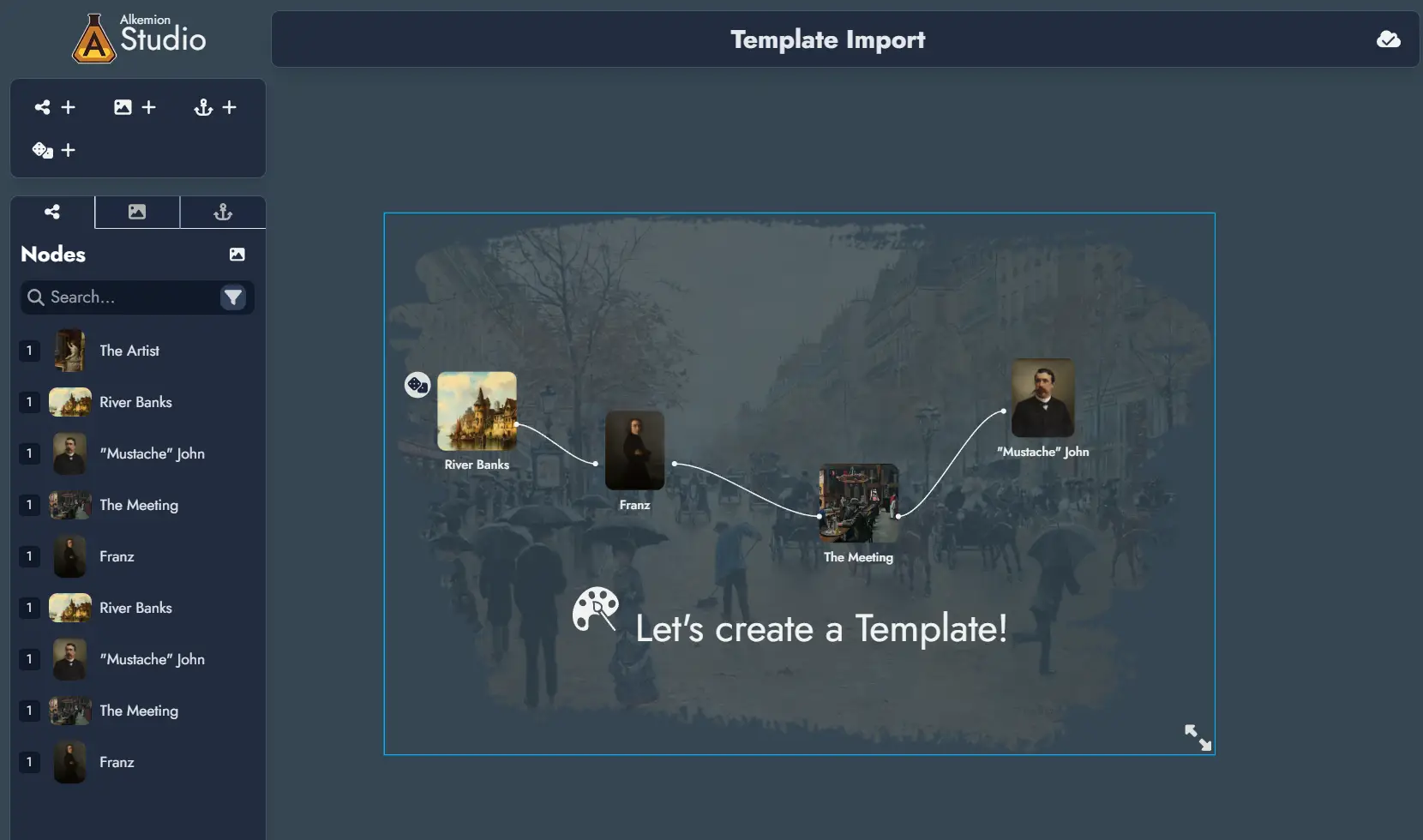
Exporting
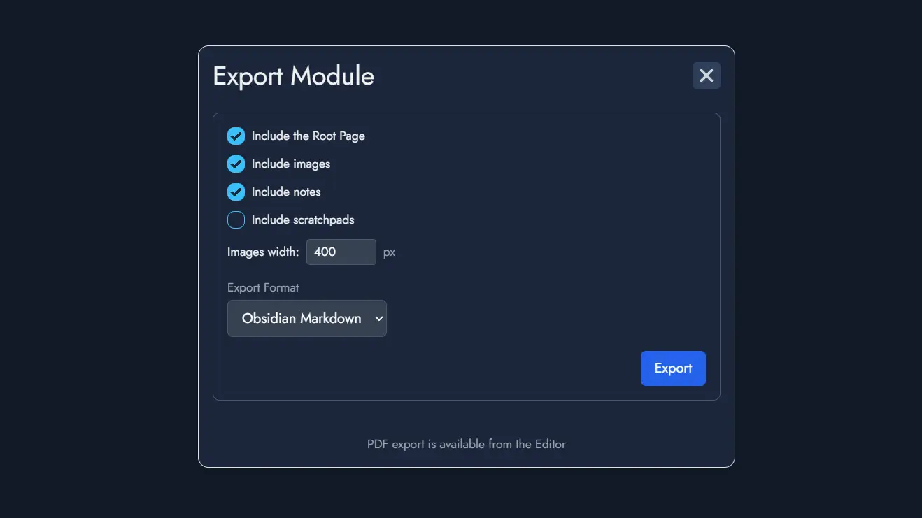
The Exporting feature allows you to export your Module in various formats. To access it, click the "Export" button located in the Board's toolbar. This will open the "Export Module" window, where you can choose from the available export options and customize what to include:
- Include the Root Page: Exports the top-level page from the Editor.
- Include images: Embeds the images used in your Module.
- Include notes: Includes Node-specific notes in the export.
- Include scratchpads: Adds Module-wide notes from the Module Panel (optional).
- Images width: Sets the default width (in pixels) for exported images.
- Export format: Choose between different file formats:
- Obsidian Markdown: Optimized for direct integration into an Obsidian vault.
- Markdown: A clean Markdown format suitable for most text editors.
- HTML: A raw HTML file that can be opened in browsers or HTML editors.
- Plain Text: A simple text version of your Module.
When you're ready, click the Export button to download a ZIP archive containing your exported content.
NB: Exporting the Module as an Alkemion Studio Template can be done with a dedicated button in the top toolbar, right next to the Export button.
Print/PDF Preview
The Print/PDF Preview feature allows you to review how your Module will appear when printed or exported as a PDF. It opens a modal with two panels: the left panel displays the Editor with your Nodes, and the right panel shows the page layout with page breaks.
The right preview panel can be zoomed in or out to adjust the display for your convenience.
- Preview Panel: When activated, this panel shows a visual representation of your Module’s content divided into pages. The display updates automatically as you modify the content.
- Page Breaks: You can manually insert page breaks using the dedicated button Page Break in the toolbar or adjust page breaks by dragging them in the left Editor panel.
- Content Control: Only Nodes visible in the Editable Page will be included in the preview. You can toggle Node visibility using the Content Tree in the Editor.
- Export Options: Once satisfied with the layout, use the print button to open your browser’s print settings and either print the module or save it as a PDF.
Note: This section of the documentation is currently under development and will be updated with more comprehensive information soon. Check back regularly for the latest updates and enhancements. Thank you for your understanding!
Sharing
The Sharing feature in Alkemion Studio allows you to share your Module with others in a read-only format. This ensures that your content remains untouched while still allowing others to explore your work. More advanced sharing permissions will be added later on.
To access sharing options, click the “Share” button located in the Board’s toolbar. This will open the “Share” window, where you can customize the sharing settings.
Generating a Shareable Link
Once the “Share” window is open, it will either display the active shareable link if it exists, or you’ll see a message inviting you to create one.
To generate a shareable link:
- Click the “Generate a link” button.
- A URL link will be provided that you can copy and share with anyone. This link allows recipients to open a read-only version of your Module.
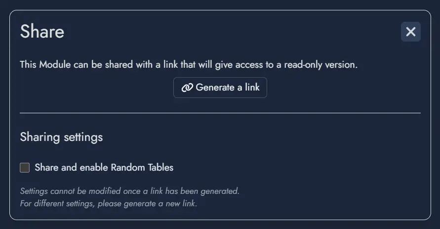
Sharing Settings
Under the “Generate a link” button, you will find the “Sharing settings” section, which provides additional customization options. Currently, there is a checkbox option:
Share and enable Random Tables: When selected, this allows users who open the shared Board to roll any Random Nodes and view Random Tables linked to the Module. The Board remains read-only, so results from rolls will not be saved when the shared Board is reloaded.
Important Note: Once a link is generated, the sharing settings cannot be modified. If you wish to change these settings, you will need to generate a new link, which will invalidate the previous one.
Experience of Viewing a Shared Board
A shared Board is displayed exactly as it was at the time of its last save, including the camera position and zoom level. This ensures that the viewer’s first impression aligns with your intended presentation.
The shared Board features the same user interface as a regular Board but with restricted functionality. Viewers can navigate the Board and read the content of the Nodes but cannot make any modifications. If the “Share and enable Random Tables” option was activated, viewers can interact with Random Tables by rolling them; however, any results generated will not be retained upon refreshing or revisiting the link.
This straightforward sharing capability makes it easy to share session recaps or worldbuilding lore with other players, collaborate with others for feedback, or simply showcase and share your creative ideas with friends and fellow RPG enthusiasts. Future updates will introduce more nuanced permissions to allow for even greater flexibility and control when sharing your Modules.